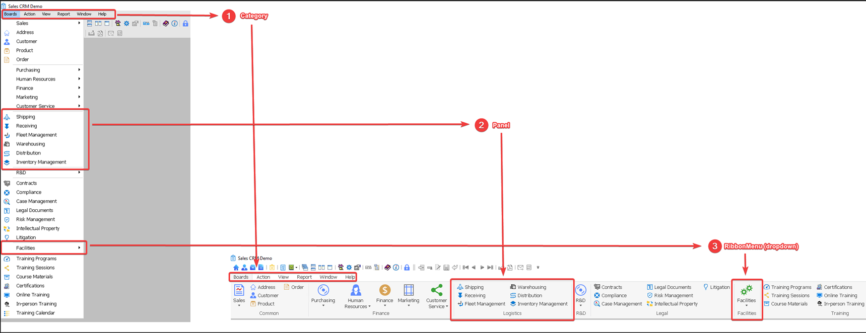
The RibbonView will use the same structure as the menu. Currently up to 4 levels of menus can be displayed.
Menus
-
The 1st-level menus will display as categories.
-
The 2nd-level menus will display as buttons.
-
The button can display as a small button or a large button depending on the ButtonImageSize property of the menu item. The default value is small button.
-
The buttons will be divided and placed into different panels according to the menu separator line. If no menu separator line is used in the original menu, then all buttons will be placed into one single panel.
Note
Even if a menu separator line's Visible property is set to false, it will still be recognized and used as a valid separator for dividing the buttons into panels in RibbonView.
-
The panel will use the value of the PanelText property of the first menu item as the panel name and the name will display at the footer area of each panel. If not specified, the name of the first menu item in the panel is used as the panel name by default.
-
The button will display the image specified by the ButtonImage property of that menu item. If no image is specified, for the contemporary style menu, the image specified by the MenuImage property of the menu item will be used, otherwise, the system default image will be displayed.
-
-
If the 2nd-level menu has sub-menus (3rd-level menus), the 3rd-level menu will display as ribbon menu (which is a dropdown menu). The ribbon menu will display the image specified by the ButtonImage property of that submenu item.
-
If the 3rd-level menu has sub-menus (4th-level menus), the 4th-level menu will display as sub menu of the ribbon menu. The sub menu will display the image specified by the ButtonImage property of that submenu item.
-
Currently only up to 4 levels of menus will be automatically displayed in the ribbon bar.
-
When a sheet list is available and the SheetListVisible property is set to true, a panel will be displayed at the position specified by the OpenSheet function; and a SheetList button with a dropdown menu that contains a list of opened sheets will be displayed in that panel.

Toolbars
-
Toolbars are displayed as the QuickAccessToolbar. For rules of displaying Toolbar as the QuickAccessToolbar, refer to QuickAccessToolbar.
Font
-
The font face and font size will stay the same as the original menu. If it is a traditional style menu (which has no font settings), the following font face and size will be used: Tahoma, 12.
Events and properties
-
The functions, events, and properties of the original menu will still be supported after the menu is displayed as a ribbon bar. For more information, refer to Support for menu functions, events, and properties.
Size
-
Supports maximizing and minimizing the ribbon bar, and automatically adjusts the size of the MDIClient area and the ribbon bar position. For more information, refer to section Window size difference.
Shortcut keys and accelerator keys:
-
If shortcut keys are set in the menu, they are automatically synchronized to the ribbon bar.
-
However, the accelerator keys will not be synchronized and supported in the ribbon bar. If the menu Text property includes an accelerator key, such as "&New", the displayed text will be "New" in the ribbon bar, the N letter will not have an underscore to indicate the accelerator key.
