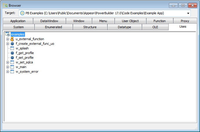
You can use TreeView controls in your application to represent relationships among hierarchical data. An example of a TreeView implementation is PowerBuilder's Browser. The tab pages in the Browser contain TreeView controls.
Adding TreeView items and pictures
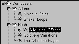
A TreeView consists of TreeView items that are associated with one or more pictures. You add images to a TreeView in the same way that you add images to a PictureListBox.
For more information, see Adding images to a PictureListBox.
Dynamically changing image size
The image size can be changed at runtime by setting the PictureHeight and PictureWidth properties when you create a TreeView.
For more information about PictureHeight and PictureWidth, see the section called “PictureHeight” in Objects and Controls and the section called “PictureWidth” in Objects and Controls.
To add items to a TreeView
-
Write a script in the TreeView constructor event to create TreeView items.
For more information about populating a TreeView, see the section called “Populating TreeViews” in Application Techniques and the section called “TreeView control” in Objects and Controls.
Adding state pictures to TreeView items
A state picture is an image that appears to the left of the TreeView item indicating that the item is not in its normal mode. A state picture could indicate that a TreeView item is being changed, or that it is performing a process and is unavailable for action.
To specify a state picture for a TreeView item
-
Select the TreeView control to display its properties in the Properties view and then select the State tab.
-
Do one of the following:
-
Use the StatePictureName drop-down list to select stock pictures to add to the TreeView.
-
Use the Browse button to select any bitmap (BMP), icon (ICO), GIF, JPEG or PNG file.
-
To specify a cursor file
To use a cursor file, you must type the file name. You cannot select it.
Working in the Properties view with the rows in the State or Pictures tab page is the same as working with them in a ListView control. For information, see ListView.
To activate a state picture for a TreeView item
-
Write a script that changes the image when appropriate.
For example, the following script gets the current TreeView item and displays the state picture for it.
long           ll_tvi
treeviewitem   tvi

ll_tvi = tv_foo.finditem(currenttreeitem!, 0)
tv_foo.getitem(ll_tvi, tvi)
tvi.statepictureindex = 1
tv_foo.setitem(ll_tvi, tvi)
For more information on the TreeView control, see the section called “Using TreeView Controls” in Application Techniques.
Setting other properties
To specify other TreeView properties
-
Select the TreeView control to display its properties in the Properties view and then select the General tab.
-
Enter a name for the TreeView in the Name text box and specify other properties as appropriate. Among the properties you can specify on the General property page are:
-
The border style
-
Whether the TreeView has lines showing the item hierarchy
-
Whether the TreeView includes collapse and expand buttons
-
Whether the user can delete items
-
Whether the user can drag and drop items into the TreeView
-
For more information, right-click in any tab page in the Properties view and select Help from the pop-up menu.
For other options, choose the tab appropriate to the property you want to specify:
|
To specify |
Choose this tab |
|---|---|
|
The images used to represent TreeView items |
Pictures |
|
The state images for the TreeView items |
State |
|
The font size, family, and color for TreeView items |
Font |
|
The size and position of the TreeView |
Other |
|
The icon for the mouse pointer in the TreeView |
Other |
|
The icon for a drag item, and whether the drag-and-drop must be performed programmatically |
Other |
For more information on the TreeView control, see the section called “Using TreeView Controls” in Application Techniques. For information about its properties, see the section called “TreeView control” in Objects and Controls.
