QuickAccessToolbar is an internal sub-control of the RibbonView and cannot be used independently as a standalone control. It can only be used in the RibbonView. When a menu contains a toolbar, the ribbon bar automatically adds a corresponding QuickAccessToolbar. You can use the ShowQuickAccessToolbar property to determine whether to show the QuickAccessToolbar.
In addition to display the shortcut icons of menu items,
QuickAccessToolbar also provides a dropdown list to conveniently
control the visibility of each shortcut icon and offer simple
customization options. For instance, you can control whether a
shortcut icon displays in the QuickAccessToolbar by selecting its
checkbox  , or use the "Show below the Ribbon" option to
display the QuickAccessToolbar at the top or bottom of the ribbon
bar.
, or use the "Show below the Ribbon" option to
display the QuickAccessToolbar at the top or bottom of the ribbon
bar.
The following is a description of the general rules when displaying the menu toolbar as QuickAccessToolbar:
-
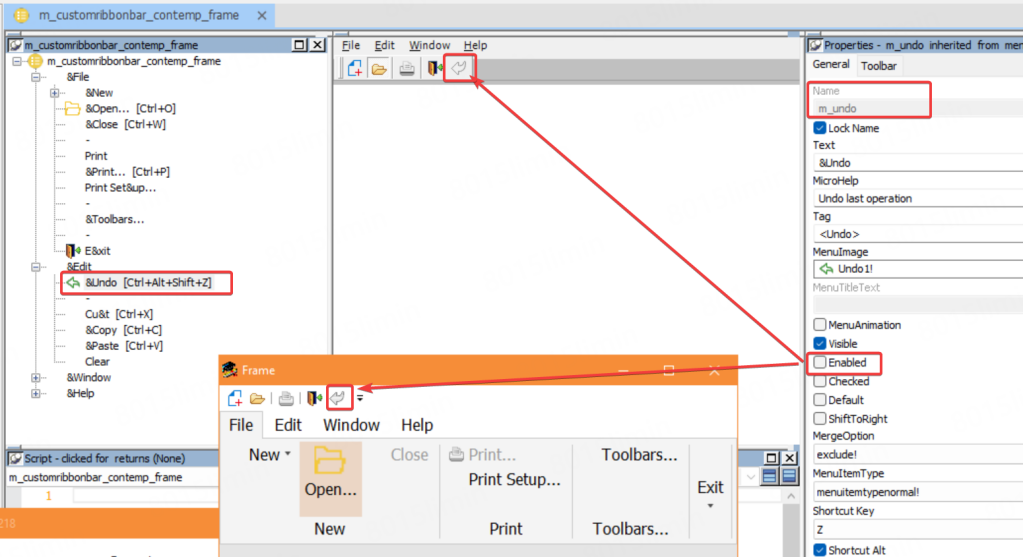
Vertical separators in toolbar are represented as vertical separators in the QuickAccessToolbar (①).
-
When there are multiple toolbars, they are combined and displayed in one single QuickAccessToolbar and separated by two vertical separators between them (②).
-
If the original toolbar contains a drop-down button, the QuickAccessToolbar will also add a corresponding drop-down button.
-
An arrow icon will appear automatically at the end of QuickAccessToolbar (③). Click it and a drop-down list will appear, showing the text content of all currently visible toolbar items (when ToolbarItemVisible is true), including separators (①②). You can customize the QuickAccessToolbar by 1) selecting which items to show in the QuickAccessToolbar (④), 2) selecting "Show below the Ribbon" (⑤) to show the QuickAccessToolbar below the ribbon bar instead of above; 3) selecting "Minimize the Ribbon" (⑥) to minimize the ribbon bar.
-
When ToolbarItemVisible is true in the menu toolbar, the corresponding icon appears in the QuickAccessToolbar, and its text content (ToolBarItemText property value) is automatically displayed and checked in the dropdown list. If ToolBarItemText is not set, an empty value is displayed in the dropdown list. Dynamic setting of the ToolbarItemVisible property is also supported.
-
QuickAccessToolbar item statuses can be saved in the path specified by the SetQuickAccessToolbarStatusPath. If no path is specified, the QuickAccessToolbar item status will not be saved.
-
The ToolbarVisible property of the menu toolbar determines the visibility of QuickAccessToolbar when QuickAccessToolbar is initializing. After QuickAccessToolbar is initialized, the ShowQuickAccessToolbar property determines the visibility of QuickAccessToolbar; however, for the QuickAccessToolbar to be visible, the initial value of ToolbarVisible must also be true.
-
The Enabled property of the menu toolbar determines the availability of corresponding icons in the QuickAccessToolbar.
-
The ObjectType and ToolbarItemOrder properties from the menu toolbar are also effective in QuickAccessToolbar. For which toolbar properties can be supported, refer to Toolbar properties.
The following features are not supported in the QuickAccessToolbar:
-
The original menu toolbar can be displayed at the top, bottom, left, or right edge of the window. After displayed as the QuickAccessToolbar, the toolbar can only be displayed at the top.
-
The text value of the MicroHelp property of the menu item will not display in QuickAccessToolbar.
The "Customize Quick Access Toolbar" dropdown menu in the QuickAccessToolbar only records manual status changes made by users at runtime.
The following Toolbar properties can be supported by QuickAccessToolbar:
-
ToolbarItemText
-
ToolbarItemName
-
ToolbarItemVisible
-
ToolbarItemOrder
-
ObjectType
-
Enabled
Usages are consistent with the Toolbar property settings.
Properties not listed such as ToolbarItemDown, ToolbarItemSpace, ToolbarItemBarIndex etc. are not supported.
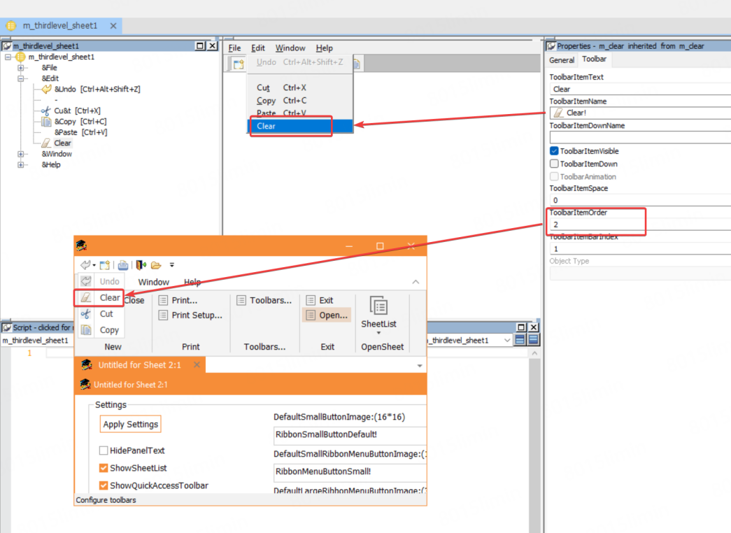
The following pictures show the effect before and after displaying in RibbonView.
The Clear icon is originally at the last position in the drop-down list, but because its ToolbarITemOrder is set to 2, it is displayed as the second item in the drop-down list.
QuickAccessToolbar supports custom theme.
You can configure the settings under the "quickaccesstoolbar" node (as shown below) in the theme file to customize the display and style of QuickAccessToolbar. QuickAccessToolbar follows the same customization rules of the RibbonBar control. For more information, refer to Theme.
Note: Please make sure that your theme folder has been updated to the latest version. Otherwise, users who have upgraded will find that the QuickAccessToolbar position is displayed in black.
The "quickaccesstoolbar" node contains the following settings:
"quickaccesstoolbar":
  {
   "background-color": "#FFFFFF",
   "moreitem-image": { "file": "moreitem.png" },
   "allitemvisible-image": { "file": "allitemvisible.png" },
   "item":
   {
    "separator-color": "#A0A0A0",
    "groupseparator-image": { "file": "groupseparator.png" },
    "arrow-image": { "file": "dropdown-arrow.png" },
    "normal-state":
    {
     "background-color": "#FFFFFF",
     "border-color": "#FFFFFF"
    },
    "hover-state":
    {
     "background-color": "#F9E4D2",
     "border-color": "#F9E4D2"
    },
    "pressed-state":
    {
     "background-color": "#F9D2B0",
     "border-color": "#F9D2B0"
    },
    "disabled-state":
    {
     "background-color": "#FFFFFF",
     "border-color": "#FFFFFF"
    }
   },
   "menu":
   {
    "border-color": "#D9D9D9",
    "background-color": "#FFFFFF",
    "separator-color": "#D9D9D9",
    "item-custom-qat":
    {
     "normal-state":
     {
      "background-color": "#F8EADF",
      "text-font": { "color": "#333333" }
     }
    },
    "item":
    {
     "checked-image": { "file": "menucheck.png" },
     "normal-state":
     {
       "border-color": "#FFFFFF",
       "background-color": "#FFFFFF",
       "text-font": { "color": "#333333" }
     },
     "hover-state":
     {
       "border-color": "#F9E4D2",
       "background-color": "#F9E4D2",
       "text-font": { "color": "#333333" }
     },
     "disabled-state":
     {
       "border-color": "#FFFFFF",
       "background-color": "#FFFFFF",
       "text-font": { "color": "#999999" }
     }
    },
    "scroll-spinner":
    {
     "normal-state":
     {
       "border-color": "#FFFFFF",
       "background-color": "#FFFFFF",
       "up-arrow-image": { "file": "scroll-spinner-up.png" },
       "down-arrow-image": { "file": "scroll-spinner-down.png" }
     },
     "hover-state":
     {
       "border-color": "#F9E4D2",
       "background-color": "#F9E4D2",
       "up-arrow-image": { "file": "scroll-spinner-up.png" },
       "down-arrow-image": { "file": "scroll-spinner-down.png" }
     },
     "pressed-state":
     {
       "border-color": "#F9D2B0",
       "background-color": "#F9D2B0",
       "up-arrow-image": { "file": "scroll-spinner-up.png" },
       "down-arrow-image": { "file": "scroll-spinner-down.png" }
     }
    }
   }
  }
If your application is upgraded from an old version and the theme feature is enabled, after upgrading to PowerBuilder 2025 (or later), the QuickAccessToolbar position will be displayed in black because the old version configuration file in the theme folder does not contain the relevant information of QuickAccessToolbar.
Normally, when upgrading or using a new version of PowerBuilder, you need to update the Theme folder. Please make sure to use the latest theme configuration file (usually located in the PowerBuilder installation directory, the default path is C:\Program Files (x86)\Appeon\PowerBuilder [version]\IDE).
