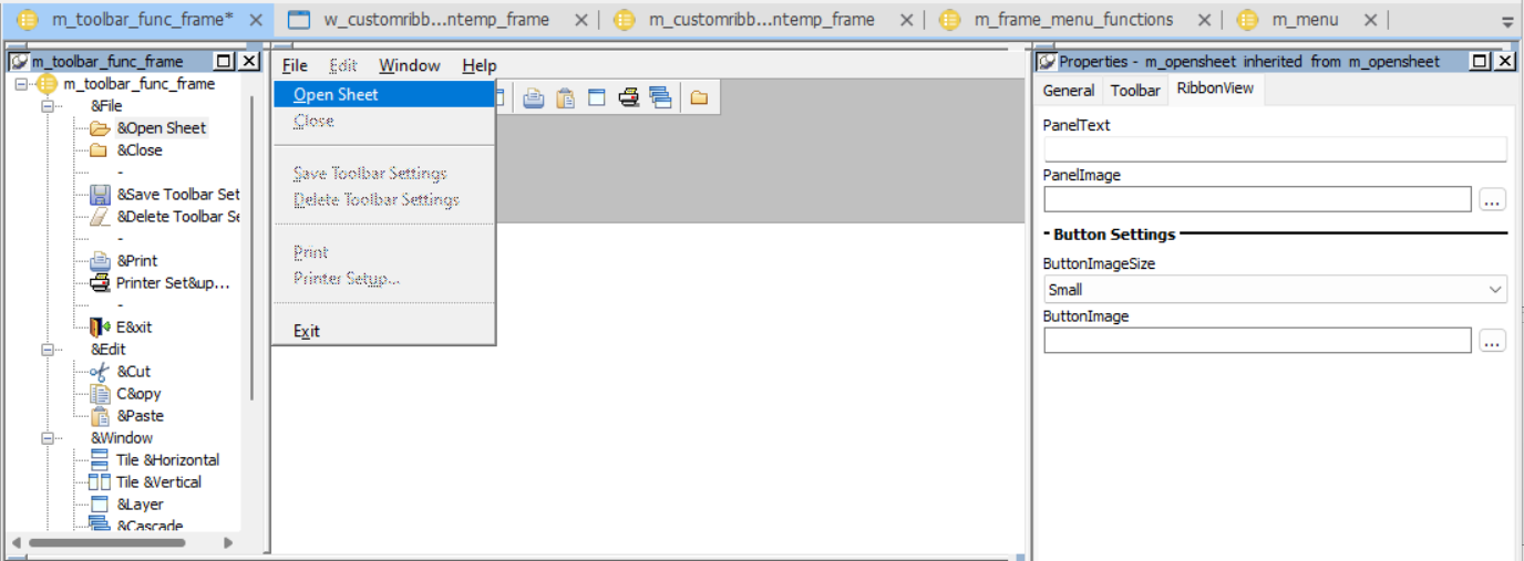
To rapidly transform the existing menu to a modern RibbonBar, without the need for deep customization, users can configure properties including PanelText, PanelImage, ButtonImageSize, and ButtonImage in the menu painter to control the appearance of the RibbonBar.
Note
To display the RibbonView tab page, open the Menu painter, expand the menu, and then select a 2nd-level menu item.
-
PanelText -- Specifies the text to be displayed as the panel name in the category. The menu items are divided into panels according to the menu separator line. You only need to set the the PanelText property of the first menu item in the panel. If not specified, the name of the first menu item in the panel is used as the panel name by default.
-
PanelImage -- Specifies the image to be displayed when the panel is collapsed (the panel is collapsed automatically if the window is too small to display all of the items in the panel).
-
ButtonImageSize -- Specifies whether to display the menu as a large button or a small button (default).
-
ButtonImage -- Specifies the image for the button. The default width and height of the image for the small button is 16 * 16 pixels, and for the large button is 32 * 32 pixels. If no image is specified, for the contemporary style menu, the MenuImage property of the menu item will be used, otherwise, the system default image will be displayed.