Often the best way to display information is graphically. Instead of showing users a series of rows and columns of data, you can present information as a graph in a DataWindow object or window. For example, in a sales application, you might want to present summary information in a column graph.
PowerBuilder provides many types of graphs and allows you to customize your graphs in many ways. Probably most of your use of graphs will be in a DataWindow object. The source of the data for your graphs will be the database.
You can also use graphs as standalone controls in windows (and user objects) and populate the graphs with data through scripts.
The way you define graphs is the same whether you are using them in a DataWindow object or directly in a window. However, the way you manipulate graphs in a DataWindow object is different from the way you manipulate them in a window.
Before using graphs in an application, you need to understand the parts of a graph and the kinds of graphs that PowerBuilder provides.
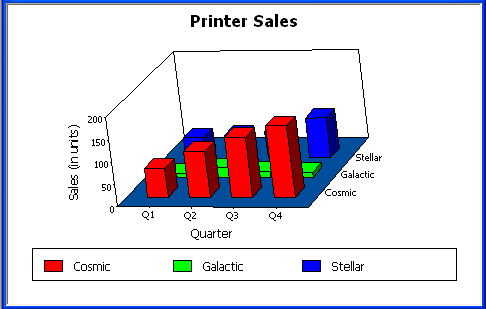
Here is a column graph created in PowerBuilder that contains most major parts of a graph. It shows quarterly sales of three products: Stellar, Cosmic, and Galactic printers:
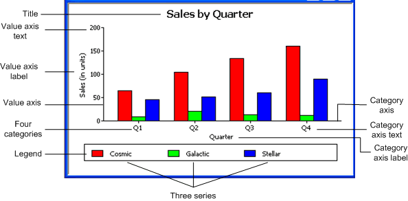
Graphs display data points. To define graphs, you need to know how the data is represented. PowerBuilder organizes data into three components.
|
Component |
Meaning |
|---|---|
|
Series |
A set of data points Each set of related data points makes up one series. In the preceding graph, there is a series for Stellar sales, another series for Cosmic sales, and another series for Galactic sales. Each series in a graph is distinguished by color, pattern, or symbol. |
|
Categories |
The major divisions of the data Series data are divided into categories, which are often non-numeric. In the preceding graph, the series are divided into four categories: Q1, Q2, Q3, and Q4. Categories represent values of the independent variable(s). |
|
Values |
The values for the data points (dependent variables). |
The following table lists the parts of a typical graph.
|
Part of graph |
What it is |
|---|---|
|
Title |
An optional title for the graph. The title appears at the top of the graph. |
|
Value axis |
The axis of the graph along which the values of the dependent variable(s) are plotted. In a column graph, as shown in the preceding graph, the Value axis corresponds to the y axis in an XY presentation. In other types of graphs, such as a bar graph, the Value axis can be along the x dimension. |
|
Category axis |
The axis along which are plotted the major divisions of the data, representing the independent variable(s). In the preceding graph, the Category axis corresponds to the x axis. It plots four categories: Q1, Q2, Q3, and Q4. These form the major divisions of data in the graph. |
|
Series |
A set of data points. There are three series in the preceding graph: Stellar, Cosmic, and Galactic. In bar and column charts, each series is represented by bars or columns of one color or pattern. |
|
Series axis |
The axis along which the series are plotted in three-dimensional (3D) graphs. |
|
Legend |
An optional listing of the series. The preceding graph contains a legend that shows how each series is represented in the graph. |
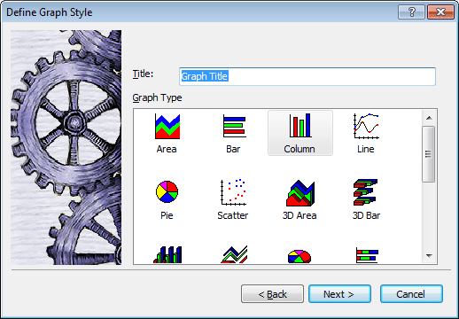
PowerBuilder provides many types of graphs for you to choose from. You choose the type on the Define Graph Style page in the DataWindow wizard or in the General page in the Properties view for the graph.
Area, bar, column, and line graphs are conceptually very similar. They differ only in how they physically represent the data values—whether they use areas, bars, columns, or lines to represent the values. All other properties are the same. Typically you use area and line graphs to display continuous data and use bar and column graphs to display noncontinuous data.
The only difference between a bar graph and a column graph is the orientation: in column graphs, values are plotted along the y axis and categories are plotted along the x axis. In bar graphs, values are plotted along the x axis and categories are plotted along the y axis.
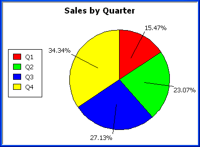
Pie graphs typically show one series of data points with each data point shown as a percentage of a whole. The following pie graph shows the sales for Stellar printers for each quarter. You can easily see the relative values in each quarter. (PowerBuilder automatically calculates the percentages of each slice of the pie.)
You can have pie graphs with more than one series if you want; the series are shown in concentric circles. Multiseries pie graphs can be useful in comparing series of data.
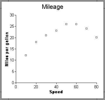
Scatter graphs show xy data points. Typically you use scatter graphs to show the relationship between two sets of numeric values.Non-numeric values, such as string and DateTime datatypes, do not display correctly.
Scatter graphs do not use categories. Instead, numeric values are plotted along both axes—as opposed to other graphs, which have values along one axis and categories along the other axis.
For example, the following data shows the effect of speed on the mileage of a sedan:
Here is the data in a scatter graph:
You can have multiple series of data in a scatter graph. You might want to plot mileage versus speed for several makes of cars in the same graph.
Traditional 3D graphs
You can also create 3-dimensional (3D) graphs of area, bar, column, line, and pie graphs. In 3D graphs (except for 3D pie graphs), series are plotted along a third axis (the Series axis) instead of along the Category axis. You can specify the perspective to use to show the third dimension:
DirectX 3D graphs
DirectX 3D rendering allows you to display the 3D graphs (Pie3D, Bar3D, Column3D, Line3D, and Area3D) with a more sophisticated look. You can use data item or series transparency with the DirectX graph styles to improve the presentation of data.
The DirectX graph rendering style is supported for standalone graph controls and for graph controls in a DataWindow object. PowerBuilder uses the following functions to support the DirectX graph styles:
|
GetDataLabelling |
SetDataLabelling |
|---|---|
|
GetDataTransparency |
SetDataTransparency |
|
GetSeriesLabelling |
SetSeriesLabelling |
|
GetSeriesTransparency |
SetSeriesTransparency |
DirectX runtime. The DirectX 3D rendering depends on the DirectX runtime. The first time you select the Render3D check box on the General tab of the Properties view for a 3D graph, PowerBuilder launches the DirectX installer. If you opt out of the installation, the Render3D property is ignored. End users of PowerBuilder applications must also have the DirectX runtime installed on their computers.
If you install DirectX on the runtime computer, but selecting the Render3D check box does not change the appearance of the graph, it is possible that the graphics card does not support DirectX.
You can check whether DirectX is supported by running dxdiag.exe. This file is typically installed in the Windows\System32 directory. The Display tab of the DirectX Diagnostic Tool that opens when you run dxdiag.exe indicates whether Direct3D is enabled.
You can use graphs in DataWindow objects and in windows. You specify the properties of a graph, such as its type and title, the same way in a DataWindow object as in a window.
Using graphs in user objects
You can also use graphs in user objects. Everything in this chapter about using graphs in windows also applies to using graphs in user objects.
The major differences between using a graph in a DataWindow object and using a graph in a window (or user object) are:
-
Specifying the data for the graph
In DataWindow objects, you associate columns in the database with the axes of a graph. In windows, you write scripts containing PowerScript functions to populate a graph.
-
Specifying the location of the graph
In DataWindow objects, you can place a graph in the foreground and allow users to move and resize the graph at runtime, or you can place a graph in a band and prevent movement. In windows, graphs are placed like all other window controls.
