Graphs in reports are dynamic
Graphs in reports are tied directly to the data that is in the report. As the data changes, the graph is automatically updated to reflect the new values.
Two techniques
You can use graphs in reports in two ways:
-
By including a graph as a control in a report
The graph enhances the display of information in a report, such as a tabular or freeform report. This technique is described in Placing a graph in a report.
-
By using the Graph presentation style
The entire report is a graph. The underlying data is not visible. This technique is described in Using the Graph presentation style.
To place a graph in a report:
-
Open or create the report that will contain the graph.
-
Select Insert>Control>Graph from the menu bar.
-
Click where you want the graph.
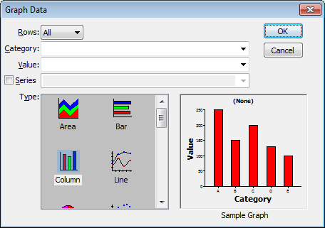
InfoMaker displays the Graph Data dialog box:
-
Specify which columns contain the data and the type of graph you want, and click OK.
For more information, see Associating data with a graph.
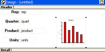
The Design view now contains a representation of the graph:
-
Specify the graph's properties in the Properties view.
A graph has a Properties view in which you can specify the data as well as the other properties of the graph.
To display the graph's Properties view:
-
Select Properties from the graph's pop-up menu.
The Properties view for a graph has several property pages in which you specify information about the graph. The following table lists the property pages that contain properties that are specific to graphs, and describes what each property page specifies.
Property page
What it specifies
Axis
Labels, scale, information about major and minor divisions for the category axes.
Data
Where to get the graph's data.
General
Various general graph properties, including border, graph colors, whether to size the graph to the full screen display, suppression in newspaper columns.
Graph type, title, legend location.
For 3D graphs, perspective, rotation, elevation, and render3D.
For bar graphs, overlap, spacing and depth of bars.
Pointer
The pointer to use when the mouse is positioned over the graph.
Position
The x,y location of the upper left corner of the graph, its width and height, sliding options, the layer in which the graph is to be positioned.
Whether the graph can be resized and moved at runtime.
Text
Text properties for text controls that display on the graph, including title, axis text, axis label, and legend.
Text properties include font, font style, font size, alignment, rotation, color, display expression, display format.
Other
Descriptions and label for use by assistive technology tools.
When you first place a graph in a report, it is in the foreground -- it sits above the bands in the report. Unless you change this setting, the graph displays in front of any retrieved data.
The initial graph is also moveable and resizable, so users have complete flexibility as to the size and location of a graph at runtime. You can change these properties.
To specify a graph's position and size:
-
Select Properties from the graph's pop-up menu and then select the Position page or the General page in the Properties view.
-
Select the settings for the following options on the Position property page:
Setting
Meaning
Layer
Background -- The graph displays behind other elements in the report.
Band -- The graph displays in one particular band. If you choose this setting, you should resize the band to fit the graph. Often you will want to place a graph in the Footer band. As users scroll through rows in the report, the graph remains at the bottom of the screen as part of the footer.
Foreground -- (Default) The graph displays above all other elements in the report. Typically, if you choose this setting, you also make the graph movable so it will not obscure data while users display the report.
Moveable
The graph can be moved in the Preview view and at runtime.
Resizable
The graph can be resized in the Preview view and at runtime.
Slide Left, Slide Up
The graph slides to the left or up to remove extra white space. For more information, see Sliding controls to remove blank space in a report.
X, Y
The location of the upper-left corner of the graph.
Width, Height
The width and height of the graph.
-
Select the settings for the following options on the General property page:
Setting
Meaning
Size To Display
The graph fills the report and resizes when users resize the report. This setting is used with the Graph presentation style.
HideSnaked
Do not repeat graph after the first column in a report using newspaper-style columns.
When using a graph in a report, you associate axes of the graph with columns in the report.
The only way to get data into a graph in a report is through columns in the report. You cannot add, modify, or delete data in the graph except by adding, modifying, or deleting data in the report.
You can graph data from any columns retrieved into the report. The columns do not have to be displayed.
About the examples
The process of specifying data for a graph is illustrated below using the Printer table in the PB Demo DB.
To specify data for a graph:
-
If you are creating a new graph, the Graph Data dialog box displays. Otherwise, select Properties from the graph's pop-up menu and select the Data page in the Properties view.
-
Fill in the boxes as described in the sections that follow, and click OK.
The Rows drop-down list allows you to specify which rows of data are graphed at any one time:
|
Setting |
Meaning |
|---|---|
|
All |
Graphs the data from all the rows that have been retrieved but not filtered or deleted (that is, the rows in the primary buffer of the report) |
|
Page |
Graphs only the data from the rows that are currently displayed on the page |
|
Group n |
Graphs only the data in the specified group (in a grouped report) |
If you select Group
If you are graphing data in the current group in a grouped report and have several groups displayed at the same time, you should localize the graph in a group-related band in the Design view. This makes clear which group the graph represents. Usually, the group header band is the most appropriate band.
Specify the column or expression whose values determine the categories. In the Graph Data page in the Graph dialog box and on the Data page in the Properties view, you can select a column name from a drop-down list.
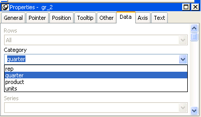
There is an entry along the Category axis for each different value of the column or expression you specify.
Using display values of data
If you are graphing columns that use code tables, when data is stored with a data value but displayed to users with more meaningful display values, by default the graph uses the column's data values. To have the graph use a column's display values, use the LookupDisplay InfoMaker expression function when specifying Category or Series. LookupDisplay returns a string that matches the display value for a column:
LookupDisplay ( column )
For more about code tables, see Defining a code table. For more about LookupDisplay, see LookUpDisplay.
InfoMaker populates the Value drop-down list. The list includes the names of all the retrieved columns as well as the following aggregate functions:
-
Count for all non-numeric columns
-
Sum for all numeric columns
Select an item from the drop-down list or type an expression (in the Properties view). For example, if you want to graph the sum of units sold, you can specify:
sum(units for graph)
To graph 110 percent of the sum of units sold, you can specify:
sum(units*1.1 for graph)
Graphs can have one or more series.
Single-series graphs
If you want only one series (that is, if you want to graph all retrieved rows as one series of values), leave the Series box empty.
Multiple-series graphs
If you want to graph more than one series, select the Series check box and specify the column that will provide the series values. You can select column names from the drop-down list.

There is a set of data points for each different value of the column you specify here. For example, if you specify a column that has 10 values, then your graph will have 10 series: one set of data points for each different value of the column.
Using expressions
You can also specify expressions for Series (on the Data page of the Properties view). For example, you could specify the following for Series:
Units / 1000
In this case, if a table had unit values of 10,000, 20,000, and 30,000, the graph would show series values of 10, 20, and 30.
Specifying multiple entries
You can specify more than one of the retrieved columns to serve as series. Separate multiple entries by commas.
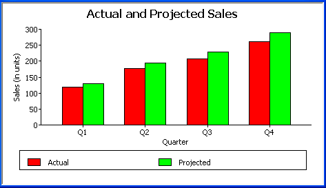
You must specify the same number of entries in the Value box as you do in the Series box. The first value in the Value box corresponds to the first series identified in the Series box, the second value corresponds to the second series, and so on. The example about graphing actual and projected sales in Examples illustrates this technique.
This section shows how to specify the data for several different graphs of the data in the Printer table in the PB Demo DB. The table records quarterly unit sales of three printers by three sales representatives.
|
Rep |
Quarter |
Product |
Units |
|---|---|---|---|
|
Simpson |
Q1 |
Stellar |
12 |
|
Jones |
Q1 |
Stellar |
18 |
|
Perez |
Q1 |
Stellar |
15 |
|
Simpson |
Q1 |
Cosmic |
33 |
|
Jones |
Q1 |
Cosmic |
5 |
|
Perez |
Q1 |
Cosmic |
26 |
|
Simpson |
Q1 |
Galactic |
6 |
|
Jones |
Q1 |
Galactic |
2 |
|
Perez |
Q1 |
Galactic |
1 |
|
... |
... |
... |
... |
|
Simpson |
Q4 |
Stellar |
30 |
|
Jones |
Q4 |
Stellar |
24 |
|
Perez |
Q4 |
Stellar |
36 |
|
Simpson |
Q4 |
Cosmic |
60 |
|
Jones |
Q4 |
Cosmic |
52 |
|
Perez |
Q4 |
Cosmic |
48 |
|
Simpson |
Q4 |
Galactic |
3 |
|
Jones |
Q4 |
Galactic |
3 |
|
Perez |
Q4 |
Galactic |
6 |
Graphing total sales
To graph total sales of printers in each quarter, retrieve all the columns into a report and create a graph with the following settings on the Data page in the Properties view:
-
Set Rows to All
-
Set Category to quarter
-
Set Value to sum(units for graph)
Leave the Series check box and text box empty.
The Quarter column serves as the category. Because the Quarter column has four values (Q1, Q2, Q3, and Q4), there will be four categories along the Category axis. You want only one series (total sales in each quarter), so you can leave the Series box empty, or type a string literal to identify the series in a legend. Setting Value to sum(units for graph) graphs total sales in each quarter.
Here is the resulting column graph. InfoMaker automatically generates the category text based on the data in the table:
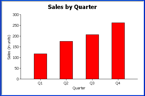
In the preceding graph, there is one set of data points (one series) across four quarters (the category values).
The following is a pie graph, which has exactly the same properties as the preceding column graph except for the type, which is Pie:
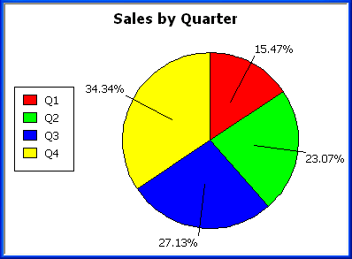
In pie graphs, categories are shown in the legend.
Graphing unit sales of each printer
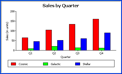
To graph total quarterly sales of each printer, retrieve all the columns into a report and create a graph with the following settings on the Data page in the Properties view:
-
Set Rows to All
-
Set Category to quarter
-
Set Value to sum(units for graph)
-
Select the Series check box
-
Set Series to product
You want a different series for each printer, so the column Product serves as the series. Because the Product column has three values (Cosmic, Galactic, and Stellar), there will be three series in the graph. As in the first example, you want a value for each quarter, so the Quarter column serves as the category, and you want to graph total sales in each quarter, so the Value box is specified as sum(units for graph).
Here is the resulting graph. InfoMaker automatically generates the category and series labels based on the data in the table. The series labels display in the graph's legend:
Graphing unit sales by representative
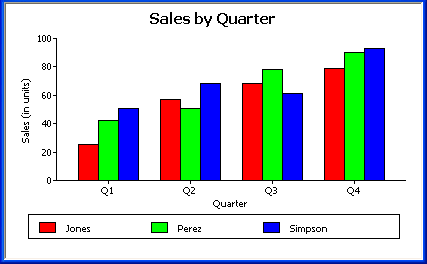
To graph quarterly sales made by each representative, create a graph with the following settings on the Data page in the Properties view:
-
Set Rows to All
-
Set Category to quarter
-
Set Value to sum(units for graph)
-
Select the Series check box
-
Set Series to rep
Here is the resulting graph:
Graphing unit sales by representative and total sales
To graph quarterly sales made by each representative, plus total sales for each printer, create a graph with the following settings on the Data page in the Properties view:
-
Set Rows to All
-
Set Category to quarter, "Total"
-
Set Value to sum(units for graph), sum(units for graph)
-
Select the Series check box
-
Set Series to rep, rep
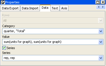
Here you have two types of categories: the first is Quarter, which shows quarterly sales, as in the previous graph. You also want a category for total sales. There is no corresponding column in the report, so you can simply type the literal "Total" to identify the category. You separate multiple entries with a comma.
For each of these category types, you want to graph the sum of units sold for each representative, so the Value and Series values are repeated.
Here is the resulting graph:
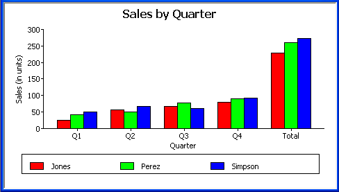
Notice that InfoMaker uses the literal "Total" supplied in the Category box in the Graph Data window as a value in the Category axis.
Graphing actual and projected sales
To graph total quarterly sales of all printers and projected sales for next year, create a graph with the following settings on the Data page in the Properties view (you assume that sales will increase by 10% next year):
-
Set Rows to All
-
Set Category to quarter
-
Set Value to sum(units for graph), sum(units*1.1 for graph)
-
Select the Series check box
-
Set Series to 'Actual','Projected'
You are using labels to identify two series, Actual and Projected. Note the single quotation marks around the literals. For Values, you enter the expressions that correspond to Actual and Projected sales. For Actual, you use the same expression as in the examples above, sum(units for graph). For Projected sales, you multiply each unit sale by 1.1 to get the 10 percent increase. Therefore, the second expression is sum(units*1.1 for graph).
Here is the resulting graph. InfoMaker uses the literals you typed for the series as the series labels in the legend:
