About this chapter
This chapter describes how to build and use graphs in PowerBuilder.
Often the best way to display information is graphically. Instead of showing users a series of rows and columns of data, you can present information as a graph in a DataWindow object or window. For example, in a sales application, you might want to present summary information in a column graph.
PowerBuilder provides many types of graphs and allows you to customize your graphs in many ways. Probably most of your use of graphs will be in a DataWindow object. The source of the data for your graphs will be the database.
You can also use graphs as standalone controls in windows (and user objects) and populate the graphs with data through scripts.
The way you define graphs is the same whether you are using them in a DataWindow object or directly in a window. However, the way you manipulate graphs in a DataWindow object is different from the way you manipulate them in a window.
Before using graphs in an application, you need to understand the parts of a graph and the kinds of graphs that PowerBuilder provides.
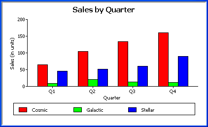
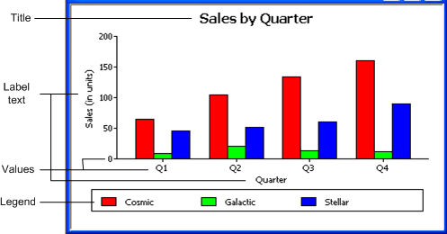
Here is a column graph created in PowerBuilder that contains most major parts of a graph. It shows quarterly sales of three products: Stellar, Cosmic, and Galactic printers:

Graphs display data points. To define graphs, you need to know how the data is represented. PowerBuilder organizes data into three components.
|
Component |
Meaning |
|---|---|
|
Series |
A set of data points Each set of related data points makes up one series. In the preceding graph, there is a series for Stellar sales, another series for Cosmic sales, and another series for Galactic sales. Each series in a graph is distinguished by color, pattern, or symbol. |
|
Categories |
The major divisions of the data Series data are divided into categories, which are often non-numeric. In the preceding graph, the series are divided into four categories: Q1, Q2, Q3, and Q4. Categories represent values of the independent variable(s). |
|
Values |
The values for the data points (dependent variables). |
The following table lists the parts of a typical graph.
|
Part of graph |
What it is |
|---|---|
|
Title |
An optional title for the graph. The title appears at the top of the graph. |
|
Value axis |
The axis of the graph along which the values of the dependent variable(s) are plotted. In a column graph, as shown in the preceding graph, the Value axis corresponds to the y axis in an XY presentation. In other types of graphs, such as a bar graph, the Value axis can be along the x dimension. |
|
Category axis |
The axis along which are plotted the major divisions of the data, representing the independent variable(s). In the preceding graph, the Category axis corresponds to the x axis. It plots four categories: Q1, Q2, Q3, and Q4. These form the major divisions of data in the graph. |
|
Series |
A set of data points. There are three series in the preceding graph: Stellar, Cosmic, and Galactic. In bar and column charts, each series is represented by bars or columns of one color or pattern. |
|
Series axis |
The axis along which the series are plotted in three-dimensional (3D) graphs. |
|
Legend |
An optional listing of the series. The preceding graph contains a legend that shows how each series is represented in the graph. |
PowerBuilder provides many types of graphs for you to choose from. You choose the type on the Define Graph Style page in the DataWindow wizard or in the General page in the Properties view for the graph.
Area, bar, column, and line graphs are conceptually very similar. They differ only in how they physically represent the data values—whether they use areas, bars, columns, or lines to represent the values. All other properties are the same. Typically you use area and line graphs to display continuous data and use bar and column graphs to display noncontinuous data.
The only difference between a bar graph and a column graph is the orientation: in column graphs, values are plotted along the y axis and categories are plotted along the x axis. In bar graphs, values are plotted along the x axis and categories are plotted along the y axis.
Pie graphs typically show one series of data points with each data point shown as a percentage of a whole. The following pie graph shows the sales for Stellar printers for each quarter. You can easily see the relative values in each quarter. (PowerBuilder automatically calculates the percentages of each slice of the pie.)
You can have pie graphs with more than one series if you want; the series are shown in concentric circles. Multiseries pie graphs can be useful in comparing series of data.
Scatter graphs show xy data points. Typically you use scatter graphs to show the relationship between two sets of numeric values.Non-numeric values, such as string and DateTime datatypes, do not display correctly.
Scatter graphs do not use categories. Instead, numeric values are plotted along both axes—as opposed to other graphs, which have values along one axis and categories along the other axis.
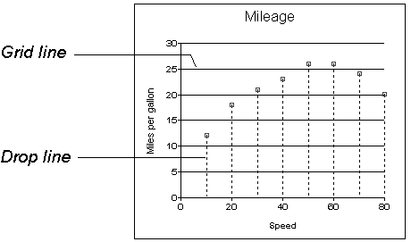
For example, the following data shows the effect of speed on the mileage of a sedan:
Here is the data in a scatter graph:

You can have multiple series of data in a scatter graph. You might want to plot mileage versus speed for several makes of cars in the same graph.
Traditional 3D graphs
You can also create 3-dimensional (3D) graphs of area, bar, column, line, and pie graphs. In 3D graphs (except for 3D pie graphs), series are plotted along a third axis (the Series axis) instead of along the Category axis. You can specify the perspective to use to show the third dimension:
DirectX 3D graphs
DirectX 3D rendering allows you to display the 3D graphs (Pie3D, Bar3D, Column3D, Line3D, and Area3D) with a more sophisticated look. You can use data item or series transparency with the DirectX graph styles to improve the presentation of data.
The DirectX graph rendering style is supported for standalone graph controls and for graph controls in a DataWindow object. PowerBuilder uses the following functions to support the DirectX graph styles:
|
GetDataLabelling |
SetDataLabelling |
|---|---|
|
GetDataTransparency |
SetDataTransparency |
|
GetSeriesLabelling |
SetSeriesLabelling |
|
GetSeriesTransparency |
SetSeriesTransparency |
DirectX runtime. The DirectX 3D rendering depends on the DirectX runtime. The first time you select the Render3D check box on the General tab of the Properties view for a 3D graph, PowerBuilder launches the DirectX installer. If you opt out of the installation, the Render3D property is ignored. End users of PowerBuilder applications must also have the DirectX runtime installed on their computers.
If you install DirectX on the runtime computer, but selecting the Render3D check box does not change the appearance of the graph, it is possible that the graphics card does not support DirectX.
You can check whether DirectX is supported by running dxdiag.exe. This file is typically installed in the Windows\System32 directory. The Display tab of the DirectX Diagnostic Tool that opens when you run dxdiag.exe indicates whether Direct3D is enabled.
You can use graphs in DataWindow objects and in windows. You specify the properties of a graph, such as its type and title, the same way in a DataWindow object as in a window.
Using graphs in user objects
You can also use graphs in user objects. Everything in this chapter about using graphs in windows also applies to using graphs in user objects.
The major differences between using a graph in a DataWindow object and using a graph in a window (or user object) are:
-
Specifying the data for the graph
In DataWindow objects, you associate columns in the database with the axes of a graph. In windows, you write scripts containing PowerScript functions to populate a graph.
-
Specifying the location of the graph
In DataWindow objects, you can place a graph in the foreground and allow users to move and resize the graph at runtime, or you can place a graph in a band and prevent movement. In windows, graphs are placed like all other window controls.
Graphs are used most often in DataWindow objects—the data for the graph comes from tables in the database.
Graphs in DataWindow objects are dynamic
Graphs in DataWindow objects are tied directly to the data that is in the DataWindow object. As the data changes, the graph is automatically updated to reflect the new values.
Two techniques
You can use graphs in DataWindow objects in two ways:
-
By including a graph as a control in a DataWindow object
The graph enhances the display of information in a DataWindow object, such as a tabular or freeform DataWindow object. This technique is described in Placing a graph in a DataWindow object.
-
By using the Graph presentation style
The entire DataWindow object is a graph. The underlying data is not visible. This technique is described in Using the Graph presentation style.
To place a graph in a DataWindow object
-
Open or create the DataWindow object that will contain the graph.
-
Select Insert>Control>Graph from the menu bar.
-
Click where you want the graph.
PowerBuilder displays the Graph Data dialog box:
-
Specify which columns contain the data and the type of graph you want, and click OK.
For more information, see Associating data with a graph.
The Design view now contains a representation of the graph:
-
Specify the graph's properties in the Properties view.


A graph has a Properties view in which you can specify the data as well as the other properties of the graph.
To display the graph's Properties view
-
Select Properties from the graph's pop-up menu.
The Properties view for a graph has several property pages in which you specify information about the graph. The following table lists the property pages that contain properties that are specific to graphs, and describes what each property page specifies.
Property page
What it specifies
Axis
Labels, scale, information about major and minor divisions for the category axes.
Data
Where to get the graph's data.
General
Various general graph properties, including border, graph colors, whether to size the graph to the full screen display, suppression in newspaper columns.
Graph type, title, legend location.
For 3D graphs, perspective, rotation, elevation, and render3D.
For bar graphs, overlap, spacing and depth of bars.
Pointer
The pointer to use when the mouse is positioned over the graph.
Position
The x,y location of the upper left corner of the graph, its width and height, sliding options, the layer in which the graph is to be positioned.
Whether the graph can be resized and moved at runtime.
Text
Text properties for text controls that display on the graph, including title, axis text, axis label, and legend.
Text properties include font, font style, font size, alignment, rotation, color, display expression, display format.
Other
Descriptions and label for use by assistive technology tools.
When you first place a graph in a DataWindow object, it is in the foreground—it sits above the bands in the DataWindow object. Unless you change this setting, the graph displays in front of any retrieved data.
The initial graph is also moveable and resizable, so users have complete flexibility as to the size and location of a graph at runtime. You can change these properties.
To specify a graph's position and size
-
Select Properties from the graph's pop-up menu and then select the Position page or the General page in the Properties view.
-
Select the settings for the following options on the Position property page:
Setting
Meaning
Layer
Background — The graph displays behind other elements in the DataWindow object.
Band — The graph displays in one particular band. If you choose this setting, you should resize the band to fit the graph. Often you will want to place a graph in the Footer band. As users scroll through rows in the DataWindow object, the graph remains at the bottom of the screen as part of the footer.
Foreground — (Default) The graph displays above all other elements in the DataWindow object. Typically, if you choose this setting, you also make the graph movable so it will not obscure data while users display the DataWindow object.
Moveable
The graph can be moved in the Preview view and at runtime.
Resizable
The graph can be resized in the Preview view and at runtime.
Slide Left, Slide Up
The graph slides to the left or up to remove extra white space. For more information, see Sliding controls to remove blank space in a DataWindow object.
X, Y
The location of the upper-left corner of the graph.
Width, Height
The width and height of the graph.
-
Select the settings for the following options on the General property page:
Setting
Meaning
Size To Display
The graph fills the DataWindow object and resizes when users resize the DataWindow object. This setting is used with the Graph presentation style.
HideSnaked
Do not repeat graph after the first column in a DataWindow object using newspaper-style columns.
When using a graph in a DataWindow object, you associate axes of the graph with columns in the DataWindow object.
The only way to get data into a graph in a DataWindow object is through columns in the DataWindow object. You cannot add, modify, or delete data in the graph except by adding, modifying, or deleting data in the DataWindow object.
You can graph data from any columns retrieved into the DataWindow object. The columns do not have to be displayed.
About the examples
The process of specifying data for a graph is illustrated below using the Printer table in the PB Demo DB.
To specify data for a graph
-
If you are creating a new graph, the Graph Data dialog box displays. Otherwise, select Properties from the graph's pop-up menu and select the Data page in the Properties view.
-
Fill in the boxes as described in the sections that follow, and click OK.
The Rows drop-down list allows you to specify which rows of data are graphed at any one time:
|
Setting |
Meaning |
|---|---|
|
All |
Graphs the data from all the rows that have been retrieved but not filtered or deleted (that is, the rows in the primary buffer of the DataWindow object) |
|
Page |
Graphs only the data from the rows that are currently displayed on the page |
|
Group n |
Graphs only the data in the specified group (in a grouped DataWindow object) |
If you select Group
If you are graphing data in the current group in a grouped DataWindow object and have several groups displayed at the same time, you should localize the graph in a group-related band in the Design view. This makes clear which group the graph represents. Usually, the group header band is the most appropriate band.
Specify the column or expression whose values determine the categories. In the Graph Data page in the Graph dialog box and on the Data page in the Properties view, you can select a column name from a drop-down list.

There is an entry along the Category axis for each different value of the column or expression you specify.
Using display values of data
If you are graphing columns that use code tables, when data is stored with a data value but displayed to users with more meaningful display values, by default the graph uses the column's data values. To have the graph use a column's display values, use the LookupDisplay DataWindow expression function when specifying Category or Series. LookupDisplay returns a string that matches the display value for a column:
LookupDisplay ( column )
For more about code tables, see Defining a code table. For more about LookupDisplay, see the section called “LookUpDisplay” in DataWindow Reference.
PowerBuilder populates the Value drop-down list. The list includes the names of all the retrieved columns as well as the following aggregate functions:
-
Count for all non-numeric columns
-
Sum for all numeric columns
Select an item from the drop-down list or type an expression (in the Properties view). For example, if you want to graph the sum of units sold, you can specify:
sum(units for graph)
To graph 110 percent of the sum of units sold, you can specify:
sum(units*1.1 for graph)
Graphs can have one or more series.
Single-series graphs
If you want only one series (that is, if you want to graph all retrieved rows as one series of values), leave the Series box empty.
Multiple-series graphs
If you want to graph more than one series, select the Series check box and specify the column that will provide the series values.You can select column names from the drop-down list.

There is a set of data points for each different value of the column you specify here. For example, if you specify a column that has 10 values, then your graph will have 10 series: one set of data points for each different value of the column.
Using expressions
You can also specify expressions for Series (on the Data page of the Properties view). For example, you could specify the following for Series:
Units / 1000
In this case, if a table had unit values of 10,000, 20,000, and 30,000, the graph would show series values of 10, 20, and 30.
Specifying multiple entries
You can specify more than one of the retrieved columns to serve as series. Separate multiple entries by commas.
You must specify the same number of entries in the Value box as you do in the Series box. The first value in the Value box corresponds to the first series identified in the Series box, the second value corresponds to the second series, and so on. The example about graphing actual and projected sales in Examples illustrates this technique.
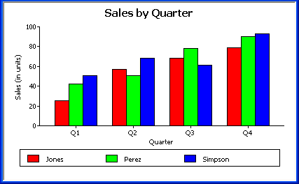
This section shows how to specify the data for several different graphs of the data in the Printer table in the PB Demo DB. The table records quarterly unit sales of three printers by three sales representatives.
|
Rep |
Quarter |
Product |
Units |
|---|---|---|---|
|
Simpson |
Q1 |
Stellar |
12 |
|
Jones |
Q1 |
Stellar |
18 |
|
Perez |
Q1 |
Stellar |
15 |
|
Simpson |
Q1 |
Cosmic |
33 |
|
Jones |
Q1 |
Cosmic |
5 |
|
Perez |
Q1 |
Cosmic |
26 |
|
Simpson |
Q1 |
Galactic |
6 |
|
Jones |
Q1 |
Galactic |
2 |
|
Perez |
Q1 |
Galactic |
1 |
|
… |
… |
… |
… |
|
Simpson |
Q4 |
Stellar |
30 |
|
Jones |
Q4 |
Stellar |
24 |
|
Perez |
Q4 |
Stellar |
36 |
|
Simpson |
Q4 |
Cosmic |
60 |
|
Jones |
Q4 |
Cosmic |
52 |
|
Perez |
Q4 |
Cosmic |
48 |
|
Simpson |
Q4 |
Galactic |
3 |
|
Jones |
Q4 |
Galactic |
3 |
|
Perez |
Q4 |
Galactic |
6 |
Graphing total sales
To graph total sales of printers in each quarter, retrieve all the columns into a DataWindow object and create a graph with the following settings on the Data page in the Properties view:
-
Set Rows to All
-
Set Category to quarter
-
Set Value to sum(units for graph)
-
Leave the Series check box and text box empty.
The Quarter column serves as the category. Because the Quarter column has four values (Q1, Q2, Q3, and Q4), there will be four categories along the Category axis. You want only one series (total sales in each quarter), so you can leave the Series box empty, or type a string literal to identify the series in a legend. Setting Value to sum(units for graph) graphs total sales in each quarter.
Here is the resulting column graph. PowerBuilder automatically generates the category text based on the data in the table:

In the preceding graph, there is one set of data points (one series) across four quarters (the category values).
The following is a pie graph, which has exactly the same properties as the preceding column graph except for the type, which is Pie:
In pie graphs, categories are shown in the legend.
Graphing unit sales of each printer
To graph total quarterly sales of each printer, retrieve all the columns into a DataWindow object and create a graph with the following settings on the Data page in the Properties view:
-
Set Rows to All
-
Set Category to quarter
-
Set Value to sum(units for graph)
-
Select the Series check box
-
Set Series to product
You want a different series for each printer, so the column Product serves as the series. Because the Product column has three values (Cosmic, Galactic, and Stellar), there will be three series in the graph. As in the first example, you want a value for each quarter, so the Quarter column serves as the category, and you want to graph total sales in each quarter, so the Value box is specified as sum(units for graph).
Here is the resulting graph. PowerBuilder automatically generates the category and series labels based on the data in the table. The series labels display in the graph's legend:
Graphing unit sales by representative
To graph quarterly sales made by each representative, create a graph with the following settings on the Data page in the Properties view:
-
Set Rows to All
-
Set Category to quarter
-
Set Value to sum(units for graph)
-
Select the Series check box
-
Set Series to rep
Here is the resulting graph:
Graphing unit sales by representative and total sales
To graph quarterly sales made by each representative, plus total sales for each printer, create a graph with the following settings on the Data page in the Properties view:
-
Set Rows to All
-
Set Category to quarter, "Total"
-
Set Value to sum(units for graph), sum(units for graph)
-
Select the Series check box
-
Set Series to rep, rep
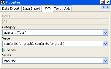
Here you have two types of categories: the first is Quarter, which shows quarterly sales, as in the previous graph. You also want a category for total sales. There is no corresponding column in the DataWindow object, so you can simply type the literal "Total" to identify the category. You separate multiple entries with a comma.
For each of these category types, you want to graph the sum of units sold for each representative, so the Value and Series values are repeated.
Here is the resulting graph:
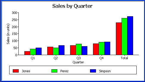
Notice that PowerBuilder uses the literal "Total" supplied in the Category box in the Graph Data window as a value in the Category axis.
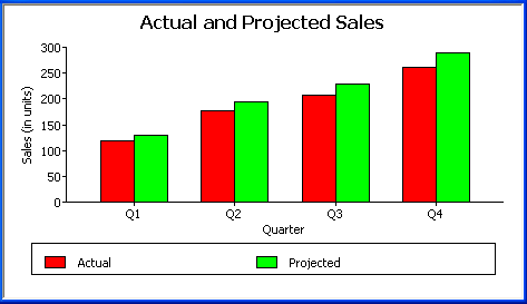
Graphing actual and projected sales
To graph total quarterly sales of all printers and projected sales for next year, create a graph with the following settings on the Data page in the Properties view (you assume that sales will increase by 10% next year):
-
Set Rows to All
-
Set Category to quarter
-
Set Value to sum(units for graph), sum(units*1.1 for graph)
-
Select the Series check box
-
Set Series to 'Actual','Projected'
You are using labels to identify two series, Actual and Projected. Note the single quotation marks around the literals. For Values, you enter the expressions that correspond to Actual and Projected sales. For Actual, you use the same expression as in the examples above, sum(units for graph). For Projected sales, you multiply each unit sale by 1.1 to get the 10 percent increase. Therefore, the second expression is sum(units*1.1 for graph).
Here is the resulting graph. PowerBuilder uses the literals you typed for the series as the series labels in the legend:
Instead of embedding a graph in a DataWindow object, you can use the Graph presentation style to create a DataWindow object that is only a graph—the underlying data is not displayed.
One advantage of the Graph presentation style is that the graph resizes automatically if users resize the DataWindow control associated with the graph DataWindow object at runtime.
To use the Graph presentation style:
-
Select File>New from the menu bar.
The New dialog box displays.
-
Select the DataWindow tab.
-
Select the Graph presentation style, then click OK.
-
On the Choose Data Source for Graph DataWindow page, specify the data you want retrieved into the DataWindow object.
For more information, see Defining DataWindow Objects.
-
On the Define Graph Data page, enter the definitions for the series, categories, and values, as described in Associating data with a graph, and click Next.
Note that when using the Graph presentation style, the graph always graphs all rows; you cannot specify page or group.
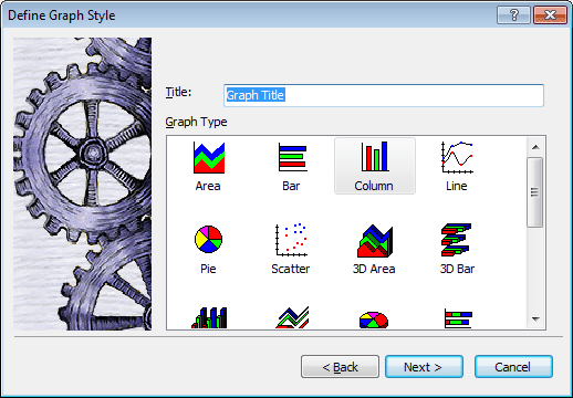
-
On the Define Graph Style page, enter a title for the graph, select a graph type, and click Next.
-
On the Ready to Create Graph DataWindow page, review your specifications and click Finish.
A model of the graph displays in the Design view.
-
Specify the properties of the graph, as described in Defining a graph's properties.
-
Save the DataWindow object in a library.
-
Associate the graph DataWindow object with a DataWindow control on a window or user object.
At runtime, the graph fills the entire control and resizes when the control is resized.
This section describes properties of a graph that are used regardless of whether the graph is in a DataWindow object or in a window.To define the properties of a graph, you use the graph's Properties view. For general information about the property pages, see Using the graph's Properties view.
You name a graph and define its basic properties on the General page in the graph's Properties view.
To specify the basic properties of a graph
-
Select Properties from the graph's pop-up menu and then select the General page in the Properties view.
About the model graph in the Design view
As you modify a graph's properties, PowerBuilder updates the model graph shown in the Design view so that you can get an idea of the graph's basic layout:
-
PowerBuilder uses the graph title and axis labels you specify.
-
PowerBuilder uses sample data (not data from your DataWindow object) to illustrate series, categories, and values.
In Preview view, PowerBuilder displays the graph with data.
Naming a graph
You can modify graphs at runtime. To reference a graph in code, you use its name. By default, the graph is named gr_n.
To name a graph
-
On the General properties page for the graph, assign a meaningful name to the graph in the Name box.
Defining a graph's title
The title displays at the top of the graph.
To specify a graph's title
-
On the General properties page for the graph, enter a title in the Title box.
Multiline titles
You can force a new line in a title by embedding ~n.
For information about specifying properties for the title text, see Specifying text properties for titles, labels, axes, and legends.
Specifying the type of graph
You can change the graph type at any time in the development environment. (To change the type at runtime, modify a graph's GraphType property.)
To specify the graph type
-
On the General properties page for the graph, select a graph type from the Graph Type drop-down list.
Using legends
A legend provides a key to your graph's series.
To include a legend for a series in a graph
-
On the General properties page for the graph, specify where you want the legend to appear by selecting a value in the Legend drop-down list.
For information on specifying text properties for the legend, see Specifying text properties for titles, labels, axes, and legends.
Specifying point of view in 3D graphs
If you are defining a 3D graph, you can specify the point of view that PowerBuilder uses when displaying the graph.
To specify a 3D graph's point of view
-
On the General properties page for the graph, adjust the point of view along the three dimensions of the graph:
-
To change the perspective, move the Perspective slider.
-
To rotate the graph, move the Rotation slider.
-
To change the elevation, move the Elevation slider.
-
-
Define the depth of the graph (the percent the depth is of the width of the graph) by using the Depth slider.
You can specify how to sort the data for series and categories. By default, the data is sorted in ascending order.
To specify how to sort the data for series and categories in a graph
-
Select Properties from the graph's pop-up menu and then select the Axis page in the Properties view.
-
Select the axis for which you want to specify sorting.
-
Scroll to Sort, the last option on the Axis page, and select Ascending, Descending, or Unsorted.
A graph can have four text elements:
-
Title
-
Labels for the axes
-
Text that shows the values along the axes
-
Legend
You can specify properties for each text element.
To specify text properties for the title, labels, axis values, and legend of a graph
-
Select Properties from the graph's pop-up menu and then select the Text page in the Properties view.
-
Select a text element from the list in the Text Object drop-down list.
-
Specify the font and its characteristics.
Using Auto Size
With Auto Size in effect, PowerBuilder resizes the text appropriately whenever the graph is resized. With Auto Size disabled, you specify the font size of a text element explicitly.
To have PowerBuilder automatically size a text element in a graph
-
On the Text properties page for the graph, select a text element from the list in the Text Object drop-down list.
-
Select the Autosize check box (this is the default).
To specify a font size for a text element in a graph
-
On the Text properties page for the graph, select a text element from the list in the Text Object drop-down list.
-
Clear the Autosize check box.
-
Select the Font size in the Size drop-down list.
Rotating text
For all the text elements, you can specify the number of degrees by which you want to rotate the text.
To specify rotation for a text element in a graph
-
On the Text properties page for the graph, select a text element from the list in the Text Object drop-down list.
-
Specify the rotation you want in the Escapement box using tenths of a degree (450 means 45 degrees).
Changes you make here are shown in the model graph in the Design view and in the Preview view.
Using display formats
To use a display format for a text element in a graph
-
On the Text properties page for the graph, select a text element from the list in the Text Object drop-down list.
-
Type a display format in the Format box or choose one from the pop-up menu. To display the pop-up menu, click the button to the right of the Format box.
Modifying display expressions
You can specify an expression for the text that is used for each graph element. The expression is evaluated at execution time.
To specify an expression for a text element in a graph
-
On the Text properties page for the graph, select a text element from the list in the Text Object drop-down list.
-
Click the button next to the Display Expression box.
The Modify Expression dialog box displays.
-
Specify the expression.
You can paste functions, column names, and operators. Included with column names in the Columns box are statistics about the columns, such as counts and sums.
-
Click OK to return to the graph's Properties view.
Example
By default, when you generate a pie graph, PowerBuilder puts the title at the top and labels each slice of the pie with the percentage each slice represents of the whole. Percentages are accurate to two decimal places.
The following graph has been enhanced as follows:
-
The current date displays in the title
-
The percentages are rounded to integers
-
The raw data for each slice is shown in addition to the percentages
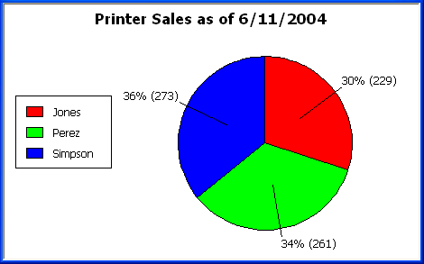
To accomplish this, the display expressions were modified for the title and pie graph labels:
|
Element |
Original expression |
Modified expression |
|---|---|---|
|
Title |
title |
title + " as of " + date(today()) |
|
Pie graph labels |
if(seriescount > 1, series, string(percentofseries, "0.00%")) |
if(seriescount > 1, series, string(percentofseries,"0%") + " (" + value + ")" ) |
With bar and column charts, you can specify the properties in the following table.
|
Property |
Meaning |
|---|---|
|
Overlap |
The percentage by which bars or columns overlap each other. The default is 0 percent, meaning no overlap. |
|
Spacing |
The amount of space to leave between bars or columns. The default is 100 percent, which leaves a space equal to the width of a bar or column. |
Graphs have two or three axes. You specify the axes' properties in the Axis page in the graph's Properties view.
To specify properties for an axis of a graph
-
Select Properties from the graph's pop-up menu and then select the Axis page in the Properties view.
-
Select the Category, the Value, or the Series axis from the Axis drop-down list.
If you are not working with a 3D graph, the Series Axis options are disabled.
-
Specify the properties as described next.
Specifying text properties
You can specify the characteristics of the text that displays for each axis. The following table shows the two kinds of text associated with an axis.
|
Type of text |
Meaning |
|---|---|
|
Text |
Text that identifies the values for an axis. |
|
Label |
Text that describes the axis. You specify the label text in a painter. You can use ~n to embed a new line within a label. |
For information on specifying properties for the text, see Specifying text properties for titles, labels, axes, and legends.
Specifying datatypes
The data graphed along the Value, Category, and Series axes has an assigned datatype. The Series axis always has the datatype String. The Value and Category axes can have the datatypes listed in the following table.
|
Axis |
Possible datatypes |
|---|---|
|
Both axes (for scatter graph) |
Number, Date, Time |
|
Value (other graph types) |
Number, Date, DateTime, Time |
|
Category (other graph types) |
String, Number, Date, DateTime, Time |
For graphs in DataWindow objects, PowerBuilder automatically assigns the datatypes based on the datatype of the corresponding column; you do not specify them.
For graphs in windows, you specify the datatypes yourself. Be sure you specify the appropriate datatypes so that when you populate the graph (using the AddData method), the data matches the datatype.
Scaling axes
You can specify the properties listed in the following table to define the scaling used along numeric axes.
|
Property |
Meaning |
|---|---|
|
Autoscale |
If selected (the default), PowerBuilder automatically assigns a scaling for the numbers along the axis. |
|
RoundTo, RoundToUnit |
Specifies how to round the end points of the axis (note that this just rounds the range displayed along the axis; it does not round the data itself). You can specify a number and a unit. The unit is based on the datatype; you can specify Default as the unit to have PowerBuilder decide for you. For example, if the Value axis is a Date column, you can specify that you want to round the end points of the axis to the nearest five years. In this case, if the largest data value is the year 1993, the axis extends up to 1995, which is 1993 rounded to the next highest five-year interval. |
|
MinimumValue, MaximumValue |
The smallest and largest numbers to appear on the axis (disabled if you have selected Autoscale). |
|
ScaleType |
Specifies linear or logarithmic scaling (common or natural). |
|
ScaleValue |
Specifies whether values are displayed as actual values or as a cumulative value, a percentage, or a cumulative percentage. |
Using major and minor divisions
You can divide axes into divisions. Each division is identified by a tick mark, which is a short line that intersects an axis. In the Sales by Printer graphs shown in Examples, the graph's Value axis is divided into major divisions of 50 units each. PowerBuilder divides the axes automatically into major divisions.
To define divisions for an axis of a graph
-
To divide an axis into a specific number of major divisions, type the number of divisions you want in the MajorDivisions box.
-
Leave the number 0 to have PowerBuilder automatically create divisions. PowerBuilder labels each tick mark in major divisions. If you do not want each tick mark labeled, enter a value in the DisplayEveryNLabels box. For example, if you enter 2, PowerBuilder labels every second tick mark for the major divisions.
-
To use minor divisions, which are divisions within each major division, type the appropriate number in the MinorDivisions box. To use no minor divisions, leave the number 0.
When using logarithmic axes
If you want minor divisions, specify 1; otherwise, specify 0.
Representing divisions with grid and drop lines
You can specify lines to represent the divisions as described in the following table and illustrated in the following figure.
|
Line |
Meaning |
|---|---|
|
Grid line |
A line that extends from a tick mark across the graph. Grid lines make graphs easier to read. |
|
Drop line |
A line that extends vertically from a data point to its axis (not available for all graph types). |
Using line styles
You can define line styles for the components of a graph listed in The following table.
|
Component |
Meaning |
|---|---|
|
PrimaryLine |
The axis itself |
|
SecondaryLine |
The axis parallel to and opposite the primary axis |
|
OriginLine |
A grid line that represents the value zero |
|
Frame |
The frame for the axis in 3D graphs (disabled for 2D graphs) |
You can specify a pointer to use when the mouse is over a graph at runtime.
In addition to using graphs in DataWindow objects, you can also place graphs directly in windows and visual user objects. You define properties for a graph control in the Window painter and use scripts to populate the graph with data and to modify properties for the graph at runtime.
This section describes procedures unique to using graphs in windows and visual user objects. For general graph properties, see Defining a graph's properties.
Placing a graph in a window
This procedure for placing a graph in a window in the Window painter can also be used for placing a graph on a user object in the User Object painter.
To place a graph in a window:
-
Open the Window painter and select the window that will contain the graph.
-
Select Insert>Control>Graph from the menu bar.
-
Click where you want the graph.
PowerBuilder displays a model of the graph in the window.
-
Specify properties for the graph, such as type, title, text properties, and axis properties.
-
Write one or more scripts to populate the graph with data.
See the section called “Manipulating Graphs” in Application Techniques and the section called “Manipulating Graphs” in DataWindow Programmers Guide.
Using the graph's Properties view in the Window painter
A graph's Properties view in the Window and User Object painters is similar to the one in the DataWindow painter except that the Properties view in the Window and User Object painter:
-
Does not have buttons for specifying property conditional expressions next to properties
-
Does not have Data, Position, and Pointer property pages
-
Does have an Other page, which you use to specify drag-and-drop, position, and pointer properties for the graph control
For more information, see Using the graph's Properties view.
