About this chapter
This chapter describes working with application, component, and .NET targets in the development environment.
A target can be used to create:
-
An executable application
A collection of PowerBuilder windows that perform related activities and that you deliver to users.
An executable application can be a traditional client/server application that accesses a database server or an application that acts as a client in a distributed application and requests services from a server application.
-
A .NET assembly or Web service (obsolete)
A custom class user object to be deployed to the .NET Framework.
The first step in creating a new application or component is to use a Target wizard, described in Working with PowerBuilder.
Depending on the type of target you choose to create, the target can include only an Application object or it can include additional objects. If the target requires connection to a server or a SQL database, the Template Application wizard also creates a Connection object.
All application, component, and .NET targets include an Application object. It is a discrete object that is saved in a PowerBuilder library, just like a window, menu, function, or DataWindow object. When a user runs the application, the scripts you write for events are triggered in the Application object.
When you open an Application object in PowerBuilder, you enter the Application painter.
After you create the new target, you can open the Application object and work in the Application painter to define application-level properties (such as which fonts are used by default for text) and application-level behavior (such as what processing should occur when the application begins and ends).
In PowerBuilder, you edit objects such as applications, windows, menus, DataWindow objects, and user objects in painters. In addition to painters that edit objects, other painters such as the Library painter and the Database painter provide you with the ability to work with libraries and databases.
Painters that edit objects
There are several ways to open painters that edit objects:
|
From here |
You can |
|---|---|
|
PowerBar |
Click New or Inherit (to create new objects) or Open (to open existing objects) |
|
Library painter |
Double-click an object or select Edit from the object's pop-up menu |
|
System Tree |
Double-click an object or select Edit from the object's pop-up menu |
|
Browser |
Select edit from an object's pop-up menu |
Other painters
Most other painters are accessible from the New dialog box. Some are also available on the PowerBar and from the Tools menu.
Select Target for Open
You may see the Select Target for Open dialog box if you use the same PBL in more than one target. When you open an object in a PBL that is used in multiple targets, PowerBuilder needs to set global properties for the specific target you are working on. If you open the object from the Workspace page when the root is not set to the current workspace, PowerBuilder asks you which target you want to open it in. A similar dialog box displays if you select Inherit, Run/Preview, Regenerate, Print, or Search.
The PowerBuilder painters are:
|
Painter |
What you do |
|---|---|
|
Application painter |
Specify application-level properties and scripts. |
|
Database painter |
Maintain databases, control user access to databases, manipulate data in databases, and create tables. |
|
DataWindow painter |
Build intelligent objects called DataWindow objects that present information from the database. |
|
Data Pipeline painter |
Transfer data from one data source to another and save a pipeline object for reuse. |
|
Function painter |
Build global functions to perform processing specific to your application. |
|
Library painter |
Manage libraries, create a new library, and build dynamic libraries. |
|
Menu painter |
Build menus to be used in windows. |
|
Project painter |
Create executable files, dynamic libraries, components, and proxies. |
|
Query painter |
Graphically define and save SQL SELECT statements for reuse with DataWindow objects and pipelines. |
|
SQLSelect painter |
Graphically define SQL SELECT statements for DataWindow objects and pipelines. |
|
Structure painter |
Define global structures (groups of variables) for use in your application. |
|
User Object painter (visual) |
Build custom visual objects that you can save and use repeatedly in your application. A visual user object is a reusable control or set of controls that has a certain behavior. |
|
User Object painter (nonvisual) |
Build custom nonvisual objects that you can save and use repeatedly in your application. A nonvisual user object lets you reuse a set of business rules or other processing that acts as a unit but has no visual component. |
|
Window painter |
Build the windows that will be used in the application. |
Painters that edit objects
Most painters that edit PowerBuilder objects have these features:
|
Feature |
Notes |
|---|---|
|
Painter window with views |
|
|
Unlimited undo/redo |
Undo and redo apply to all changes. |
|
Drag-and-drop operations |
Most drag-and-drop operations change context or copy objects. |
|
To-Do List support |
When you are working in a painter, a linked item you add to the To-Do list can take you to the specific location. See Using the To-Do List. |
|
Save needed indicator |
When you make a change, PowerBuilder displays an asterisk after the object's name in the painter's Title bar to remind you that the object needs to be saved. |
Other painters
Most of the painters that do not edit PowerBuilder objects have views and some drag-and-drop operations.
Each painter has a View menu that you use for opening views. The views you can open depend on the painter you are working in. Every painter has a default arrangement of views. You can rearrange these views, choose to show or hide views, and save arrangements that suit your working style. See Using views in painters.
Many views are shared by some painters, but some views are specific to a single painter. For example, the Layout, Properties, and Control List views are shared by the Window, Visual User Object, and Application painters, but the Design, Column Specifications, Data, Preview, Export/Import Template for XML, and Export Template for XHTML views are specific to the DataWindow painter. The WYSIWYG Menu and Tree Menu views are specific to the Menu painter.
The following sections describe the views you see in many painters. Views that are specific to a single object type are described in the chapter for that object.
The Layout view shows a representation of the object and its controls. It is where you place controls on an object and design the layout and appearance of the object.

If the Properties view is displayed and you select a control in the Layout view or the Control List view, the properties for that control display in the Properties view. If you select several controls in the Layout view or the Control List view, the properties common to the selected controls display in the Properties view.
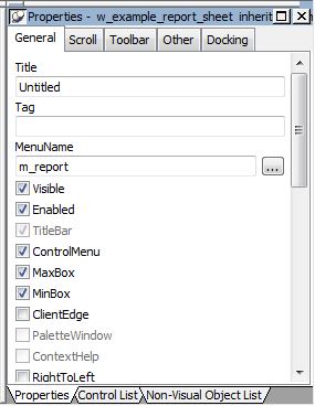
The Properties view displays properties for the object itself or for the currently selected controls or nonvisual objects in the object. You can see and change the values of properties in this view.
The Properties view dynamically changes when you change selected objects or controls in the Layout, Control List, and Non-Visual Object List views.
If you select several controls in the Layout view or the Control List view, the Properties view says group selected in the title bar and displays the properties common to the selected controls.
In the Properties view pop-up menu, you can select Labels On Top or Labels On Left to specify where the labels for the properties display. For help on properties, select Help from the pop-up menu.
If the Properties view is displayed and you select a nonvisual object in the Non-Visual Object List view, the properties for that nonvisual object display in the Properties view. If you select several nonvisual objects in the Non-Visual Object List view, the properties common to the selected nonvisual objects display in the Properties view.
The Script view is where you edit the scripts for events and functions, define and modify user events and functions, declare variables and external functions, and view the scripts for ancestor objects.

You can open the default script for an object or control by double-clicking it in the System Tree or the Layout, Control List, or Non-Visual Object List views, and you can insert the name of an object, control, property, or function in a script by dragging it from the System Tree.
For information about the Script view, see Writing Scripts.
The Control List view lists the visual controls on the object. You can click the Control column to sort the controls by control name or by hierarchy.

If you select one or more controls in the Control List view, the controls are also selected in the Layout view. Selecting a control changes the Properties view and double-clicking a control changes the Script view.
The Event List view displays the full event prototype of both the default and user-defined events mapped to an object. Icons identify whether an event has a script, is a descendant event with a script, or is a descendant event with an ancestor script and a script of its own.

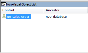
The Non-Visual Object List view is a list of nonvisual objects that have been inserted in an Application object, window, or user object of any type. You can sort controls by control name or ancestor.
The Function List view lists the system-defined functions and the object-level functions you defined for the object. Icons identify whether a function has a script, is a descendant of a function with a script, or is a descendant of a function with an ancestor script and script of its own.
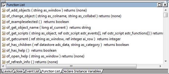
Note that although the half-colored icon identifies the myfunc user-defined function as having both an ancestor script and a script of its own, for a function this means that the function is overridden. This is different from the meaning of a half-colored icon in the Event List view.
The Structure List view lists the object-level structures defined for the object.
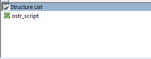
If you double-click a structure in the Structure List view, the structure's definition displays in the Structure view.
The Structure view is where you edit the definition of object-level structures in the Window, Menu, and User Object painters.

Views in the Application painter
The Application painter has several views where you specify properties for your application and how it behaves at start-up. Because the Application painter is an environment for editing a nonvisual object of type application, the Application painter looks like the User Object painter for nonvisual user objects and it has the same views. For details about the views, how you use them, and how they are related, see Views in painters that edit objects.
Application painter layout
Most of your work in the Application painter is done in the Properties view and the Script view to set application-level properties and code application-level scripts. For information about specifying properties, see Specifying application properties. For information about coding in the Script view, see Writing Scripts.
Inserting nonvisual objects
You can automatically create nonvisual objects in an application by inserting a nonvisual object in the Application object. You do this if you want the services of a nonvisual object available to your application. The nonvisual object you insert can be a custom class or standard class user object.
You insert a nonvisual object in an Application object in the same way you insert one in a user object. For more information, see Using class user objects.
You specify application properties in the Application painter's Properties view.
To specify application properties:
-
In the Application painter, if the Properties view is not open, select View>Properties from the menu bar.
With the exception of the AppName property, the properties on the General and Toolbar tab pages can be modified in the Properties view and in scripts.
If you need help specifying properties in the Properties view, right-click on the background of the Properties view and select Help from the pop-up menu.
-
Select the General or Toolbar tab page, or, on the General tab page, click the Additional Properties button to display the Application properties dialog box.
The additional properties on the Application properties dialog box can be modified only in this dialog box. They cannot be modified in scripts.
-
Specify the properties:
To specify this
Use this tab page
Display name
General tab page
Application has toolbar text and toolbar tips
Toolbar tab page
Default font for static text as it appears in windows, user objects, and DataWindow objects
Additional Properties (Text Font)
Default font for data retrieved in a DataWindow object
Additional Properties (Column Font)
Default font for column headers in tabular and grid DataWindow objects
Additional Properties (Header Font)
Default font for column labels in freeform DataWindow objects
Additional Properties (Label Font)
Application icon
Additional Properties (Icon)
Global objects for the application
Additional Properties (Variable Types)
RichTextEdit control for the application
Additional Properties (RichTextEdit)
UI Theme for the application
Additional Properties (Themes)
These sections have information about how you specify the following application properties in the Application painter:
You probably want to establish a standard look for the text in your application. There are four kinds of text whose properties you can specify in the Application painter: text, header, column, and label.
PowerBuilder provides default settings for the font, size, and style for each of these and a default color for text and the background. You can change these settings for an application in the Application painter and override the settings for a window, user object, or DataWindow object.
Properties set in the Database painter override application properties
If extended attributes have been set for a database column in the Database painter or Table painter, those font specifications override the fonts specified in the Application painter.
To change the text defaults for an application:
-
In the Properties view, click Additional Properties and select one of the following:
-
Text Font tab
-
Header Font tab
-
Column Font tab
-
Label Font tab
The tab you choose displays the current settings for the font, size, style, and color. The text in the Sample box illustrates text with the current settings.
-
-
Review the settings and make any necessary changes:
-
To change the font, select a font from the Font list.
-
To change the size, select a size from the Size list or type a valid size in the list.
-
To change the style, select a style (Regular, Italic, Bold, or Bold Italic) from the Font styles list.
-
To change font effects, select one or more from the Effects group box (Strikeout and Underline).
-
To change the text color, select a color from the Text Color list. (You do not specify colors for data, headings, and labels here; instead, you do that in the DataWindow painter.)
-
To change the background color, select a color from the Background list.
Using custom colors
When specifying a text color, you can choose a custom color. You can define custom colors in several painters, including the Window painter or DataWindow painter.
-
-
When you have made all the changes, click OK.
Users can minimize your application at runtime. If you specify an icon in the application painter, the icon will display when the application is minimized.
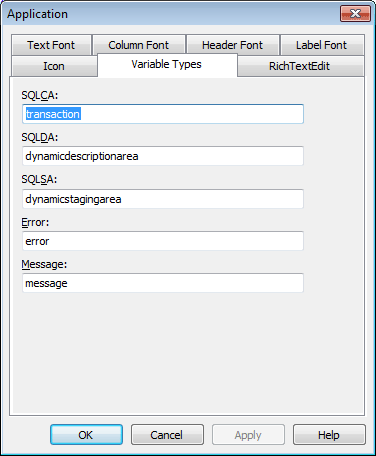
PowerBuilder provides five built-in global objects that are predefined in all applications.
|
Global object |
Description |
|---|---|
|
SQLCA |
Transaction object, used to communicate with your database |
|
SQLDA |
DynamicDescriptionArea, used in dynamic SQL |
|
SQLSA |
DynamicStagingArea, used in dynamic SQL |
|
Error |
Used to report errors during execution |
|
Message |
Used to process messages that are not PowerBuilder-defined events and to pass parameters between windows |
You can create your own versions of these objects by creating a standard class user object inherited from one of the built-in global objects. You can add instance variables and functions to enhance the behavior of the global objects.
For more information, see Working with User Objects.
After you do this, you can specify that you want to use your version of the object in your application as the default, instead of the built-in version.
To specify the default global objects
-
In the Properties view, click Additional Properties and select the Variable Types tab.
The Variable Types property page displays.
-
Specify the standard class user object you defined in the corresponding field.
For example, if you defined a user object named mytrans that is inherited from the built-in Transaction object, type mytrans in the box corresponding to SQLCA.
-
Click OK.
When you run your application, it will use the specified standard class user objects as the default objects instead of the built-in global objects.
You can select from the three rich text editors supported by Appeon PowerBuilder. The selected rich text editor will be applicable to the RichTextEdit control, the RichText DataWindow object, and the RichText edit style.
To select a rich text editor:
-
In the Application painter, select the General tab page.
-
On the General tab page, click the Additional Properties button to display the Application properties dialog box.
-
In the Application properties dialog box, select the RichTextEdit Control tab, and then select a rich text editor.
You can select different rich text editors for 32-bit and 64-bit applications.
For 32-bit applications, you can choose from four editors: Built-in TX Text Control ActiveX 15.0, Built-in TX Text Control ActiveX 28.0, Built-in Rich Edit Control (Obsolete), and TX Text Control ActiveX 24.0 Professional/Enterprise.
For 64-bit applications, you can choose from two editors: Built-in TX Text Control ActiveX 28.0, and Microsoft RichEdit Control.
For more information about the rich text editors, see the section called “Rich text editors” in Application Techniques; and for feature difference of the rich text editor, see the section called “Feature difference between TE Edit Control and TX Text Control” in Application Techniques and the section called “Feature difference between TX Text Control 28.0 (64-bit) and Microsoft RichEdit Control (64-bit)” in Application Techniques.
-
Input a valid serial number if you selected to use the TX Text Control ActiveX 24.0 Professional/Enterprise editor.
-
Click OK.
You can apply the following system themes to the window, DataWindow, and all visual controls (except Line, Oval, Rectangle, RoundRectangle, Picture, PictureHyperLink, and Animation) in your application.
-
Flat Design Blue -- this theme is evolved from the Windows 10 style, featuring a flat design style in contrasting to a prominent UI content. The window style is similar to that of Windows 10. The controls are flattened, and the color is gray in the normal state, and blue in the default state, making a more visually appealing and recognizable UI.
-
Flat Design Dark -- this theme displays light white text on dark backgrounds, making the information on the page more prominent and easy to read; and displays a blue auxiliary color, making the page looks technical. The dark theme can lessen eye strain during the night.
-
Flat Design Grey -- this theme is based on the original PowerBuilder style. It retains most of the color matching of the controls, and removes their 3D effect so they are flattened; the window is displayed in a gray background, making the UI convenient for users to read and improves user experience.
-
Flat Design Silver -- this theme is a combination of the modern designs. The theme removes the control border, and divides controls by shallow color blocks, making the UI more concise and focused.
If no theme is applied or if the theme is unsupported for a control, the style of windows, DataWindows, and controls will be determined by the settings in the PowerBuilder IDE or script.
| Do not use theme | Flat Design Blue | Flat Design Dark | Flat Design Grey | Flat Design Silver | |
|---|---|---|---|---|---|
| Window background color | By IDE or script | White | Dark | Grey | White |
| Font color * | By IDE or script | Black | White | Black | Silver Black |
| Control background color | By IDE or script | White | Black | White | White or Shallow Color Block |
| Button | By IDE or script | 2D | 2D | 2D | 2D |
| Border | By IDE or script | 2D | 2D | 2D | No Border |
| Border thickness | 1 pixel | 1 pixel | 1 pixel | 1 pixel | No Border |
* The font related properties (except font color) are unsupported to be set by the theme.
The system themes are installed to %AppeonInstallPath%\PowerBuilder [version]\IDE\theme. There are four subfolders in the "theme" folder by default; each represents a system theme: Flat Design Blue, Flat Design Dark, Flat Design Grey, and Flat Design Silver. Each subfolder contains the theme definition files of the corresponding theme, which are mainly the following two types of files:
-
theme.json file -- this is the master theme definition file which sets the visual appearance (such as color, state, border, text etc.) of all supported elements of the window, DataWindow and control. For more about the theme.json file, refer to Understanding the theme.json file.
-
numerous image files -- they are referenced in the theme.json file and used to make up the visual elements (such as checked/unchecked/indeterminate/enabled/disabled/hover/pressed state of the control etc.) in the theme.
You can add a new folder in the theme path to hold your custom themes. It is recommended that you directly make a copy of an existing system theme folder and then make changes to the copy. Make sure the copied folder contains the theme.json file, so the folder name will be automatically recognized as the theme name and listed for selection in the Themes tab.
Note
If you directly make changes to the system theme, the changes may lose after you re-install or upgrade PowerBuilder IDE.
Each individual control or object can have its own theme settings, for example, one button can have theme settings different from the other buttons. And controls of the same type in the same window/user object can have their own theme settings, for example, all group boxes in one window can have theme settings different from the group boxes in the other window.
Therefore you can create custom themes to configure theme settings for a specific control or object, or controls or objects of a specific type.
Unsupported
The dynamically created DataWindow is unsupported to have custom theme settings.
The dynamically created user object is unsupported to have custom theme settings.
To create custom themes and configure for a control or object:
-
Open the "%AppeonInstallPath%\PowerBuilder [version]\IDE\theme" directory, copy a system theme folder, and rename it.
-
In your theme folder where the theme.json file exists, add one or more custom theme definition files.
-
The custom theme file must be named in this format: theme-[xxxx].json.
The file prefix must be "theme-", [xxxx] can be any text, and the extension must be .json, for example, theme-control.json, theme-dw.json, etc.
-
The settings in the file can be a subset or all of the theme.json file (see Understanding the theme.json file for more about the theme.json file).
The nodes that host theme settings are the system object or control name (such as "checkbox", "commandbutton" etc.) in theme.json; but the nodes that host theme settings in the custom theme file must be the name that points to the specific object or control (such as "w_main.uo_1.cb_1", "w_main$commandbutton" etc.) that will apply the settings. For example,
{
 "meta-info":
 {
  "version":"190"
 },
  "w_main.uo_1.cb_1":
 {
   ...
   //Copy the settings from the "commandbutton" node
   //of the "theme.json" file and then modify.
 }
  "w_main$commandbutton":
 {
   ...
   //Copy the settings from the "commandbutton" node
   //of the "theme.json" file and then modify.
 }
  "w_main":
 {
   ...
   //Copy the settings from the "window" node
   //of the "theme.json" file and then modify.
 }
}
-
-
In the custom theme file, configure the theme settings for a specific control/object, controls of the same type in the same window, a window, or a custom visual user object.
-
A specific control or user object in the window must be referenced in this format: [windowname].[...].[control-or-object-name], for example,
-
A control in a window: w_main.cb_1
-
A userobject in a window: w_main.uo_1
-
An embedded userobject in a window: w_main.uo_1.uo_custom
-
A control in a userobject: w_main.uo_1.cb_1
-
A control in an embedded userobject: w_main.uo_1.uo_custom.cb_1
-
A tab in a window: w_main.tab_1
-
A tab in a userobject: w_main.uo_1.tab_1
-
A tab in an embedded userobject: w_main.uo_1.uo_custom.tab_1
-
A control in a tabpage: w_main.tab_1.tabpage_1.cb_1
-
A control in a tabpage in a userobject: w_main.uo_1.tab_1.tabpage_1.cb_1
-
A control in a tabpage in an embedded userobject: w_main.uo_1.uo_custom.tab_1.tabpage_1.cb_1
-
A control in a userobject in a tabpage: w_main.tab_1.tabpage_1.uo_1.cb_1
-
A control in an embedded userobject in a tabpage: w_main.tab_1.tabpage_1.uo_1.uo_custom.cb_1
-
A userobject in a tabpage: w_main.tab_1.tabpage_1.uo_1
-
An embedded userobject in a tabpage: w_main.tab_1.tabpage_1.uo_1.uo_custom
-
-
A specific control or user object in the user object must be referenced in this format: [userobjectname].[...].[control-or-object-name], for example,
-
A control in a userobject: uo_base1.cb_1
-
An embedded userobject in a userobject: uo_base1.uo_1 or uo_base2. See example 4 below.
-
A control in an embedded userobject: uo_base2.cb_1 (the parent userobject must be ignored). See example 5 below.
-
A tab in a userobject: uo_base1.tab_1
-
A tab in an embedded userobject: uo_base2.tab_1 (the parent userobject must be ignored)
-
A control in a tabpage: uo_base1.tab_1.tabpage_1.cb_1
-
A control in a tabpage in an embedded userobject: uo_base2.tab_1.tabpage_1.cb_1 (the parent userobject must be ignored)
-
-
Controls of the same type in the same window must be referenced in this format: [windowname]$[controltype], for example, for all command buttons in w_main window: w_main$commandbutton.
[controltype] must be the same values as those in theme.json, for example, checkbox, commandbutton, datawindow, groupbox, ribbonbar, tab, userobject etc.
[userobject]$[controltype] is unsupported currently.
-
A window must be referenced in this format: [windowname], for example, w_main.
-
A user object must be referenced in this format: [userobjectname], for example, uo_base1.
The user object indicates the custom visual user object only (not the external or standard visual user objects).
However, the user object which is dynamically created via OpenTab or OpenUserObject method is unsupported to have their own theme settings.
Example 1: to configure the theme settings for a specific button in a window: w_main.uo_1.cb_1, add the following scripts in theme-[xxxx].json:
"w_main.uo_1.cb_1":
{
  ... //You should copy syntax in "commandbutton" node from "theme.json" file.
}
Example 2: to configure the theme settings for all group boxes in a window: w_main$groupbox, add the following scripts in theme-[xxxx].json:
"w_main$groupbox":
{
  ... //You should copy syntax in "groupbox" node from "theme.json" file.
}
Example 3: to configure the theme settings for a window: w_main, add the following scripts in theme-[xxxx].json:
"w_main":
{
  ... //You should copy syntax in "window" node from "theme.json" file.
}
Example 4: suppose uo_base2 is embedded (as name uo_1) in uo_base1, to configure the theme settings for uo_1, add the following scripts in theme-[xxxx].json:
"uo_base1.uo_1":
{
  ...//You should copy syntax in "userobject" node from "theme.json" file.
}
Or
"uo_base2":
{
  ...//You should copy syntax in "userobject" node from "theme.json" file.
}
Example 5: suppose uo_base2 is embedded in uo_base1, to configure the theme settings for a button contained in uo_base2, add the following scripts in theme-[xxxx].json (the parent object uo_base1 must be omitted):
"uo_base2.cb_1": { ...//You should copy syntax in "commandbutton" node from "theme.json" file. } -
Setting precedence
If there are multiple theme-[xxxx].json files, the settings in the last file in alphabetical order will be searched and applied first.
If there are multiple settings defined for the same object/control, the settings will be searched and applied in this order: setting configured for a specific control (in theme-[xxxx].json) > setting for controls of the same type (in theme-[xxxx].json) > generic setting for controls of the same type (in theme.json).
You can apply a theme in the Application painter or by calling the ApplyTheme function.
To select a theme in the painter:
-
In the Application painter, select the General tab page.
-
On the General tab page, click the Additional Properties button to display the Application properties dialog box.
-
In the Application properties dialog box, select the Themes tab, and then specify the path for the theme files and select a theme from the list.
-
Theme Path -- The default value for Theme Path is %AppeonInstallPath%\PowerBuilder [version]\IDE\theme and this is where the system themes are stored.
Theme Path can be either set to an absolute path or a relative path. For example, it can be an absolute path: D:\App1SourceCode\Themes, or a relative path that starts with ".\", ".\..\", or a folder name: ".\Themes", ".\..\Themes" or "themes". The relative path is relative to the location of the PBT file.
Note
In Windows system, the maximum length for a path is defined as 260 characters. Therefore, it is recommended the theme path (including theme name) should be less than 260 characters and the path alone (excluding theme name) should be less than 200 characters.
When the application is run from the IDE, it reads the theme files from the path specified by Theme Path in the painter; but when the application's executable file is run, the Theme Path setting in the painter will be ignored; instead it reads the theme files from the "theme" folder under the root of the application installation directory (for example, if the application is installed to C:\App1Executable\, then the theme path is C:\App1Executable\theme). To summarize:
-
At the development environment (when the app is run from the IDE): use the path set in the Theme Path field.
-
At the production environment (when the app's executable file is run): use the "theme" folder under the same location of the application's executable file.
However, this will be a different case if the ApplyTheme function is used, as the theme path and name set by the ApplyTheme function takes precedence over those selected in the painter.
-
-
Theme -- Four system themes are provided under the default path; each one is stored in a sub-folder named after the theme: Flat Design Blue, Flat Design Dark, Flat Design Grey, and Flat Design Silver. These four sub-folders will be overwritten when you re-install or upgrade PowerBuilder IDE. Therefore, if you want to customize the system theme, make sure to make a copy of the theme and then make changes there, the custom theme will not be overwritten when PowerBuilder is re-installed or upgraded.
-
Restore button -- The Restore button is effective only when Theme Path is the default path and the theme name is the system theme.
If restoring theme failed, make sure to close any theme files that are currently opened and then click the Restore button to try again.
-
-
In the Preview section, take a quick look at how UI will look like after a theme is applied.
-
Click OK.
To select a theme in the script:
Instead of specifying the theme to use in the Additional Properties of the application object, you can set a theme dynamically in the script using the ApplyTheme method. The theme path and name set by the ApplyTheme function takes precedence over those selected in the painter.
-
Call the ApplyTheme function in the application script to select a theme.
Best practice: 1) It is recommended to call the ApplyTheme function in the Application Open event and before any child window is opened. 2) You can add an dialog box to the application, where you provide end users the theme options to select by themselves.
You can specify no path, a relative path, or an absolute path (not recommended) in the function.
When specifying no path:
ApplyTheme ("Flat Design Blue")This script applies the "Flat Design Blue" theme (the theme name selected in the painter will be ignored) and reads the theme files from the following path:
-
At the development environment: the script reads the theme files from the Theme Path set in the painter.
-
At the production environment: the script reads the theme files from the "theme" folder under the same location of the application's executable file.
When specifying a relative path:
ApplyTheme (".\themes\Flat Design Blue")This script applies the "Flat Design Blue" theme (both the theme path and the theme name selected in the painter will be ignored) and reads the theme files from the path relative to the location of the PBT file (or the application's executable file).
When specifying an absolute path (not recommended):
ApplyTheme ("D:\App1SourceCode\themes\Flat Design Blue")This script applies the "Flat Design Blue" theme (both the theme path and the theme name selected in the painter will be ignored) and reads the theme files from "D:\App1SourceCode\themes\" at both the development environment and the production environment.
Note: absolute path is not recommended, because when it goes to the production environment, it would be difficult to ensure the absolute path exists at every client machine.
You can get the theme that is currently applied to the application using the GetTheme function. For more, see the section called “GetTheme” in PowerScript Reference and the section called “ApplyTheme” in PowerScript Reference.
-
The UI Theme takes effect only when the application is run, not at the painter or under preview.
To make the theme effective:
-
Click the Run or Select and Run button on the PowerBar to run the application and review the UI effect of the selected theme.
-
Or, run the compiled executable file of the application.
Disable the following options in PowerBuilder IDE or the Windows operating system as they may prevent the selected theme working correctly:
-
Disable the "Enable Windows Classic Style in the IDE" option in System Options and the "Windows classic style" option in the project painter
When you run the application from the IDE or build the application in the project painter, you should not select the Windows classic style option, otherwise, the application UI will be rendered in the Windows classic style instead of the selected theme.
-
Avoid using the "Windows Classic" theme in the Windows operating system
When the application is run in the Windows system and if the Windows system theme is set to "Windows Classic", then the application UI will be rendered in the Windows Classic theme instead of the selected theme.
-
Disable the "Use Windows XP style DPI scaling" option in Windows 7 and Windows Server 2012
If the scaling percentage is set to 125% or lower, the "Use Windows XP style DPI scaling" option will be automatically selected, which will prevent the selected theme working correctly. In such case (125% or lower), you should manually uncheck the "Use Windows XP style DPI scaling" option.
-
When the PowerBuilder application is deployed, the system DLLs such as pbtheme.dll and pbjson.dll for supporting the UI Theme will be deployed automatically. However, you will also need to manually copy the "theme" folder when creating the application installation package, so that the theme definition files will be installed along with the application and will be accessible to the application.
To package the theme folder:
-
Manually copy the theme definition folder (just like copy the other resource files) to the path according to how you apply the theme:
-
If you have not specified the path in the ApplyTheme function (and no matter if you have specified the theme path in the Application painter), copy the "theme" folder to the same location of the application's executable file and place the theme definition folder into the "theme" folder.
-
If you have specified the relative path in the ApplyTheme function, then copy the theme definition folder to the path relative to the location of the application's executable file;
-
If you have specified the absolute path in the ApplyTheme function, make sure the theme definition folder exists in the specified path or change to use no path or the relative path and then copy the theme folder according to the above instructions.
-
If you have specified the theme path in the Application painter instead of using the ApplyTheme function, copy the "theme" folder to the same location of the application's executable file and place the theme definition folder into the "theme" folder.
-
You can select or switch a theme in the painter or scripts easily, but to turn off the theme (to not use any theme), you may need to do a little bit work, especially at runtime.
To turn off the theme:
-
At design time: remove the ApplyTheme method from the scripts first, then select "Do Not Use Themes" for the theme settings in the PowerBuilder painter, and then restart the application for the change to take effect.
At runtime, use this workaround if you want to dynamically turn off the theme: create a custom theme that has {“drawing”:false} for every control type, and use this theme in the ApplyTheme method.
Important
Before switching between themes or turning off the theme thru the ApplyTheme method, it is the best practice to prompt end users to reopen the current window, in order to refresh the UI correctly.
The "theme.json" file is the master theme definition file which contains all of the available theme settings. It can be used as a template or example that shows how each supported control and individual property can be set through a theme. The file is well structured and shall be easy to follow. Here are a few points worth mentioning:
-
Every supported control and their supported properties are listed and set with default values (given as examples) in the theme.json file; and the unsupported control or properties are not listed currently. The supported controls and properties are named literally so developers can find and understand them easily.
-
Developers are not recommended to directly adjust the property values in the theme.json file, instead, they should create a custom theme file by copying the content from theme.json and adjust the property values in the custom file to see the effects.
-
"drawing"=true in each section means that the settings in the section will take effect after you apply the theme. You can set the node to false if you want to use the "no-theme" style for the settings in the section.
Note that the value for "drawing" can only be true or false (all letters in lower case).
-
"border" can be set to 0, 1, or 2. Unless otherwise explained in this tutorial, 0 means whether to draw borders relies on the Border setting in the PB IDE; 1 means that borders will always be drawn; 2 means no border.
-
The other node values will be either hex color value or specific image file to be assigned to the node.
You will find that you can configure much more visual elements in the theme.json file for your application than before. See Understanding what additional features provided by the theme for the additional UI properties that you can set in the theme.json file.
Since the application UI mechanism is very complicated, it is very important to understand what the UI Theme can achieve and cannot achieve before you decide to apply the theme.
Once a theme is applied, the UI settings of window and user object can be set by the theme JSON file.
The theme settings for user object contain a "default-style" property to determine whether "border-color" is effective. When "default-style" is true, "border-color" has no effect.
What can be set by the theme
-
Background color, title bar, border, and system buttons (such as maximize, minimize and restore buttons) of window and user object
-
Menu, toolbar, and status bar of window and user object
-
Scroll bar on the OLE control, user object, and window
-
Font color of the window title
What cannot be set by the theme
-
Windows system dialog (such as Save As dialog, Open dialog) and the PowerBuilder built-in dialog (such as Filter dialog, Sort dialog)
-
Menu which calls a third-party DLL (which may cause the application crash)
-
Floating FrameBar and toolbar
-
Font related properties (except font color)
-
Dockable window (obsolete)
Once a theme is applied, the UI settings (mainly font color and background color) of controls in the theme file have the highest priority; and the border (whether and what color to display) varies from different controls.
What can be set by the theme
Background color and font color:
-
The background color and the text font color of controls in the theme file have the highest priority.
-
The background of the following control is set to transparent by default in the theme file: GroupBox, StaticText, and StaticHyperLink. If you want to set the background color of them, you should first set "background-transparent" to false in the theme file.
Border:
-
If the control has a border, then the border style is always StyleBox!, no matter if you have set to StyleBox!, StyleLowered!, StyleRaised!, or StyleShadowBox in the painter.
-
If the control has a border, then the border color in the theme file has the highest priority.
-
The following control always has a border regardless whether Border is selected in the painter: DatePicker, DropDownListBox, and DropDownPictureListBox. And you can set their border color in the theme file.
-
The following control always has a border although there is no Border property in the painter or the theme file: CommandButton, PictureButton, and GroupBox. And you can set their border color in the theme file.
-
Whether the following control has a border is determined by the Border setting in the painter: WebBrowser, InkEdit, InkPicture, SingleLineEdit, EditMask, MultiLineEdit, RichTextEdit, ListBox, PictureListBox, ListView, TreeView, Graph, and MonthCalendar. Dynamically setting the border property at runtime in the script has no effect.
-
The following control has no border by default ("border"=0 in the theme file): StaticText and StaticHyperLink. If you set "border"=1 in the theme file, then the border settings in the painter determine whether and what color to display the border.
RibbonBar:
-
The background color, border color, font color of the RibbonBar control and ribbon item controls can be set in the theme file.
What cannot be set by the theme
-
The theme is not effective to Line, Oval, Rectangle, RoundRectangle, Picture, PictureHyperLink, and Animation.
-
The theme is not effective to the OLE control or ActiveX control.
-
RichTextEdit control is a third-party ActiveX control, so only the border of this control is configurable in the theme file.
-
The background color for the following controls is transparent: CheckBox and RadioButton; it cannot be changed in the painter or the theme file. But when they are placed on top of an unsupported control (such as Picture), their background color will not be transparent and can be set in the painter.
-
The lines that connect the tree items in the TreeView control will not display, even though the HasLines property is enabled.
-
The font related properties (except font color) cannot be set by the theme file.
-
The ListView Header cannot be set by the theme file.
Workarounds
Take StaticText as an example. If a theme is applied, the font color and background color of StaticText can only be set in the theme file, and cannot be dynamically changed by the expression or the Modify method. If you want to set different font color or background color for multiple StaticText controls, you will have to disable the UI Theme for this control first. To disable the UI Theme for the StaticText control, change the value of "drawing" to false under "statictext" in the theme file.
The UI settings of DataWindow set by the expression or the Modify method have higher priorities than the theme file; except for the border and resizable properties whose settings in the painter have higher priorities than the theme file.
What can be set by the theme
Background color and font color:
-
When "background-color-enabled" is true in the theme file, the background color in the theme file takes effect; when "background-color-enabled" is false in the theme file, the background color in the painter takes effect.
-
For the background color and font color of Column, Text, Computed Field, and GroupBox controls, the settings in the expression or the Modify method have higher priorities than the theme file. The settings in the painter have no effect.
-
For the Header of Grid and CrossTab DataWindows, the background of the Text control is transparent and the background color of the Header band is determined by the theme file.
Border:
-
For the DataWindow border property, the settings in the painter have higher priorities than the theme file. Dynamically setting the border property at runtime in the script will not take effect.
-
When the TitleBar property is disabled and the Border property is enabled in the painter, border is rendered using the settings in the theme file; when both the TitleBar property and the Border property are disabled in the painter, no border is rendered (the theme file has no effect to the DataWindow title bar as well as its border).
-
For controls in the DataWindow object, when "border"=0 in the theme file, the visibility of the border is determined by the Border setting in the painter; if the Border setting is selected in the painter, the border is displayed (with the style of StyleBox!) and the border color can be set in the theme file; when "border"=1 in the theme file, controls in the DataWindow object will have StyleBox! border, regardless of the border settings in the painter; when "border"=2 in the theme file, controls in the DataWindow object will not have border, regardless of the border settings in the painter.
Resizable:
-
For the Resizable property, the settings in the painter have higher priorities than the theme file: when enabled in the painter, DataWindow is not flattened; when disabled in the painter, DataWindow is flattened. Dynamically setting the Resizable property at runtime in the script will not take effect.
Presentation styles:
-
The controls in the DataWindow are configured respectively in the theme file, except for the Column, Text and Computed Field controls in the Grid and Crosstab DataWindow which are configured under the "grid-style" and "cross-style" in the theme file.
-
The DataWindow selected row is determined by the theme file, which are configured under the "cross-style" for the Crosstab DataWindow, or configured under the "grid-style" for DataWindows of other presentation styles.
What cannot be set by the theme
-
The theme is not effective to the DataWindow with the following presentation style: Label, Composite, OLE 2.0, and RichText.
-
The theme is not effective to the DataWindow title bar.
-
The theme is not effective to the DataWindow Button control if the button displays a picture (system picture or custom picture).
-
If a DataWindow control is dynamically created, it will be first rendered by the theme file (rather than the definition in the Create statement), or changed later by the property expression in the painter or the Modify method in the script.
-
The color of the DataWindow band (except for the Header of Grid and Crosstab DataWindows) is not configurable in the theme file; it is determined by the settings in the painter.
-
When printing or saving the DataWindow as PDF file, the theme will not take effect, except for the Graph DataWindow.
-
The border style is always StyleBox!. The following border styles are unsupported: StyleLowered!, StyleRaised!, and StyleShadowBox.
-
The CheckBox and RadioButton control on a DataWindow Column will have no border.
-
The font related properties (except font color) cannot be set by the theme file.
-
If DataWindow HSplitScroll is set to true, the height of HScrollBar groove and the width of VScrollBar groove cannot be set by the theme file; they will have no effect and will use the default values.
Workarounds
The following workaround takes the Text control for DataWindow as an example. If a theme is applied, the font color, background color, and border of Text is set in the theme file. If you want to set different background color for the Text controls in the header band and the detail band, you can set it in the expression or the Modify method.
In the expression:
string ls_create,ls_error
dw_1.dataobject = "d_test2"
ls_create = 'create text(band=detail alignment="2" text="create" border="2" color=" 65280~t 65280" x="100" y="200" height="116" width="485" html.valueishtml="0"  name=t_1 visible="1"  font.face="MS Sans Serif" font.height="-16" font.weight="700"  font.family="2" font.pitch="2" font.charset="0" background.mode="2" background.color=" 255~tif(1<>1,rgb(0,0,255),rgb(255,0,0))" )'
ls_error = dw_1.modify(ls_create)
In the Modify method:
ls_error =dw_1.modify("t_1.color=' 65280'")The new UI Theme allows you to configure much more visual elements of the controls than before. For example, you can configure the grid line in the CrossTab and Grid DataWindows, or change the image for the box (of CheckBox), arrow (of DropDownListBox, EditMask etc.) etc. The following lists the additional UI properties which you can set in the theme file.
RibbonBar:
-
Configure the background color, border color, font color of the RibbonBar control and ribbon item controls (JSON node: "ribbonbar").
Menu and status bar:
-
Configure the menu (including menubar, popup menu, toolbar) and status bar of the window and user object (JSON node: "menu" and "statusbar").
Grid line:
-
Configure the line and color for the grid line of CrossTab and Grid DataWindow (JSON node: "datawindow"->"cross-style" and "datawindow"->"grid-style").
Border color:
-
Configure the border color of controls (JSON node: "border-color" under each control).
Background transparency:
-
Configure a transparent background for GroupBox, StaticText, and StaticHyperLink (JSON node: "background-transparent" under the control).
Graph:
-
Configure the color for a graph (JSON node: "graph-colors").
Select row:
-
Configure the text color and background color for the selected row in the DropDown edit-style column in DataWindow (JSON node: "datawindow"->"dwo-column"->"dropdown-type").
-
Configure the text color and background color for the detail band of CrossTab and Grid DataWindow (JSON node: "datawindow"->"cross-style" and "datawindow"->"grid-style").
Images:
-
Configure the box for the CheckBox control and the CheckBox edit-style column in DataWindow (JSON node: "checkbox" and "datawindow"->"dwo-column"->"checkbox-type").
-
Configure the radio for the RadioButton control and the RadioButton edit-style column in DataWindow (JSON node: "radiobutton" and "datawindow"->"dwo-column"->"radiobuttons-type").
-
Configure the arrow for the DropDown edit-style column in DataWindow (JSON node: "datawindow"->"dwo-column"->"dropdown-type").
-
Configure the arrow for the DatePicker, DropDownListBox, and DropDownPictureListBox controls (JSON node: "datepicker", "dropdownlistbox", and "dropdownpicturelistbox").
-
Configure the arrow (up, down, and dropdown) for the EditMask control and the EditMask edit-style column in DataWindow (JSON node: "editmask" and "datawindow" -> "dwo-column" -> "editmask-type").
-
Configure the left and right buttons for the HScrollBar control (JSON node: "hscrollbar").
-
Configure the top and bottom buttons for the VScrollBar control (JSON node: "vscrollbar").
-
Configure the left, right, top, and bottom buttons for the Tab control (JSON node: "tab").
-
Configure the foreground and background color for the slider and the image for thumb in the HTrackBar and VTrackBar control (JSON node: "htrackbar" and "vtrackbar").
-
Configure the image for the check box and the expanded and collapsed buttons in TreeView (JSON node: "treeview").
-
Configure the background color of toolbar (JSON node: "toolbar").
Example
PowerBuilder IDE provides no options for you to set the background color of toolbar; but the theme file allows you to do that. In the theme file, find the "bitmap-background-color" property under "toolbar" to set the background color of toolbar.
  "toolbar":
  {
   "border-color":"#CCCCCC",
   "background-color":"#E6E6E6",
   "grabbar-color":"#999999",
   "separator-color":"#BFBFBF",
   "arrow-color":"#666666",
   "bitmap-background-color":"#E6E6E6",
......With the UI Theme feature applied to an application, the application may be affected by the following event differences:
-
When the DataWindow adds the scroll bar, the DataWindow Resize event will be automatically triggered (for one time) to refresh UI. We recommend you review the scripts carefully in the DataWindow Resize event as the event will be triggered for one extra time.
-
The ListBox Resize event will have to be triggered a few times automatically when the ListBox control is painted according to the settings in the theme file. We recommend you should not write scripts to the ListBox Resize event to avoid any issues as the event will be repeatedly triggered a few times.
-
The ListView GetFocus event must be triggered first before the ListView Clicked event can be triggered. Therefore, please make sure to trigger the ListView GetFocus event first if you want to trigger the ListView Clicked event.
When a user runs an application, an Open event is triggered in the Application object. The script you write for the Open event initiates the activity in the application. Typically it sets up the environment and opens the initial window.
When a user ends an application, a Close event is triggered in the Application object. The script you write for the Close event usually does all the cleanup required, such as closing a database or writing a preferences file.
If there are serious errors during execution, a SystemError event is triggered in the Application object.
Batch applications
If your application performs only batch processing, all processing takes place in the script for the application Open event.
The following table lists all events that can occur in the Application object. The only event that requires a script is Open.
|
Event |
Occurs when |
|---|---|
|
Open |
The user starts the application. |
|
Close |
The user closes the application. Typically, you write a script for this event that shuts everything down (such as closing the database connection). |
|
SystemError |
A serious error occurs at runtime (such as trying to open a nonexistent window). If there is no script for this event, PowerBuilder displays a message box with the PowerBuilder error number and message text. If there is a script, PowerBuilder executes the script. For more about error handling, see Handling errors at runtime. |
|
Idle |
The Idle PowerScript function has been called and the specified number of seconds has elapsed with no mouse or keyboard activity. |
The Application object has several properties that specify application-level properties. For example, the property ToolbarText specifies whether text displays on toolbars in an MDI application.
You can reference these properties in any script in the application using this syntax:
AppName.property
For example, to specify that text displays on toolbars in the Test application, code this in a script:
Test.ToolbarText = TRUE
If the script is in the Application object itself, you do not need to qualify the property name with the application name.
Application name cannot be changed
The name of an application is one of the Application object's properties, but you cannot change it.
For a complete list of the properties of the Application object, see the section called “Application object” in Objects and Controls.
To set properties for a target, right-click the target in the System Tree and select Properties from the pop-up menu.
Close all painters
The tab pages in the target properties dialog box are disabled if any painters are open.
All target types have Library List and Deploy tabs. If there is more than one project in the target, you can use the Deploy tab page to specify which projects should be deployed and in which order.For more information about setting deploy properties for workspaces and targets, see Building workspaces.
.NET targets have a Run tab, where you select the project to be used for running and debugging the target. .NET targets also have a .NET Assemblies tab that you use to import .NET assemblies into the target.
The objects you create in painters are stored in PowerBuilder libraries (PBLs). You can use objects from one library or multiple libraries in a target. You define each library the target uses in the library search path.
PowerBuilder uses the search path to find referenced objects at runtime. When a new object is referenced, PowerBuilder looks through the libraries in the order in which they are specified in the library search path until it finds the object.
On the Library List tab page of the Target Properties dialog box, you can modify the libraries associated with the current target.
To specify the target's library search path
-
In the Workspace tab of the System Tree, right-click on the target containing your application and select Library List from the pop-up menu.
The Target Properties dialog box displays the Library List tab page. The libraries currently included in the library search path are displayed in the list.
-
Do one of the following:
-
Enter the name of each library you want to include in the Library Search Path list, separating the names with semicolons.
-
Use the Browse button to include other libraries in your search path.
You must specify libraries using an absolute path. To change the order of libraries in the search path, use the pop-up menu to copy, cut, and paste libraries.
Make sure the order is correct
When you select multiple libraries from the Select Library dialog box using Shift+click or Ctrl+click, the first library you select appears last in the Library Search Path list and will be the last library searched.
To delete a library from the search path, select the library in the list and use the pop-up menu or press Delete.
-
-
Click OK.
PowerBuilder updates the search path for the target.
Where PowerBuilder maintains the library search path
PowerBuilder stores your target's library search path in the target (.pbt) file in a line beginning with LibList; for example:
LibList "pbtutor.pbl;tutor_pb.pbl";
Note
.NET Web Service target and .NET Assembly target are considered to be obsolete in PowerBuilder. Obsolete features are still available to use, but are no longer eligible for technical support and will no longer be enhanced.
You can import .NET assemblies into .NET targets from the .NET Assemblies page in the Properties dialog box for the target. (Right-click on the target and select .NET Assemblies from the pop-up menu.)
Click the Browse button to open the Browse for a .NET Assembly dialog box, from which you can browse to import private assemblies with the .dll, .tlb, .olb, .ocx, or .exe extension. To import an assembly, select it and click Open. To import multiple assemblies, you must select and import them one at a time.
Click the Add button to open the Import .NET Assembly dialog box, from which you can import a shared assembly into your target. Assemblies must have a strong name. A strong name includes the assembly's identity as well as a public key and a digital signature. For more information about assemblies and strong names, see the Microsoft library at https://msdn.microsoft.com/en-us/library/wd40t7ad(v=vs.100).aspx.
To import an assembly, select it and click OK. To import multiple assemblies, you must select and import them one at a time.
You can also use the Import .NET Assembly dialog box to import recently used assemblies.
Note
Starting from version 2019 R2, PowerBuilder the section called “DotNetAssembly object” and the section called “DotNetObject object” objects are provided to call the functions defined in the .NET class; and a tool called ".NET DLL Importer" is provided to help developers write scripts to correctly call .NET functions.
System Tree display
The System Tree shows the classes, methods, structures, and enumerations for C# assemblies that you import into your .NET targets. However, a language-related limitation affecting managed C++ assemblies prevents the System Tree from displaying members of classes, structures, and enumeration types. It also causes managed C++ classes to display as structures.
By default, the full name of each class in an assembly is displayed in the System Tree. If you prefer to show only the final name, add the following line to the [PB] section of your pb.ini file:
SystemTree_DotNetFullName=0
For example, with this setting the Microsoft.SQLServer.Server.DataAccessKind class in System.Data.dll displays as DataAccessKind. You can right-click the class and select Properties from the pop-up menu to display the full class name.
If you are working with an application that references one or more objects in an application-level script, you can look at the application's structure in the Browser.
To display the application's structure:
-
Click the Browser button on the PowerBar.
-
In the Browser, select the Uses tab page and select Expand All from the Application object's pop-up menu.
PowerBuilder expands the display to show all the global objects that are referenced in a script for the Application object. You can expand the display further as needed.
The Browser's Uses tab page shows global objects that are referenced in your application. It shows the same types of objects that you can see in the Library painter. It does not show entities that are defined within other objects, such as controls and object-level functions.
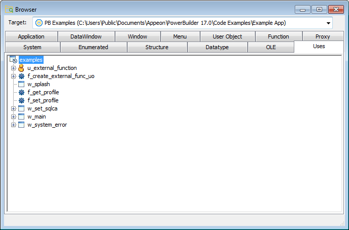
The Browser displays the following types of references when the Application object is expanded.
Objects referenced in painters
These are examples of objects referenced in painters:
-
If a menu is associated with a window in the Window painter, the menu displays when the window is expanded.
-
If a DataWindow object is associated with a DataWindow control in the Window painter, the DataWindow object displays when the window is expanded.
-
If a window contains a custom user object that includes another user object, the custom user object displays when the window is expanded, and the other user object displays when the custom user object is expanded.
Objects directly referenced in scripts
These are examples of objects referenced in scripts:
-
If a window script contains the following statement, w_continue displays when the window is expanded:
Open(w_continue)
Which referenced windows display in the Browser
Windows are considered referenced only when they are opened from within a script. A use of another window's property or instance variable will not cause the Browser to display the other window as a reference of the window containing the script.
-
If a menu item script refers to the global function f_calc, f_calc displays when the menu is expanded:
f_calc(EnteredValue)
-
If a window uses a pop-up menu through the following statements, m_new displays when the window is expanded:
m_new mymenu
mymenu = create m_new
mymenu.m_file.PopMenu(PointerX(), PointerY())
The Browser does not display the following types of references.
Objects referenced through instance variables or properties
These are examples of objects referenced through instance variables or properties:
-
If w_go has this statement (and no other statement referencing w_emp), w_emp does not display as a reference for w_go:
w_emp.Title = "Managers"
Objects referenced dynamically through string variables
These are examples of objects referenced dynamically through string variables:
-
If a window script has the following statements, the window w_go does not display when the window is expanded. The window w_go is named only in a string:
window mywin
string winname = "w_go"
Open(mywin,winname)
-
If the DataWindow object d_emp is associated with a DataWindow control dynamically through the following statement, d_emp does not display when the window containing the DataWindow control is expanded:
dw_info.DataObject = "d_emp"
In targets, you can:
-
Create new objects
-
Create new objects using inheritance
-
Open existing objects
-
Run or preview objects
After you create or open an object, the object displays in its painter and you work on it there.
To create new objects, you use the New dialog box.
To create a new object:
-
Do one of the following:
-
Click the New button in the PowerBar.
-
Select File>New from the menu bar.
-
On the Workspace tab of the System Tree, right-click on a workspace or target name and select New from the pop-up menu.
-
-
In the New dialog box, select the appropriate tab page for the object you want to create.
You use icons on the PB Object tab page for creating new user objects, windows, menus, structures, and functions.
-
Select an icon and click OK.
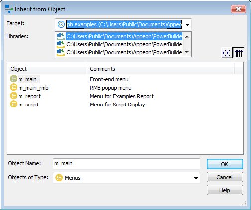
One of the most powerful features of PowerBuilder is inheritance. With inheritance, you can create a new window, user object, or menu (a descendant object) from an existing object (the ancestor object).
To create a new object by inheriting it from an existing object
-
Click the Inherit button in the PowerBar, or select File>Inherit from the menu bar.
-
In the Inherit From Object dialog box, select the object type (menu, user object, or window) from the Object Type drop-down list. Then select the target as well as the library or libraries you want to look in. Finally, select the object from which you want to inherit the new object.
Displaying objects from many libraries
To find an object more easily, you can select more than one library in the Libraries list. Use Ctrl+click to select additional libraries and Shift+click to select a range.
-
Click OK.
The new object, which is a descendant of the object you chose to inherit from, opens in the appropriate painter.
For more information about inheritance, see Understanding Inheritance.
As you use PowerBuilder to develop your application, you create many different components that require names. These components include objects such as windows and menus, controls that go into your windows, and variables for your event and function scripts.
You should devise a set of naming conventions and follow them throughout your project. When you are working in a team, this is critical to enforcing consistency and enabling others to understand your code. This section provides tables of common naming conventions. PowerBuilder does not require you to use these conventions, but they are followed in many PowerBuilder books and examples.
All identifiers in PowerBuilder can be up to 255 characters long. The first few characters are typically used to specify a prefix that identifies the kind of object or variable, followed by an underscore character, followed by a string of characters that uniquely describes this particular object or variable.
Object naming conventions
The following table shows common prefixes for objects that you create in PowerBuilder.
|
Prefix |
Description |
|---|---|
|
w_ |
Window |
|
m_ |
Menu |
|
d_ |
DataWindow |
|
pipe_ |
Data Pipeline |
|
q_ |
Query |
|
n_ or n_standardobject_ |
Standard class user object, where standardobject represents the type of object; for example, n_trans |
|
n_ or n_cst |
Custom class user object |
|
u_ or u_standardobject_ |
Standard visual user object, where standardobject represents the type of object; for example, u_cb |
|
u_ |
Custom visual user object |
|
f_ |
Global function |
|
of_ |
Object-level function |
|
s_ |
Global structure |
|
str_ |
Object-level structure |
|
ue_ |
User event |
Variable naming conventions
The prefix for variables typically combines a letter that represents the scope of the variable and a letter or letters that represent its datatype. The following table lists the prefixes used to indicate a variable's scope. The following table lists the prefixes for standard datatypes, such as integer or string.
The variable might also be a PowerBuilder object or control. The following table lists prefixes for some common PowerBuilder system objects. For controls, you can use the standard prefix that PowerBuilder uses when you add a control to a window or visual user object. To see these prefixes, open the Window painter, select Design>Options, and look at the Prefixes 1 and Prefixes 2 pages.
|
Prefix |
Description |
|---|---|
|
a |
Argument to an event or function |
|
g |
Global variable |
|
i |
Instance variable |
|
l |
Local variable |
|
s |
Shared variable |
|
Prefix |
Description |
|---|---|
|
a |
Any |
|
blb |
Blob |
|
b |
Boolean |
|
ch |
Character |
|
d |
Date |
|
dtm |
DateTime |
|
dc |
Decimal |
|
dbl |
Double |
|
e |
Enumerated |
|
i |
Integer |
|
l |
Long |
|
r |
Real |
|
s |
String |
|
tm |
Time |
|
ui |
UnsignedInteger |
|
ul |
UnsignedLong |
|
Prefix |
Description |
|---|---|
|
ds |
DataStore |
|
dw |
DataWindow |
|
dwc |
DataWindowChild |
|
dwo |
DWobject |
|
env |
Environment |
|
err |
Error |
|
gr |
Graph |
|
inet |
Inet |
|
ir |
InternetResult |
|
lvi |
ListViewItem |
|
mfd |
MailFileDescription |
|
mm |
MailMessage |
|
mr |
MailRecipient |
|
ms |
MailSession |
|
msg |
Message |
|
nvo |
NonVisualObject |
|
tr |
Transaction |
|
tvi |
TreeViewItem |
You can open existing objects through the Open dialog box or directly from the System Tree.
To open existing objects
-
Click the Open button in the PowerBar or select File>Open from the menu bar.
When using the System Tree
To open an existing object directly from the System Tree, either double-click on the object name or select Edit from the pop-up menu.
-
In the Open dialog box, select the object type from the Object Type drop-down list. Then select the target as well as the library or libraries you want to look in. Finally select the object you want to open.
Displaying objects from many libraries
To find an object more easily, you can select more than one library in the Libraries list. Use Ctrl+click to select additional libraries and Shift+click to select a range.
-
Click OK.
The object opens in the appropriate painter.

Accessing recently opened objects
You can quickly open recently opened objects by selecting File>Recent Objects from the menu bar. The Recent Objects list includes the eight most recently opened objects by default, but you can include up to 36 objects on the list.
To run a window or preview a DataWindow object, you use the Run dialog box.
Using the System Tree
Instead of using the Run dialog box, you can right-click the object in the System Tree and select Run/Preview from the pop-up menu.
To run or preview an object
-
Do one of the following:
-
Click the Run/Preview Object button in the PowerBar.
-
Select File>Run/Preview from the menu bar.
-
-
In the Run dialog box, select the object type from the Object Type drop-down list.
-
Select the target as well as the library or libraries you want to look in.
-
Select the object you want to run or preview and click OK.
The object runs or is previewed.
For more specific information on running a window, see Running a window. For information on using the DataWindow painter's Preview view, see Defining DataWindow Objects.
You can use the Source editor to edit the source of most PowerScript objects directly instead of making changes to an object in a painter. You cannot edit the source of project or proxy objects. The Source editor makes it unnecessary to export an object in order to edit it and then import it, as you do with the file editor.
Caution: back up your objects
Although the Source editor provides a quick way to make global changes, you should use it with caution, and you must be familiar with the syntax and semantics of PowerScript source code before using the Source editor to change it.
Changes you make to an object's source code using the Source editor take effect immediately when you save the object, before the code is validated. If an error message displays in the Output window, you must fix the problem in the Source editor before you close the editor. If you do not, you will not be able to open the object in a painter.
Technical Support is not able to provide support if changes you make in the Source editor render an object unusable. For this reason, Appeon strongly recommends that you make backup copies of your PBLs or objects before you edit objects in the Source editor.
You can open an object in the Source editor in one of several ways:
-
Use the Open dialog box
-
Select the Edit Source menu item in the System Tree or Library painter
-
Select the Edit Source menu item in the Output window for a line that contains an error
Unlike the file editor, the Source editor cannot be opened independently. It can only be used in conjunction with an object defined within a target in the current workspace. You cannot open an object in the Source editor that is already open in a painter.
When you export an object and view the exported file in the file editor, a PBExportHeader line displays at the beginning of the file. If you saved the object with a comment from the object's painter, a PBExportComment also displays. The Source editor display is identical to the display in the file editor except that the PBExport lines are not present in the Source editor.
For more information on exporting objects, see Exporting and importing entries.
