About this chapter
This chapter describes how to build and use DataWindow objects in PowerBuilderusing the TreeView presentation style.
The TreeView presentation style provides an easy way to create DataWindow objects that display hierarchical data in a TreeView, where the rows are divided into groups that can be expanded and collapsed.
The TreeView DataWindow displays a hierarchy of nodes, similar to the way:
-
The left pane of Windows Explorer displays folders and files
-
The PowerBuilder System Tree displays workspaces and their contents
In the TreeView DataWindow, each parent node contains other nodes called child nodes. You can display parent nodes—nodes that contain child nodes—in expanded or collapsed form.
With the TreeView DataWindow presentation style, you can group data in a hierarchy that allows users to browse the data and expand nodes to view details. Each TreeView level or node has an icon that users can click to expand or collapse the node.
You use the TreeView DataWindow wizard to create a TreeView DataWindow object. For information, see Creating a new TreeView DataWindow.
Example
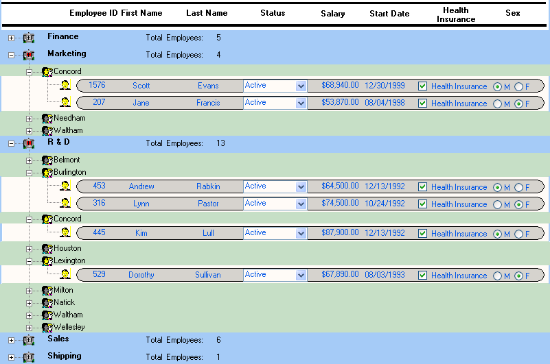
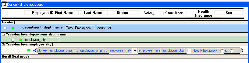
This sample TreeView DataWindow uses the department and employee tables in the PB Demo DB database and has two TreeView levels. The first level is the department name. The second level is the city where each employee resides. The detail data for each employee is grouped in TreeView leaf nodes under these two levels.
Similarities to the Group presentation style
Creating and using a TreeView DataWindow is similar to creating and using a Group DataWindow. However, with the TreeView DataWindow, you can click the state icon to expand and collapse nodes.
The state icon in a TreeView DataWindow is a plus sign (+) when the node is collapsed and a minus sign (-) when the node is expanded. When a node is expanded, connecting lines display by default to show more detail and indicate how the parent data connects with the child data. When a node is collapsed, only the parent data displays; the detail data does not.
You use the TreeView wizard and the DataWindow painter to create a TreeView DataWindow.
A TreeView DataWindow has multiple levels, each of which is a node in the TreeView. You use the TreeView wizard to create a TreeView DataWindow, but the wizard produces a DataWindow that includes only the top level of the TreeView.
Creating a complete TreeView DataWindow involves three steps:
-
Using the TreeView DataWindow wizard to create the top level (level 1) of the TreeView DataWindow.
-
Using the DataWindow painter to add additional levels to the TreeView DataWindow.
-
Setting TreeView DataWindow properties to customize the TreeView style.
For information about adding and deleting TreeView levels, see Adding and deleting TreeView levels.For information about setting properties in the DataWindow painter, see Setting properties for the TreeView DataWindow.
You can use TreeView DataWindow methods to expand and collapse TreeView nodes, and you can write code for TreeView DataWindow events that are fired when a node is expanded or collapsed. For detailed information about using TreeView DataWindow properties, methods, and events, see DataWindow Reference.
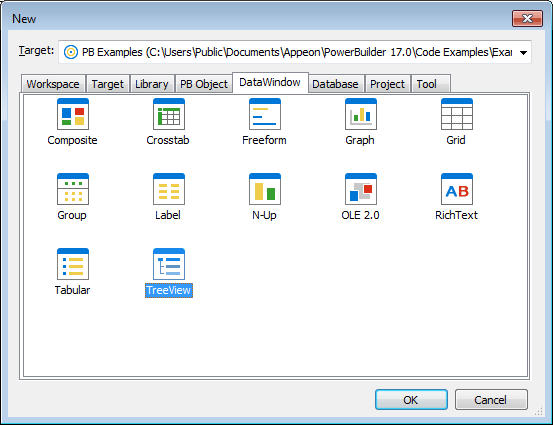
To create a TreeView DataWindow
-
Select File>New from the menu bar and select the DataWindow tab.
-
If there is more than one target in the workspace, select the target where you want to create the DataWindow from the drop-down list at the bottom of the dialog box.
-
Choose the TreeView presentation style for the DataWindow and click OK.
-
Select the data source you want to use.
You are prompted to specify the data.
-
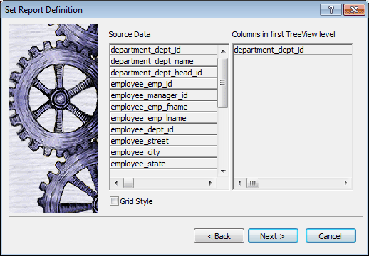
Define the tables and columns you want to use.
You are prompted to specify the TreeView grouping columns.
Multiple columns and multiple TreeView levels
You can specify more than one column, but all columns apply to TreeView level one. At this point, you can define only one TreeView level. You define additional levels later.
In the following example, TreeView grouping will be by department, as specified by the dept_id column:
If you want to use an expression, you can define it when you have completed the wizard. See Using an expression for a column name.
The sample DataWindow shown in Example uses the department and employee tables in the PB Demo DB database.
-
Specify the column or columns that will be at the top level (level 1) of the TreeView DataWindow.
The sample DataWindow uses the department name as the top level. If you want to display both the department ID and department name, you specify that both columns are at the top level.
-
If you want the TreeView DataWindow to display grid lines, select the Grid Style check box.
When you select the Grid Style check box, the TreeView DataWindow displays grid lines for rows and columns. You can drag the grid lines to resize rows and columns.
-
Click Next.
-
Modify the default color and border settings if needed, and then click Next.
-
Review the TreeView DataWindow characteristics.
-
Click Finish.
The DataWindow painter Design view displays. For information about the Design view, see TreeView DataWindow Design view. For information about adding additional levels, see Adding and deleting TreeView levels.
What PowerBuilder does
As a result of your specifications, PowerBuilder generates a TreeView DataWindow object and creates:
-
A TreeView header band with controls that include the heading text of the detail band columns
-
The first TreeView level band with the TreeView level columns you chose in the wizard
-
The detail (leaf node) band that includes all the column controls except for first-level columns you selected in the wizard
-
A level 1 trailer band.
-
A summary band, and a footer band.
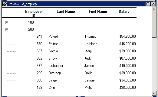
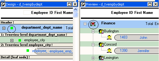
Here is the sample TreeView DataWindow object in the Design view:

If you selected the Grid Style check box, vertical and horizontal grid lines display:

Here is the sample TreeView DataWindow object in the Preview view:
Using an expression for a column name
If you want to use an expression for one or more column names in a TreeView, you can enter it as the TreeView definition on the General page in the Properties view after you finish using the TreeView wizard.
To use an expression for a TreeView column name
-
Open the Properties view and click the TreeView level band in the Design view.
-
Click the ellipsis button next to the TreeView Level Definition box on the General page in the Properties view to open the Specify Group Columns dialog box.
-
In the Columns box, double-click the column you want to use in an expression.
The Modify Expression dialog box opens. You can specify more than one grouping item expression for a group. A break occurs whenever the value concatenated from each column/expression changes.
What you can do
All of the techniques available in a tabular DataWindow object, such as moving controls and specifying display formats, are available for modifying and enhancing TreeView DataWindow objects. See Adding and deleting TreeView levels to read more about the bands in a TreeView DataWindow object and see how to add features especially suited for TreeView DataWindow objects, such as additional TreeView levels or summary statistics.
DataWindow Object is not updatable by default
When you generate a DataWindow object using the TreeView presentation style, PowerBuilder makes it not updatable by default. If you want to be able to update the database through the TreeView DataWindow object, you must modify its update characteristics. For more information, see Controlling Updates in DataWindow objects.
You add and delete TreeView levels using the Rows menu in the DataWindow painter.
To create an additional level in a TreeView DataWindow:
-
Open the TreeView DataWindow if it is not already open.
-
Select Rows>Create TreeView Level from the menu bar.
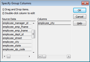
The Specify Group Columns dialog box displays.
-
Specify the columns you want to set as the next TreeView level by dragging them from the Source Data pane to the Columns pane.
In the sample DataWindow shown in Example, the second level has a single column, the employee_city column.
-
Click OK.
The new TreeView level and a Trailer band for that level are created in the TreeView Design view. For information on how to set properties for a TreeView level, see Setting TreeView level properties.
To delete a level in a TreeView DataWindow:
-
Select Rows>Delete TreeView Level from the menu bar.
-
Select the number of the level to delete from the list of levels that displays.
The level in the TreeView DataWindow is deleted immediately.
If you delete a level by mistake
If you unintentionally delete a level, close the TreeView DataWindow without saving changes, then reopen it and continue working.
You can select a tree node in the TreeView DataWindow in the following ways:
-
Use the SelectTreeNode method to select a tree node.
-
Set the Select Node By Mouse property to "true" and then click a tree node to select it with the mouse.
After you select a tree node in the TreeView DataWindow, you can navigate the tree using the up, down, left, and right keys.
|
Use this key |
To do this |
|---|---|
|
Up |
Select a tree node prior to the currently selected node. |
|
Down |
Select a tree node next to the currently selected node. |
|
Left |
Collapse the currently selected node. If the current tree node is a leaf node or the node has been collapsed, the DataWindow just scrolls to the left, which is its normal behavior. |
|
Right |
Expand the currently selected node. If the current tree node is a leaf node or the node has been expanded, the DataWindow just scrolls to the right, which is its normal behavior. |
For detailed information about TreeView DataWindow properties, methods and events, see DataWindow Reference.
To sort the rows within levels in a TreeView DataWindow:
-
Select Rows>Sort from the menu bar.
-
Drag the columns that you want to sort the rows on from the Source Data box to the Columns box.
The order of the columns determines the precedence of the sort. The sort order is ascending by default. To sort in descending order, clear the Ascending check box.
For example, the sample DataWindow shown in Example has department name as the first level and the employee's city of residence as the second level.

Other actions you can take
To reorder the columns, drag them up or down in the list. To delete a column from the sort columns list, drag the column outside the dialog box. To specify an expression to sort on, double-click a column name in the Columns box and modify the expression in the Modify Expression dialog box.
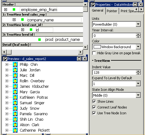
The Design view for the TreeView DataWindow differs from the traditional Design view for most DataWindow presentation styles.
The Design view has a header band, a TreeView level band for each added level, a detail band, a Trailer band for each level, a summary band, and a footer band.
By default, the controls in the header band are the heading text of the detail band columns, and the controls in the detail (leaf node) band are all the column controls except for the first-level columns (in the 1:Treeview level band) that you selected when you used the TreeView wizard. Columns that you specify as additional levels remain in the detail band.
The minimum height of each TreeView level band is the height of the tree node icon.
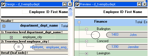
There are three icons in the Design view that represent the locations of nodes, icons, and connecting lines in the tree to help you design the DataWindow. Columns must always display to the right of the state and tree node icons:
-
A square icon with a plus sign (+) in each TreeView level band represents the position of the state icon, the icon that indicates whether a node is expanded or collapsed.
-
A shaded square icon in the detail band and in each TreeView level band represents the position of the image you specify as a tree node icon.
-
When there is no tree node icon specified, a shaded square icon in the detail band and in each TreeView level band represents where the connecting line ends.
The position of all the icons changes when you change the indent value.
For more information about specifying icons and the indent value, see Setting properties for the TreeView DataWindow.
You can set three types of properties for the TreeView DataWindow:
-
General properties
-
TreeView level properties
-
Detail band properties
Specifying images for tree node icons
In the sample DataWindow shown in Creating a new TreeView DataWindow, different tree node icons display for collapsed and expanded levels. The icons are also different for each level. You specify images for these icons as TreeView level band properties.
The sample DataWindow also displays a tree node icon next to every row in the detail band. You specify an image for this icon as a detail band property.
Tree node icons do not display by default. After specifying images for icons, select the Use Tree Node Icon general property.
You set most TreeView DataWindow properties on the General page in the Properties view for the DataWindow object.
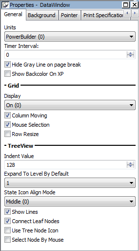
The properties that are specific to a TreeView DataWindow are the TreeView properties and the Grid properties. The grid-related properties display only if you select the Grid Style check box when you define the TreeView DataWindow.
|
Property |
Description |
|---|---|
|
Display |
On – Grid lines always display. Off – Grid lines never display (columns cannot be resized at runtime). Display Only – Grid lines display only when the DataWindow object displays online. Print Only – Grid lines display only when the contents of the DataWindow object are printed. |
|
Column Moving |
Columns can be moved at runtime. |
|
Mouse Selection |
Data can be selected at runtime and, for example, copied to the clipboard. |
|
Row Resize |
Rows can be resized at runtime. |
|
Indent Value |
The indent value of the child node from its parent in the units specified for the DataWindow. The indent value defines the position of the state icon. The X position of the state icon is the X position of its parent plus the indent value. |
|
Expand To Level By Default |
Expand to TreeView level 1, 2, or 3. |
|
State Icon Align Mode |
Align the state icon in the middle, at the top, or at the bottom. |
|
Show Lines |
Whether lines display that connect parent nodes and child nodes. If you want to display lines that connect the rows in the detail band to their parent, select Connect Leaf Nodes. |
|
Connect Leaf Nodes |
Whether lines display that connect the leaf nodes in the detail band rows. |
|
Use Tree Node Icon |
Whether an icon for the tree node displays. This applies to icons in the level and detail bands. For how to specify icon images, see Setting TreeView level properties and Setting detail band properties. |
|
Select Node By Mouse |
Whether a Tree node is selected by clicking the Tree node with the mouse. |
In the Properties view for a band, you can specify expanded and collapsed icons for each TreeView level. You access the Properties view by clicking the bar identifying the band for that level in the Design view in the DataWindow painter. You can also access the Properties view from the Rows menu, or by clicking any of the icons in the Design view that represent the locations of nodes, icons, and connecting lines. (See Icons in the Design view.)
To modify properties for a level in a TreeView DataWindow
-
Select Rows>Edit TreeView Level from the menu bar and then select the number of the level from the list of levels, or click the bar identifying the band for that level or any of the icons in that band.
-
Use the DataWindow TreeView Level properties view that displays to edit the properties for the level you selected.
The properties that are specific to a TreeView level band are at the bottom of the Properties view:
Property
Description
Tree Node Icon File
The file name of the tree node icon in a TreeView level band when it is in the expanded state.
Collapsed Tree Node Icon File
The file name of the tree node icon in a TreeView level band when it is in the collapsed state.
You set the tree node icon file name separately for each TreeView level band. You can use a quoted expression for the tree node icon file.

You can specify an icon for the rows in the detail band by clicking the detail band in the DataWindow painter to display the Properties view.

If you want to hide tree nodes in the detail band, set the Height property to 0. The only property that is specific to the TreeView DataWindow is located at the bottom of the Properties view:
|
Property |
Description |
|---|---|
|
Tree Node Icon File |
The file name of the tree node icon in the detail band. You can use a quoted expression. |
For more information
For reference information about TreeView DataWindow properties, methods and events, see DataWindow Reference.
The examples in this section demonstrate how you might use the TreeView DataWindow.
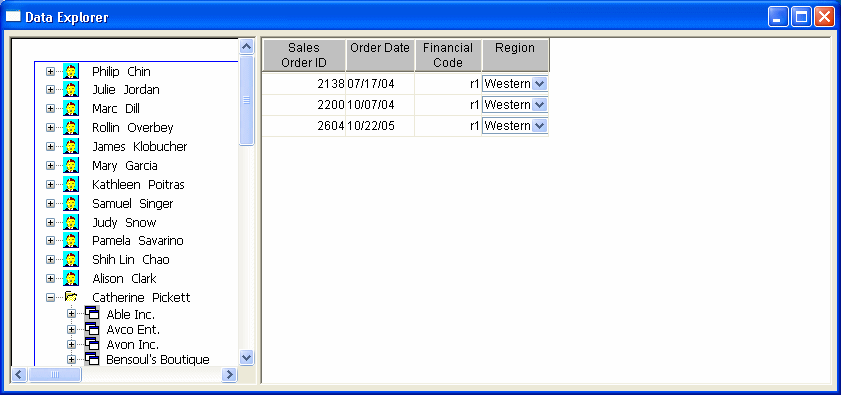
The Data Explorer uses a TreeView DataWindow to display sales-related data in a Windows Explorer-like interface and allows users to update the data.
The Data Linker uses a TreeView DataWindow on the left for data navigation, linked to four DataWindows on the right for updating the data. The Data Linker demonstrates populating a TreeView DataWindow with data and linking each TreeView level to a separate DataWindow.
Tables and database
Both examples use the employee, sales_order, sales_order_items, customer, and product tables in the PB Demo DB database.
TreeView DataWindows
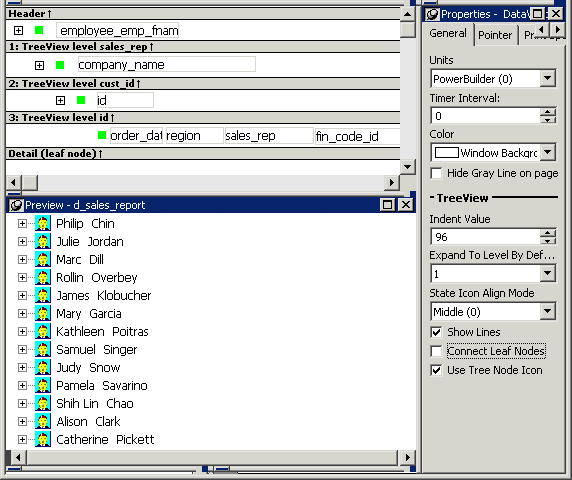
The TreeView DataWindows are d_sales_report and d_sales_report2. Each TreeView DataWindow has three TreeView levels:
-
The first level (level 1) is the sales representative's name.
You create the first level using the TreeView DataWindow wizard.
-
The second level (level 2) is the name of the customer's company.
You create the second level using the Rows>Create TreeView Level menu item in the DataWindow painter.
-
The third level (level 3) is the sales order ID.
You also create the third level using the Rows>Create TreeView Level menu item in the DataWindow painter.
Clicking on each TreeView level displays details in a DataWindow on the right. For example, if you click a name in the TreeView DataWindow on the left, detailed customer data displays in the DataWindow on the right.

You can click on any TreeView level in the Data Explorer. If you click a company name in the TreeView DataWindow on the left (for example, Able Inc., under Catherine Pickett), order information displays on the right.
If you click an order ID in the TreeView DataWindow on the left (for example, order ID 2400, under Bilhome Industries, under Alison Clark), the customer order information displays on the right.
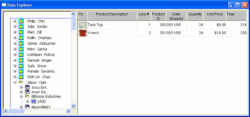
Data Explorer TreeView DataWindow
Here is the TreeView DataWindow used in the Data Explorer.
One TreeView DataWindow
The Data Explorer uses one TreeView DataWindow, but DataWindows that are not TreeView DataWindows also support the Data Explorer's functionality.
Data Explorer code
The code in the Clicked event uses GetBandAtPointer to determine which DataWindow to display. Clicking on some editable items in the detail DataWindow opens a window in which you can manipulate the data.
The PopMenu menu object has two menu items that call the CollapseAll and ExpandAll methods to collapse or expand all the nodes in the TreeView.
When you first run the Data Linker, no data displays on the right side of the window.
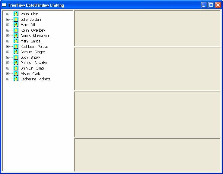
To use the Data Linker, you first expand an employee name and a company's data in the TreeView DataWindow.
Expanding the TreeView displays the company names, the orders for the company you select, and in the detail band, the icon and name for each item in the order.
You can click on each of the TreeView levels in order, and then click in the detail band to display the details in the four DataWindows on the right.
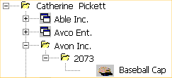
For example, if you click first on Catherine Pickett, then on Avon Inc., then on 2073, and last on Baseball Cap, the data in each of the related DataWindows displays on the right. You can also update the data in each of the DataWindows.
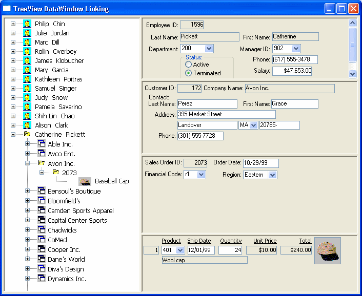
Data Linker TreeView DataWindow
Here is the TreeView DataWindow used in the Data Linker sample.
One TreeView DataWindow
The Data Linker uses one TreeView DataWindow, but other DataWindows that are not TreeView DataWindows also support the Data Linker's functionality.
Data Linker code
The code in the Clicked event uses GetBandAtPointer to determine which DataWindow to display.
