You specify application properties in the Application painter's Properties view.
To specify application properties:
-
In the Application painter, if the Properties view is not open, select View>Properties from the menu bar.
With the exception of the AppName property, the properties on the General and Toolbar tab pages can be modified in the Properties view and in scripts.
If you need help specifying properties in the Properties view, right-click on the background of the Properties view and select Help from the pop-up menu.
-
Select the General or Toolbar tab page, or, on the General tab page, click the Additional Properties button to display the Application properties dialog box.
The additional properties on the Application properties dialog box can be modified only in this dialog box. They cannot be modified in scripts.
-
Specify the properties:
To specify this
Use this tab page
Display name
General tab page
Application has toolbar text and toolbar tips
Toolbar tab page
Default font for static text as it appears in windows, user objects, and DataWindow objects
Additional Properties (Text Font)
Default font for data retrieved in a DataWindow object
Additional Properties (Column Font)
Default font for column headers in tabular and grid DataWindow objects
Additional Properties (Header Font)
Default font for column labels in freeform DataWindow objects
Additional Properties (Label Font)
Application icon
Additional Properties (Icon)
Global objects for the application
Additional Properties (Variable Types)
RichTextEdit control for the application
Additional Properties (RichTextEdit)
UI Theme for the application
Additional Properties (Themes)
These sections have information about how you specify the following application properties in the Application painter:
You probably want to establish a standard look for the text in your application. There are four kinds of text whose properties you can specify in the Application painter: text, header, column, and label.
PowerBuilder provides default settings for the font, size, and style for each of these and a default color for text and the background. You can change these settings for an application in the Application painter and override the settings for a window, user object, or DataWindow object.
Properties set in the Database painter override application properties
If extended attributes have been set for a database column in the Database painter or Table painter, those font specifications override the fonts specified in the Application painter.
To change the text defaults for an application:
-
In the Properties view, click Additional Properties and select one of the following:
-
Text Font tab
-
Header Font tab
-
Column Font tab
-
Label Font tab
The tab you choose displays the current settings for the font, size, style, and color. The text in the Sample box illustrates text with the current settings.
-
-
Review the settings and make any necessary changes:
-
To change the font, select a font from the Font list.
-
To change the size, select a size from the Size list or type a valid size in the list.
-
To change the style, select a style (Regular, Italic, Bold, or Bold Italic) from the Font styles list.
-
To change font effects, select one or more from the Effects group box (Strikeout and Underline).
-
To change the text color, select a color from the Text Color list. (You do not specify colors for data, headings, and labels here; instead, you do that in the DataWindow painter.)
-
To change the background color, select a color from the Background list.
Using custom colors
When specifying a text color, you can choose a custom color. You can define custom colors in several painters, including the Window painter or DataWindow painter.
-
-
When you have made all the changes, click OK.
Users can minimize your application at runtime. If you specify an icon in the application painter, the icon will display when the application is minimized.
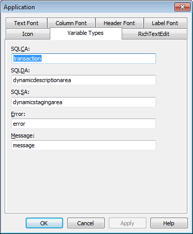
PowerBuilder provides five built-in global objects that are predefined in all applications.
|
Global object |
Description |
|---|---|
|
SQLCA |
Transaction object, used to communicate with your database |
|
SQLDA |
DynamicDescriptionArea, used in dynamic SQL |
|
SQLSA |
DynamicStagingArea, used in dynamic SQL |
|
Error |
Used to report errors during execution |
|
Message |
Used to process messages that are not PowerBuilder-defined events and to pass parameters between windows |
You can create your own versions of these objects by creating a standard class user object inherited from one of the built-in global objects. You can add instance variables and functions to enhance the behavior of the global objects.
For more information, see Working with User Objects.
After you do this, you can specify that you want to use your version of the object in your application as the default, instead of the built-in version.
To specify the default global objects
-
In the Properties view, click Additional Properties and select the Variable Types tab.
The Variable Types property page displays.
-
Specify the standard class user object you defined in the corresponding field.
For example, if you defined a user object named mytrans that is inherited from the built-in Transaction object, type mytrans in the box corresponding to SQLCA.
-
Click OK.
When you run your application, it will use the specified standard class user objects as the default objects instead of the built-in global objects.
You can select from the three rich text editors supported by Appeon PowerBuilder. The selected rich text editor will be applicable to the RichTextEdit control, the RichText DataWindow object, and the RichText edit style.
To select a rich text editor:
-
In the Application painter, select the General tab page.
-
On the General tab page, click the Additional Properties button to display the Application properties dialog box.
-
In the Application properties dialog box, select the RichTextEdit Control tab, and then select a rich text editor.
For 32-bit applications, you can select Built-in TX Text Control ActiveX.
For 64-bit applications, you can select Built-in TX Text Control ActiveX or Microsoft RichEdit Control.
For more information about the rich text editors, see the section called “Rich text editors” in Application Techniques; and for feature difference of the rich text editor, see the section called “Feature difference between TX Text Control (64-bit) and Microsoft RichEdit Control (64-bit)” in Application Techniques.
-
Click OK.
You can apply the following system themes to the window, DataWindow, and all visual controls (except Line, Oval, Rectangle, RoundRectangle, Picture, PictureHyperLink, and Animation) in your application.
-
Flat Design Blue -- this theme is evolved from the Windows 10 style, featuring a flat design style in contrasting to a prominent UI content. The window style is similar to that of Windows 10. The controls are flattened, and the color is gray in the normal state, and blue in the default state, making a more visually appealing and recognizable UI.
-
Flat Design Dark -- this theme displays light white text on dark backgrounds, making the information on the page more prominent and easy to read; and displays a blue auxiliary color, making the page looks technical. The dark theme can lessen eye strain during the night.
-
Flat Design Grey -- this theme is based on the original PowerBuilder style. It retains most of the color matching of the controls, and removes their 3D effect so they are flattened; the window is displayed in a gray background, making the UI convenient for users to read and improves user experience.
-
Flat Design Silver -- this theme is a combination of the modern designs. The theme removes the control border, and divides controls by shallow color blocks, making the UI more concise and focused.
If no theme is applied or if the theme is unsupported for a control, the style of windows, DataWindows, and controls will be determined by the settings in the PowerBuilder IDE or script.
| Do not use theme | Flat Design Blue | Flat Design Dark | Flat Design Grey | Flat Design Silver | |
|---|---|---|---|---|---|
| Window background color | By IDE or script | White | Dark | Grey | White |
| Font color * | By IDE or script | Black | White | Black | Silver Black |
| Control background color | By IDE or script | White | Black | White | White or Shallow Color Block |
| Button | By IDE or script | 2D | 2D | 2D | 2D |
| Border | By IDE or script | 2D | 2D | 2D | No Border |
| Border thickness | 1 pixel | 1 pixel | 1 pixel | 1 pixel | No Border |
* The font related properties (except font color) are unsupported to be set by the theme.
The system themes are installed to %AppeonInstallPath%\PowerBuilder [version]\IDE\theme. There are four subfolders in the "theme" folder by default; each represents a system theme: Flat Design Blue, Flat Design Dark, Flat Design Grey, and Flat Design Silver. Each subfolder contains the theme definition files of the corresponding theme, which are mainly the following two types of files:
-
theme.json file -- this is the master theme definition file which sets the visual appearance (such as color, state, border, text etc.) of all supported elements of the window, DataWindow and control. For more about the theme.json file, refer to Understanding the theme.json file.
-
numerous image files -- they are referenced in the theme.json file and used to make up the visual elements (such as checked/unchecked/indeterminate/enabled/disabled/hover/pressed state of the control etc.) in the theme.
You can add a new folder in the theme path to hold your custom themes. It is recommended that you directly make a copy of an existing system theme folder and then make changes to the copy. Make sure the copied folder contains the theme.json file, so the folder name will be automatically recognized as the theme name and listed for selection in the Themes tab.
Note
If you directly make changes to the system theme, the changes may lose after you re-install or upgrade PowerBuilder IDE.
Each individual control or object can have its own theme settings, for example, one button can have theme settings different from the other buttons. And controls of the same type in the same window/user object can have their own theme settings, for example, all group boxes in one window can have theme settings different from the group boxes in the other window.
Therefore you can create custom themes to configure theme settings for a specific control or object, or controls or objects of a specific type.
Unsupported
The dynamically created DataWindow is unsupported to have custom theme settings.
The dynamically created user object is unsupported to have custom theme settings.
To create custom themes:
-
Open the "%AppeonInstallPath%\PowerBuilder [version]\IDE\theme" directory, copy a system theme folder, and rename it.
-
In your theme folder where the theme.json file exists, add one or more custom theme definition files.
-
The custom theme file must be named in this format: theme-[xxxx].json.
The file prefix must be "theme-", [xxxx] can be any text, and the extension must be .json, for example, theme-control.json, theme-dw.json, etc.
-
The settings in the file can be a subset or all of the theme.json file (see Understanding the theme.json file for more about the theme.json file).
The nodes that host theme settings are the system object or control name (such as "checkbox", "commandbutton" etc.) in theme.json; but the nodes that host theme settings in the custom theme file must be the name that points to the specific object or control (such as "w_main.uo_1.cb_1", "w_main$commandbutton" etc.) that will apply the settings. For example,
{
 "meta-info":
 {
  "version":"190"
 },
  "w_main.uo_1.cb_1":
 {
   ...
   //Copy the settings from the "commandbutton" node
   //of the "theme.json" file and then modify.
 }
  "w_main$commandbutton":
 {
   ...
   //Copy the settings from the "commandbutton" node
   //of the "theme.json" file and then modify.
 }
  "w_main":
 {
   ...
   //Copy the settings from the "window" node
   //of the "theme.json" file and then modify.
 }
}
-
-
In the custom theme file, configure the theme settings for a window, a custom visual user object, a control/object, or controls/objects of the same type in the window or user object.
For detailed information and examples, refer to the next section Configuring the custom theme.
Similar to PowerScript, you write dot donation in Application Techniques in the theme file to qualify a reference to a control/object in a container. But pay attention to the following:
-
There are two types of containers: window container and user object container; and different containers use different rules when customizing the theme settings. If a user object is placed into a window, then it should use rules for the window container, instead of rules for user object container.
-
You can customize theme settings for controls and objects (except DropDownDataWindows) in both containers.
-
To reference to controls (or objects) in the window container, you could write dot notation in the theme file, in the same way as how you write in PowerScript, except for
-
In the window container, controls (or objects) of the same type in the window or user object must be referenced by qualifier of the current window or current user object only: [window]$[controltype] or [userobject]$[controltype]. You must reference by only one level of window or user object (even if there are more). For example, [w_1].[uo1]$[controltype] will NOT take effect, and must be changed to [w_1]$[controltype] (which affects controls contained in w_1) or [uo1]$[controltype] (which affects controls contained in uo1).
-
-
To reference to controls (or objects) in the user object container, you could write dot notation in the theme file, in the same way as how you write in PowerScript, except for
-
In the user object container, a control (or object) in the user object must be referenced by qualifier of the current user object only: [userobject].[control-or-object]. You must reference by only one level of user object (even if there are more). For example, [uo1].[uo2].[control-or-object] will NOT take effect, and must be changed to [uo1].[control-or-object] (which affects the control contained in uo1) or [uo2].[control-or-object] (which affects the control contained in uo2).
-
In the user object container, controls (or objects) of the same type in the user object must be referenced by qualifier of the current user object only: [userobject]$[controltype]. You must reference by only one level of user object (even if there are more). For example, [uo1].[uo2]$[controltype] will NOT take effect, and must be changed to [uo1]$[controltype] (which affects controls contained in uo1) or [uo2]$[controltype] (which affects controls contained in uo2).
-
-
The user object indicates the custom visual user object only (not the external or standard visual user objects). And the user object which is dynamically created via OpenTab or OpenUserObject method is unsupported to have their own theme settings. Standard visual user objects can have theme settings only when it is placed into the custom visual user object and customized through the container.
To configure the custom theme settings for the window container and control/object in the window container:
-
A window must be referenced in this format: [windowname]
For example, to configure the theme settings for w_main:
"w_main":
{
 ... //Copy "window" node from "theme.json" and customize.
}
For another example, to configure the theme settings for w_descendant (which is inherited from another window):
"w_descendant": { ... //Copy "window" node from "theme.json" and customize. } -
A control or object in the window must be referenced in this format: [windowname].[control-or-object].
-
A control in a window
Supposing the w_main window contains the cb_1 button, you can customize cb_1 like below:
"w_main.cb_1": { ... //Copy "commandbutton" node from "theme.json" and customize. } -
A userobject in a window
Supposing the w_main window contains the uo_1 user object, you can customize uo_1 like below:
"w_main.uo_1": { ... //Copy "userobject" node from "theme.json" and customize. } -
An embedded userobject in a window
Supposing the w_main window contains the uo_1 user object and uo_1 contains an embedded userobject uo_custom, you can customize uo_custom like below:
"w_main.uo_1.uo_custom": { ... //Copy "userobject" node from "theme.json" and customize. } -
A control in a userobject in a window
Supposing the w_main window contains the uo_1 user object and uo_1 contains the cb_1 button, you can customize cb_1 like below:
"w_main.uo_1.cb_1": { ... //Copy "commandbutton" node from "theme.json" and customize. } -
A control in an embedded userobject in a window
Supposing the w_main window contains the uo_1 user object, uo_1 contains an embedded userobject uo_custom, and uo_custom contains the cb_1 button, you can customize cb_1 like below:
"w_main.uo_1.uo_custom.cb_1": { ... //Copy "commandbutton" node from "theme.json" and customize. } -
A tab in a window
Supposing the w_main window contains the tab_1 tab control, you can customize tab_1 like below:
"w_main.tab_1": { ... //Copy "tab" node from "theme.json" and customize. } -
A tab in a userobject in a window
Supposing the w_main window contains the uo_1 user object and uo_1 contains the tab_1 tab control, you can customize tab_1 like below:
"w_main.uo_1.tab_1": { ... //Copy "tab" node from "theme.json" and customize. } -
A tab in an embedded userobject in a window
Supposing the w_main window contains the uo_1 user object, uo_1 contains an embedded userobject uo_custom, and uo_custom contains the tab_1 tab control, you can customize tab_1 like below:
"w_main.uo_1.uo_custom.tab_1": { ... //Copy "tab" node from "theme.json" and customize. } -
A control in a tabpage in a window
Supposing the w_main window contains the tab_1 tab control and tab_1's tab page 1 contains the cb_1 button, you can customize cb_1 like below:
"w_main.tab_1.tabpage_1.cb_1": { ... //Copy "commandbutton" node from "theme.json" and customize. } -
A control in a tabpage in a userobject in a window
Supposing the w_main window contains the uo_1 user object, uo_1 contains the tab_1 tab control, and tab_1's tab page 1 contains the cb_1 button, you can customize cb_1 like below:
"w_main.uo_1.tab_1.tabpage_1.cb_1": { ... //Copy "commandbutton" node from "theme.json" and customize. } -
A control in a tabpage in an embedded userobject in a window
Supposing the w_main window contains the uo_1 user object, uo_1 contains an embedded userobject uo_custom, uo_custom contains the tab_1 tab control, and tab_1's tab page 1 contains the cb_1 button, you can customize cb_1 like below:
"w_main.uo_1.uo_custom.tab_1.tabpage_1.cb_1": { ... //Copy "commandbutton" node from "theme.json" and customize. } -
A control in a userobject in a tabpage in a window
Supposing the w_main window contains the tab_1 tab control, tab_1's tab page 1 contains the uo_1 user object, and uo_1 contains the cb_1 button, you can customize cb_1 like below:
"w_main.tab_1.tabpage_1.uo_1.cb_1": { ... //Copy "commandbutton" node from "theme.json" and customize. } -
A control in an embedded userobject in a tabpage in a window
Supposing the w_main window contains the tab_1 tab control, tab_1's tab page 1 contains the uo_1 user object, uo_1 contains an embedded user object uo_custom, and uo_custom contains the cb_1 button, you can customize cb_1 like below:
"w_main.tab_1.tabpage_1.uo_1.uo_custom.cb_1": { ... //Copy "commandbutton" node from "theme.json" and customize. } -
A userobject in a tabpage in a window
Supposing the w_main window contains the tab_1 tab control and tab_1's tab page 1 contains the uo_1 user object, you can customize uo_1 like below:
"w_main.tab_1.tabpage_1.uo_1": { ... //Copy "userobject" node from "theme.json" and customize. } -
An embedded userobject in a tabpage in a window
Supposing the w_main window contains the tab_1 tab control, tab_1's tab page 1 contains the uo_1 user object, uo_1 contains an embedded user object uo_custom, you can customize uo_custom like below:
"w_main.tab_1.tabpage_1.uo_1.uo_custom":
{
   ... //Copy "userobject" node from "theme.json" and customize.
}
-
-
A control or object in the descendant window (a descendant window is a window inherited from another window) must be referenced in this format: [descendantwindow].[control-or-object].
If the control or object in the descendant window has no custom theme settings, it will inherit the theme settings from the control or object in the ancestor window. If the control or object in the descendant window has custom theme settings, its custom theme settings will take effect.
-
A control in the descendant window
Supposing the w_descendant window (inherited from another window) contains the cb_1 button, you can customize cb_1 like below:
"w_descendant.cb_1": { ... //Copy "commandbutton" node from "theme.json" and customize. } -
A tab in the descendant window
Supposing the w_descendant window (inherited from another window) contains the tab_1 tab control, you can customize tab_1 like below:
"w_descendant.tab_1": { ... //Copy "tab" node from "theme.json" and customize. } -
A control in a tabpage in the descendant window:
Supposing the w_w_descendant window (inherited from another window) contains the tab_1 tab control, and tab_1's tab page 1 contains cb_1 button, you can customize cb_1 like below:
"w_descendant.tab_1.tabpage_1.cb_1":
{
   ... //Copy "commandbutton" node from "theme.json" and customize.
}
-
-
Controls of the same type in the window must be referenced in this format: [windowname]$[controltype]
[controltype] must be the same values as those in theme.json, for example, checkbox, commandbutton, datawindow, groupbox, ribbonbar, tab, userobject etc.
You must reference by only one level of window or object (even if there are more). For example, [w_1].[uo1]$[controltype] will NOT take effect, and must be changed to [w_1]$[controltype] or [uo1]$[controltype].
For example, to configure the theme settings for all command buttons in w_main window:
"w_main$commandbutton":
{
 ... //Copy "commandbutton" node from "theme.json" and customize.
}
For another example, supposing the w_main window contains the uo_base1 user object and cb_1 button, and uo_base1 contains cb_2; to configure the theme settings for these command buttons, you cannot use "w_main.uo_base1$commandbutton" and will have to use "w_main$commandbutton" (which affects all buttons including cb_1 and cb_2) or "uo_base1$commandbutton" (which affects cb_2 only).
"w_main$commandbutton": { ... //affects all buttons including cb_1 and cb_2 }"uo_base1$commandbutton": { ... //affects cb_2 only }
-
Controls of the same type in the descendant window (a descendant window is a window inherited from another window) must be referenced in this format: [descendantwindow]$[controltype]
[controltype] must be the same values as those in theme.json, for example, checkbox, commandbutton, datawindow, groupbox, ribbonbar, tab, userobject etc.
For example, to customize the theme settings for all command buttons in w_descendant window (inherited from another window):
"w_descendant$commandbutton":
{
 ... //Copy "commandbutton" node from "theme.json" and customize.
}
To configure the custom theme settings for the user object container and control/object in the user object container:
-
A user object must be referenced in this format: [userobjectname].
For example, to configure the theme settings for uo_base1:
"uo_base1":
{
 ... //Copy "userobject" node from "theme.json" and customize.
}
You must reference by only one level of user object. For example, suppose uo_base2 is placed in uo_base1. To configure the theme settings for uo_base2, you should not include the qualifier of uo_base1 (uo_base1.uo_base2 will NOT take effect).
"uo_base2": { ... //Copy "userobject" node from "theme.json" and customize. } -
A control or object in the user object must be referenced in this format: [userobjectname].[control-or-object].
-
A control in a userobject
Supposing the uo_base1 user object contains the cb_1 button, you can customize cb_1 like below:
"uo_base1.cb_1": { ... //Copy "commandbutton" node from "theme.json" and customize. } -
An embedded userobject in a userobject
Supposing the uo_base2 user object is placed (and named as uo_1) in the uo_base1 user object, you can customize uo_base2 like below:
"uo_base2": { ... //Copy "userobject" node from "theme.json" and customize. } -
A tab in a userobject
Supposing the uo_base1 user object contains the tab_1 tab control, you can customize tab_1 like below:
"uo_base1.tab_1": { ... //Copy "tab" node from "theme.json" and customize. } -
A control in a tabpage
Supposing the uo_base1 user object contains the tab_1 tab control and tab_1's tab page 1 contains the cb_1 button, you can customize cb_1 like below:
"uo_base1.tab_1.tabpage_1.cb_1":
{
   ... //Copy "commandbutton" node from "theme.json" and customize.
}
-
-
A control or object in the embedded user object (an embedded user object is a user object placed into another user object) must be referenced in this format: [embeddeduserobject].[control-or-object].
You must reference by only one level of user object (even if there are more). For example, [uo1].[uo2].[control-or-object] will NOT take effect, and must be changed to [uo1].[control-or-object] (which affects the control contained in uo1) or [uo2].[control-or-object] (which affects the control contained in uo2).
-
A control in an embedded userobject
Supposing the uo_base2 user object contains the cb_1 button, and uo_base2 is placed and named as uo_1 in uo_base1, you can customize cb_1 like below:
Incorrect: uo_base1.uo_base2.cb_1 or uo_base1.uo_1.cb_1
Correct:
"uo_base2.cb_1": { ... //Copy "commandbutton" node from "theme.json" and customize. } -
A tab in an embedded userobject
Supposing the uo_base2 user object contains the tab_1 tab control, and uo_base2 is placed and named as uo_1 in uo_base1, you can customize tab_1 like below:
Incorrect: uo_base1.uo_base2.tab_1 or uo_base1.uo_1.tab_1
Correct:
"uo_base2.tab_1": { ... //Copy "tab" node from "theme.json" and customize. } -
A control in a tabpage in an embedded userobject:
Supposing the uo_base2 user object contains the tab_1 tab control, tab_1's tab page 1 contains the cb_1 button, and uo_base2 is placed and named as uo_1 in uo_base1, you can customize cb_1 like below:
Incorrect: uo_base1.uo_base2.tab_1.tabpage_1.cb_1 or uo_base1.uo_1.tab_1.tabpage_1.cb_1
Correct:
"uo_base2.tab_1.tabpage_1.cb_1":
{
   ... //Copy "commandbutton" node from "theme.json" and customize.
}
-
-
Controls of the same type in the user object must be referenced in this format: [userobjectname]$[controltype]
[controltype] must be the same values as those in theme.json, for example, checkbox, commandbutton, datawindow, groupbox, ribbonbar, tab, userobject etc.
For example, to configure the theme settings for all command buttons in uo_base1 user object:
"uo_base1$commandbutton": { ... //Copy "commandbutton" node from "theme.json" and customize. } -
Controls of the same type in the embedded user object (an embedded user object is a user object placed into another user object) must be referenced in this format: [embeddeduserobject]$[controltype]
[controltype] must be the same values as those in theme.json, for example, checkbox, commandbutton, datawindow, groupbox, ribbonbar, tab, userobject etc.
You must reference by only one level of user object (even if there are more). For example, [uo1].[uo2]$[controltype] will NOT take effect, and must be changed to [uo1]$[controltype] or [uo2]$[controltype].
For example, to configure the theme settings for all command buttons in uo_base2 user object (uo_base2 is placed into uo_base1):
"uo_base2$commandbutton":
{
 ... //Copy "commandbutton" node from "theme.json" and customize.
}
For another example, supposing the uo_base1 user object contains the uo_base2 user object and cb_1 button, and uo_base2 contains cb_2; to configure the theme settings for these command buttons, you cannot use "uo_base1.uo_base2$commandbutton" and will have to use "uo_base1$commandbutton" (which affects cb_1 only) or "uo_base2$commandbutton" (which affects cb_2 only).
"uo_base1$commandbutton":
{
 ... //affects cb_1
}
"uo_base2$commandbutton: { ... //affects cb_2 }
Precedence of theme files:
If there are multiple theme-[xxxx].json files, the settings in the last file in alphabetical order will be searched and applied first.
Precedence of theme settings for control/object in the window (container):
If there are multiple settings defined for the same object/control in the window container, the settings will be searched and applied in this order:
-
setting for a specific control in the window ([windowname].[controlname] in theme-[xxxx].json)
-
setting for controls of the same type in the window ([windowname]$[controltype] in theme-[xxxx].json)
-
generic setting for controls of the same type ([controltype] in theme.json)
Precedence of theme settings for control/object in the user object (container):
If there are multiple settings defined for the same object/control in the user object container, the settings will be searched and applied in this order:
-
setting for a specific control in the user object ([userobject].[controlname] in theme-[xxxx].json)
-
setting for controls of the same type in the user object ([userobject]$[controltype] in theme-[xxxx].json)
-
generic setting for controls of the same type ([controltype] in theme.json)
Precedence of theme settings for control/object in the descendant window (container):
If the control/object in the descendant window has custom theme settings, its custom theme settings will take effect. If the control/object in the descendant window has no custom theme settings, it will inherit the theme settings from the control/object in the ancestor window. For example, if w_ancestor contains cb_1, and w_descendant inherits from w_ancestor and adds another button cb_2, and if settings are defined for w_descendant$commandbutton, then settings under w_descendant$commandbutton will be effective to cb_2, and if no settings are defined for w_descendant$commandbutton, then settings under w_ancestor$commandbutton will be effective to both cb_1 and cb_2.
If there are multiple settings defined for the same object/control in the descendant window, the settings will be searched and applied in this order:
-
setting for a specific control in the descendant window ([descendantwindow].[controlname] in theme-[xxxx].json)
-
setting for a specific control in the ancestor window ([ancestorwindow].[controlname] in theme-[xxxx].json)
-
setting for controls of the same type in the descendant window ([descendantwindow]$[controltype] in theme-[xxxx].json)
-
setting for controls of the same type in the ancestor window ([ancestorwindow]$[controltype] in theme-[xxxx].json)
-
generic setting for controls of the same type ([controltype] in theme.json)
Precedence of theme settings for control/object in the descendant user object (container):
If the control/object in the descendant user object has custom theme settings, its custom theme settings will take effect. If the control/object in the descendant user object has no custom theme settings, it will inherit the theme settings from the control/object in the ancestor user object. For example, if uo_ancestor contains cb_1, and uo_descendant inherits from uo_ancestor and adds another button cb_2, and if settings are defined for uo_descendant$commandbutton, then settings under uo_descendant$commandbutton will be effective to cb_2, and if no settings are defined for uo_descendant$commandbutton, then settings under uo_ancestor$commandbutton will be effective to both cb_1 and cb_2.
If there are multiple settings defined for the same object/control in the descendant user object, the settings will be searched and applied in this order:
-
setting for a specific control in the descendant user object ([descendantuserobject].[controlname] in theme-[xxxx].json)
-
setting for a specific control in the ancestor user object ([ancestoruserobject].[controlname] in theme-[xxxx].json)
-
setting for controls of the same type in the descendant user object ([descendantuserobject]$[controltype] in theme-[xxxx].json)
-
setting for controls of the same type in the ancestor user object ([ancestoruserobject]$[controltype] in theme-[xxxx].json)
-
generic setting for controls of the same type ([controltype] in theme.json)
Precedence of theme settings for control/object in the user object in the window (user object is contained by the window):
If there are multiple settings defined for the same object/control in the user object in the window, the settings will be searched and applied in this order:
-
setting for a specific control in the user object in the window ([windowname].[userobjectname].[controlname] in theme-[xxxx].json)
-
setting for a specific control in the user object ([userobjectname].[controlname] in theme-[xxxx].json)
-
setting for controls of the same type in the user object ([userobjectname]$[controltype] in theme-[xxxx].json)
-
setting for controls of the same type in the window ([windowname]$[controltype] in theme-[xxxx].json)
-
generic setting for controls of the same type ([controltype] in theme.json)
Precedence of theme settings for control/object in the descendant user object in the descendant window (user object is contained by the window):
If there are multiple settings defined for the same object/control in the descendant user object in the descendant window, the settings will be searched and applied in this order:
-
setting for a specific control in the descendant user object in the descendant window ([descendantwindow].[userobjectname].[controlname] in theme-[xxxx].json)
-
setting for a specific control in the descendant user object in the ancestor window ([ancestorwindow].[userobjectname].[controlname] in theme-[xxxx].json)
-
setting for a specific control in the descendant user object ([descendantuserobject].[controlname] in theme-[xxxx].json)
-
setting for a specific control in the ancestor user object ([ancestoruserobject].[controlname] in theme-[xxxx].json)
-
setting for controls of the same type in the descendant user object ([descendantuserobject]$[controltype] in theme-[xxxx].json)
-
setting for controls of the same type in the ancestor user object ([ancestoruserobject]$[controltype] in theme-[xxxx].json)
-
setting for controls of the same type in the descendant window ([descendantwindow]$[controltype] in theme-[xxxx].json)
-
setting for controls of the same type in the ancestor window ([ancestorwindow]$[controltype] in theme-[xxxx].json)
-
generic setting for controls of the same type ([controltype] in theme.json)
You can apply a theme in the Application painter or by calling the ApplyTheme function.
To select a theme in the painter:
-
In the Application painter, select the General tab page.
-
On the General tab page, click the Additional Properties button to display the Application properties dialog box.
-
In the Application properties dialog box, select the Themes tab, and then specify the path for the theme files and select a theme from the list.
-
Theme Path -- The default value for Theme Path is %AppeonInstallPath%\PowerBuilder [version]\IDE\theme and this is where the system themes are stored.
Theme Path can be either set to an absolute path or a relative path. For example, it can be an absolute path: D:\App1SourceCode\Themes, or a relative path that starts with ".\", ".\..\", or a folder name: ".\Themes", ".\..\Themes" or "themes". The relative path is relative to the location of the PBT file.
Note
In Windows system, the maximum length for a path is defined as 260 characters. Therefore, it is recommended the theme path (including theme name) should be less than 260 characters and the path alone (excluding theme name) should be less than 200 characters.
When the application is run from the IDE, it reads the theme files from the path specified by Theme Path in the painter; but when the application's executable file is run, the Theme Path setting in the painter will be ignored; instead it reads the theme files from the "theme" folder under the root of the application installation directory (for example, if the application is installed to C:\App1Executable\, then the theme path is C:\App1Executable\theme). To summarize:
-
At the development environment (when the app is run from the IDE): use the path set in the Theme Path field.
-
At the production environment (when the app's executable file is run): use the "theme" folder under the same location of the application's executable file.
However, this will be a different case if the ApplyTheme function is used, as the theme path and name set by the ApplyTheme function takes precedence over those selected in the painter.
-
-
Theme -- Four system themes are provided under the default path; each one is stored in a sub-folder named after the theme: Flat Design Blue, Flat Design Dark, Flat Design Grey, and Flat Design Silver. These four sub-folders will be overwritten when you re-install or upgrade PowerBuilder IDE. Therefore, if you want to customize the system theme, make sure to make a copy of the theme and then make changes there, the custom theme will not be overwritten when PowerBuilder is re-installed or upgraded.
-
Restore button -- The Restore button is effective only when Theme Path is the default path and the theme name is the system theme.
If restoring theme failed, make sure to close any theme files that are currently opened and then click the Restore button to try again.
-
-
In the Preview section, take a quick look at how UI will look like after a theme is applied.
-
Click OK.
To select a theme in the script:
Instead of specifying the theme to use in the Additional Properties of the application object, you can set a theme dynamically in the script using the the section called “ApplyTheme” method. The theme path and name set by the ApplyTheme function takes precedence over those selected in the painter.
-
Call the the section called “ApplyTheme” function in the application script to select a theme.
Best practice: 1) It is recommended to call the ApplyTheme function in the Application Open event and before any child window is opened. 2) You can add a dialog box to the application, where you provide end users the theme options to select by themselves.
You can specify no path, a relative path, or an absolute path (not recommended) in the function.
When specifying no path:
ApplyTheme ("Flat Design Blue")This script applies the "Flat Design Blue" theme (the theme name selected in the painter will be ignored) and reads the theme files from the following path:
-
At the development environment: the script reads the theme files from the Theme Path set in the painter.
-
At the production environment: the script reads the theme files from the "theme" folder under the same location of the application's executable file.
When specifying a relative path:
ApplyTheme (".\themes\Flat Design Blue")This script applies the "Flat Design Blue" theme (both the theme path and the theme name selected in the painter will be ignored) and reads the theme files from the path relative to the location of the PBT file (or the application's executable file).
When specifying an absolute path (not recommended):
ApplyTheme ("D:\App1SourceCode\themes\Flat Design Blue")This script applies the "Flat Design Blue" theme (both the theme path and the theme name selected in the painter will be ignored) and reads the theme files from "D:\App1SourceCode\themes\" at both the development environment and the production environment.
Note: absolute path is not recommended, because when it goes to the production environment, it would be difficult to ensure the absolute path exists at every client machine.
You can get the theme that is currently applied to the application using the the section called “GetTheme” function.
-
The UI Theme takes effect only when the application is run, not at the painter or under preview.
To make the theme effective:
-
Click the Run or Select and Run button on the PowerBar to run the application and review the UI effect of the selected theme.
-
Or, run the compiled executable file of the application.
Disable the following options in PowerBuilder IDE or the Windows operating system as they may prevent the selected theme working correctly:
-
Disable the "Enable Windows Classic Style in the IDE" option in System Options and the "Windows classic style" option in the project painter
When you run the application from the IDE or build the application in the project painter, you should not select the Windows classic style option, otherwise, the application UI will be rendered in the Windows classic style instead of the selected theme.
-
Avoid using the "Windows Classic" theme in the Windows operating system
When the application is run in the Windows system and if the Windows system theme is set to "Windows Classic", then the application UI will be rendered in the Windows Classic theme instead of the selected theme.
-
Disable the "Use Windows XP style DPI scaling" option in Windows Server 2012
If the scaling percentage is set to 125% or lower, the "Use Windows XP style DPI scaling" option will be automatically selected, which will prevent the selected theme working correctly. In such case (125% or lower), you should manually uncheck the "Use Windows XP style DPI scaling" option.
-
When the PowerBuilder application is deployed, the system DLLs such as pbtheme.dll and pbjson.dll for supporting the UI Theme will be deployed automatically. However, you will also need to manually copy the "theme" folder when creating the application installation package, so that the theme definition files will be installed along with the application and will be accessible to the application.
To package the theme folder:
-
Manually copy the theme definition folder (just like copy the other resource files) to the path according to how you apply the theme:
-
If you have not specified the path in the ApplyTheme function (and no matter if you have specified the theme path in the Application painter), copy the "theme" folder to the same location of the application's executable file and place the theme definition folder into the "theme" folder.
-
If you have specified the relative path in the ApplyTheme function, then copy the theme definition folder to the path relative to the location of the application's executable file.
-
If you have specified the absolute path in the ApplyTheme function, make sure the theme definition folder exists in the specified path or change to use no path or the relative path and then copy the theme folder according to the above instructions.
-
If you have specified the theme path in the Application painter instead of using the ApplyTheme function, copy the "theme" folder to the same location of the application's executable file and place the theme definition folder into the "theme" folder.
-
You can select or switch a theme in the painter or scripts easily, but to turn off the theme (to not use any theme), you may need to do a little bit work, especially at runtime.
To turn off the theme:
-
At design time: remove the ApplyTheme method from the scripts first, then select "Do Not Use Themes" for the theme settings in the PowerBuilder painter, and then restart the application for the change to take effect.
At runtime, use this workaround if you want to dynamically turn off the theme: create a custom theme that has {“drawing”:false} for every control type, and use this theme in the ApplyTheme method.
Important
Before switching between themes or turning off the theme thru the ApplyTheme method, it is the best practice to prompt end users to reopen the current window, in order to refresh the UI correctly.
The "theme.json" file is the master theme definition file which contains all of the available theme settings. It can be used as a template or example that shows how each supported control and individual property can be set through a theme. The file is well structured and shall be easy to follow. Here are a few points worth mentioning:
-
Every supported control and their supported properties are listed and set with default values (given as examples) in the theme.json file; and the unsupported control or properties are not listed currently. The supported controls and properties are named literally so developers can find and understand them easily.
-
Developers are not recommended to directly adjust the property values in the theme.json file, instead, they should create a custom theme file by copying the content from theme.json and adjust the property values in the custom file to see the effects.
-
"drawing"=true in each section means that the settings in the section will take effect after you apply the theme. You can set the node to false if you want to use the "no-theme" style for the settings in the section.
Note that the value for "drawing" can only be true or false (all letters in lower case).
-
"border" can be set to 0, 1, or 2. Unless otherwise explained in this tutorial, 0 means whether to draw borders relies on the Border setting in the PB IDE; 1 means that borders will always be drawn; 2 means no border.
-
The other node values will be either hex color value or specific image file to be assigned to the node.
You will find that you can configure much more visual elements in the theme.json file for your application than before. See Understanding what additional features provided by the theme for the additional UI properties that you can set in the theme.json file.
Since the application UI mechanism is very complicated, it is very important to understand what the UI Theme can achieve and cannot achieve before you decide to apply the theme.
Once a theme is applied, the UI settings of window and user object can be set by the theme JSON file.
The theme settings for user object contain a "default-style" property to determine whether "border-color" is effective. When "default-style" is true, "border-color" has no effect.
Dynamically setting the Resizable property at runtime in the script will not take effect.
What can be set by the theme
-
Background color, title bar, border, and system buttons (such as maximize, minimize and restore buttons) of window and user object
-
Menu, toolbar, and status bar of window and user object
-
Scroll bar on the OLE control, user object, and window
-
Font color of the window title
What cannot be set by the theme
-
Windows system dialog (such as Save As dialog, Open dialog) and the PowerBuilder built-in dialog (such as Filter dialog, Sort dialog)
-
Menu which calls a third-party DLL (which may cause the application crash)
-
Floating FrameBar and toolbar
-
Font related properties (except font color)
-
Dockable window (obsolete)
Once a theme is applied, the UI settings (mainly font color and background color) of controls in the theme file have the highest priority; and the border (whether and what color to display) varies from different controls.
What can be set by the theme
Background color and font color:
-
The background color and the text font color of controls in the theme file have the highest priority.
-
The background of the following control is set to transparent by default in the theme file: GroupBox, StaticText, and StaticHyperLink. If you want to set the background color of them, you should first set "background-transparent" to false in the theme file.
Border:
-
If the control has a border, then the border style is always StyleBox!, no matter if you have set to StyleBox!, StyleLowered!, StyleRaised!, or StyleShadowBox in the painter.
-
If the control has a border, then the border color in the theme file has the highest priority.
-
The following control always has a border regardless whether Border is selected in the painter: DatePicker, DropDownListBox, and DropDownPictureListBox. And you can set their border color in the theme file.
-
The following control always has a border although there is no Border property in the painter or the theme file: CommandButton, PictureButton, and GroupBox. And you can set their border color in the theme file.
-
Whether the following control has a border is determined by the Border setting in the painter: WebBrowser, InkEdit, InkPicture, SingleLineEdit, EditMask, MultiLineEdit, RichTextEdit, ListBox, PictureListBox, ListView, TreeView, Graph, and MonthCalendar. Dynamically setting the border property at runtime in the script has no effect.
-
The following control has no border by default ("border"=0 in the theme file): StaticText and StaticHyperLink. If you set "border"=1 in the theme file, then the border settings in the painter determine whether and what color to display the border.
RibbonBar:
-
The background color, border color, font color of the RibbonBar control and ribbon item controls can be set in the theme file.
What cannot be set by the theme
-
The theme is not effective to Line, Oval, Rectangle, RoundRectangle, Picture, PictureHyperLink, and Animation.
-
The theme is not effective to the OLE control or ActiveX control.
-
RichTextEdit control is a third-party ActiveX control, so only the border of this control is configurable in the theme file.
-
The background color for the following controls is transparent: CheckBox and RadioButton; it cannot be changed in the painter or the theme file. But when they are placed on top of an unsupported control (such as Picture), their background color will not be transparent and can be set in the painter.
-
The lines that connect the tree items in the TreeView control will not display, even though the HasLines property is enabled.
-
The font related properties (except font color) cannot be set by the theme file.
-
The ListView Header cannot be set by the theme file.
Workarounds
Take StaticText as an example. If a theme is applied, the font color and background color of StaticText can only be set in the theme file, and cannot be dynamically changed by the expression or the Modify method. If you want to set different font color or background color for multiple StaticText controls, you will have to disable the UI Theme for this control first. To disable the UI Theme for the StaticText control, change the value of "drawing" to false under "statictext" in the theme file.
The UI settings of DataWindow set by the expression or the Modify method have higher priorities than the theme file; except for the border and resizable properties whose settings in the painter have higher priorities than the theme file.
What can be set by the theme
Background color and font color:
-
When "background-color-enabled" is true in the theme file, the background color in the theme file takes effect; when "background-color-enabled" is false in the theme file, the background color in the painter takes effect.
-
For the background color and font color of Column, Text, Computed Field, and GroupBox controls, the settings in the expression or the Modify method have higher priorities than the theme file. The settings in the painter have no effect.
-
For the Header of Grid and CrossTab DataWindows, the background of the Text control is transparent and the background color of the Header band is determined by the theme file.
Border:
-
For the DataWindow border property, the settings in the painter have higher priorities than the theme file. Dynamically setting the border property at runtime in the script will not take effect.
-
When the TitleBar property is disabled and the Border property is enabled in the painter, border is rendered using the settings in the theme file; when both the TitleBar property and the Border property are disabled in the painter, no border is rendered (the theme file has no effect to the DataWindow title bar as well as its border).
-
For controls in the DataWindow object, when "border"=0 in the theme file, the visibility of the border is determined by the Border setting in the painter; if the Border setting is selected in the painter, the border is displayed (with the style of StyleBox!) and the border color can be set in the theme file; when "border"=1 in the theme file, controls in the DataWindow object will have StyleBox! border, regardless of the border settings in the painter; when "border"=2 in the theme file, controls in the DataWindow object will not have border, regardless of the border settings in the painter.
Resizable:
-
For the Resizable property, the settings in the painter have higher priorities than the theme file: when enabled in the painter, DataWindow is not flattened; when disabled in the painter, DataWindow is flattened. Dynamically setting the Resizable property at runtime in the script will not take effect.
Presentation styles:
-
The controls in the DataWindow are configured respectively in the theme file, except for the Column, Text and Computed Field controls in the Grid and Crosstab DataWindow which are configured under the "grid-style" and "cross-style" in the theme file.
-
The DataWindow selected row is determined by the theme file, which are configured under the "cross-style" for the Crosstab DataWindow, or configured under the "grid-style" for DataWindows of other presentation styles.
What cannot be set by the theme
-
The theme is not effective to the DataWindow with the following presentation style: Label, Composite, OLE 2.0, and RichText.
-
The theme is not effective to the DataWindow title bar.
-
The theme is not effective to the DataWindow Button control if the button displays a picture (system picture or custom picture).
-
If a DataWindow control is dynamically created, it will be first rendered by the theme file (rather than the definition in the Create statement), or changed later by the property expression in the painter or the Modify method in the script.
-
The color of the DataWindow band (except for the Header of Grid and Crosstab DataWindows) is not configurable in the theme file; it is determined by the settings in the painter.
-
When printing or saving the DataWindow as PDF file, the theme will not take effect, except for the Graph DataWindow.
-
The border style is always StyleBox!. The following border styles are unsupported: StyleLowered!, StyleRaised!, and StyleShadowBox.
-
The CheckBox and RadioButton control on a DataWindow Column will have no border.
-
The font related properties (except font color) cannot be set by the theme file.
-
If DataWindow HSplitScroll is set to true, the height of HScrollBar groove and the width of VScrollBar groove cannot be set by the theme file; they will have no effect and will use the default values.
Workarounds
The following workaround takes the Text control for DataWindow as an example. If a theme is applied, the font color, background color, and border of Text is set in the theme file. If you want to set different background color for the Text controls in the header band and the detail band, you can set it in the expression or the Modify method.
In the expression:
string ls_create,ls_error
dw_1.dataobject = "d_test2"
ls_create = 'create text(band=detail alignment="2" text="create" border="2" color=" 65280~t 65280" x="100" y="200" height="116" width="485" html.valueishtml="0"  name=t_1 visible="1"  font.face="MS Sans Serif" font.height="-16" font.weight="700"  font.family="2" font.pitch="2" font.charset="0" background.mode="2" background.color=" 255~tif(1<>1,rgb(0,0,255),rgb(255,0,0))" )'
ls_error = dw_1.modify(ls_create)
In the Modify method:
ls_error =dw_1.modify("t_1.color=' 65280'")The new UI Theme allows you to configure much more visual elements of the controls than before. For example, you can configure the grid line in the CrossTab and Grid DataWindows, or change the image for the box (of CheckBox), arrow (of DropDownListBox, EditMask etc.) etc. The following lists the additional UI properties which you can set in the theme file.
RibbonBar:
-
Configure the background color, border color, font color of the RibbonBar control and ribbon item controls (JSON node: "ribbonbar").
Menu and status bar:
-
Configure the menu (including menubar, popup menu, toolbar) and status bar of the window and user object (JSON node: "menu" and "statusbar").
Grid line:
-
Configure the line and color for the grid line of CrossTab and Grid DataWindow (JSON node: "datawindow"->"cross-style" and "datawindow"->"grid-style").
Border color:
-
Configure the border color of controls (JSON node: "border-color" under each control).
Background transparency:
-
Configure a transparent background for GroupBox, StaticText, and StaticHyperLink (JSON node: "background-transparent" under the control).
Graph:
-
Configure the color for a graph (JSON node: "graph-colors").
Select row:
-
Configure the text color and background color for the selected row in the DropDown edit-style column in DataWindow (JSON node: "datawindow"->"dwo-column"->"dropdown-type").
-
Configure the text color and background color for the detail band of CrossTab and Grid DataWindow (JSON node: "datawindow"->"cross-style" and "datawindow"->"grid-style").
Images:
-
Configure the box for the CheckBox control and the CheckBox edit-style column in DataWindow (JSON node: "checkbox" and "datawindow"->"dwo-column"->"checkbox-type").
-
Configure the radio for the RadioButton control and the RadioButton edit-style column in DataWindow (JSON node: "radiobutton" and "datawindow"->"dwo-column"->"radiobuttons-type").
-
Configure the arrow for the DropDown edit-style column in DataWindow (JSON node: "datawindow"->"dwo-column"->"dropdown-type").
-
Configure the arrow for the DatePicker, DropDownListBox, and DropDownPictureListBox controls (JSON node: "datepicker", "dropdownlistbox", and "dropdownpicturelistbox").
-
Configure the arrow (up, down, and dropdown) for the EditMask control and the EditMask edit-style column in DataWindow (JSON node: "editmask" and "datawindow" -> "dwo-column" -> "editmask-type").
-
Configure the left and right buttons for the HScrollBar control (JSON node: "hscrollbar").
-
Configure the top and bottom buttons for the VScrollBar control (JSON node: "vscrollbar").
-
Configure the left, right, top, and bottom buttons for the Tab control (JSON node: "tab").
-
Configure the foreground and background color for the slider and the image for thumb in the HTrackBar and VTrackBar control (JSON node: "htrackbar" and "vtrackbar").
-
Configure the image for the check box and the expanded and collapsed buttons in TreeView (JSON node: "treeview").
-
Configure the background color of toolbar (JSON node: "toolbar").
Example
PowerBuilder IDE provides no options for you to set the background color of toolbar; but the theme file allows you to do that. In the theme file, find the "bitmap-background-color" property under "toolbar" to set the background color of toolbar.
  "toolbar":
  {
   "border-color":"#CCCCCC",
   "background-color":"#E6E6E6",
   "grabbar-color":"#999999",
   "separator-color":"#BFBFBF",
   "arrow-color":"#666666",
   "bitmap-background-color":"#E6E6E6",
......With the UI Theme feature applied to an application, the application may be affected by the following event differences:
-
When the DataWindow adds the scroll bar, the DataWindow Resize event will be automatically triggered (for one time) to refresh UI. We recommend you review the scripts carefully in the DataWindow Resize event as the event will be triggered for one extra time.
-
The ListBox Resize event will have to be triggered a few times automatically when the ListBox control is painted according to the settings in the theme file. We recommend you should not write scripts to the ListBox Resize event to avoid any issues as the event will be repeatedly triggered a few times.
-
The ListView GetFocus event must be triggered first before the ListView Clicked event can be triggered. Therefore, please make sure to trigger the ListView GetFocus event first if you want to trigger the ListView Clicked event.
