About this chapter
This chapter describes how you modify the way information displays in DataWindow objects and reports based on the conditions you specify. The conditions are usually related to data values, which are not available until runtime.
Every control in a DataWindow object has a set of properties that determines what the control looks like and where it is located. For example, the values in a column of data display in a particular font and color, in a particular location, with or without a border, and so on.
You define the appearance and behavior of controls in DataWindow objects in the DataWindow painter. As you do that, you are specifying the controls' properties. For example, when you place a border around a column, you are setting that column's Border property.
In most cases, the appearance and behavior of controls is fixed; you do not want them to change at runtime. When you make headings bold when designing them, you want them to be bold at all times.
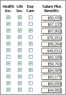
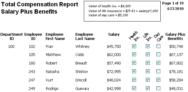
In the following DataWindow object, the Salary Plus Benefits column has a Shadow box border around every data value in the column. To display the border, you set the border property for the column:
In some cases, however, you might want some properties of controls in DataWindow objects to be driven by the data, which is not known when you are defining the DataWindow object in the painter. For these situations you can define property conditional expressions, which are expressions that are evaluated at runtime.
You can use these expressions to conditionally and dynamically modify the appearance and behavior of your DataWindow object at runtime. The results of the expressions set the values of properties of controls in the DataWindow object.
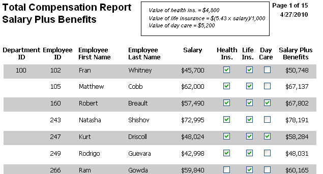
In the following DataWindow object, the Salary Plus Benefits column has a Shadow box border highlighting each data value that is greater than $60,000:
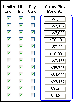
To control the display of the border, you define a property conditional expression for the column's Border property. When users run the DataWindow object, PowerBuilder changes the border of individual data values based on the condition (value greater than $60,000).
Defining an expression
The following illustration shows the Salary_Plus_Benefits column selected in the Design view. To the right of the Design view, the Properties view shows properties for the column, including the Border property. Next to the Border property is a button for accessing the dialog box where you enter the expression. The button displays an equals sign with a slash through it when no expression has been entered, and an equals sign without a slash when it has.
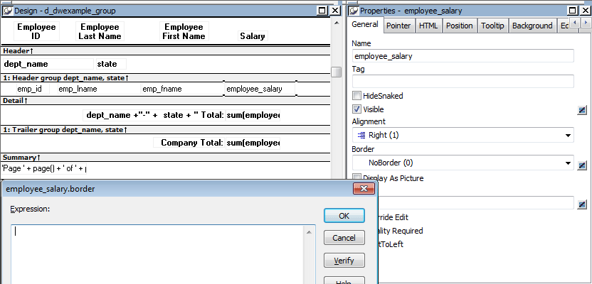
In this example the Border property is set to NoBorder in the Properties view. However, the expression defined for the property overrides that setting at runtime.
A closer look at the expression
The expression you enter almost always begins with If. Then you specify three things: the condition, what happens if it is true, and what happens if it is false. Parentheses surround the three things and commas separate them:
If( expression, true, false )
The following expression is used in the example. Because the expression is for the Border property, the values for true and false indicate particular borders. The value 1 means Shadow box border and the value 0 means no border:
If(salary_plus_benefits > 60000, 1, 0)
When users run the DataWindow object, PowerBuilder checks the value in the computed column called salary_plus_benefits to see if it is greater than 60,000. If it is (true), PowerBuilder displays the value with the Shadow box border. If not (false), PowerBuilder displays the value with no border.
About specifying properties
Usually you specify a number to indicate what you want for a particular property. For example, the following list shows all of the borders you can specify and the numbers you use. If you want the border property to be Shadow box, you specify 1 in the If statement, for either true or false.
0—None
1—Shadow box
2—Box
3—Resize
4—Underline
5—3D Lowered
6—3D Raised
In the Properties view, the list of choices for setting a property includes the values that correspond to choices in parentheses. This makes it easier to define an expression for a property; you do not need to look up the values. For example, if you want to specify the ResizeBorder in your expression, you use the number 3, as shown in the drop-down list.

For details on the values of properties that can be set using expressions, see Supplying property values.
For complete information about what the valid values are for all properties associated with a DataWindow object, see the discussion of DataWindow object properties in DataWindow Object Properties in DataWindow Reference.
About modifying properties programmatically
You can also programmatically modify the properties of controls in a DataWindow object at runtime. For more information, see DataWindow Reference and DataWindow Programmers Guide.
Modifying properties at runtime described how you can use conditional expressions that are evaluated at runtime to highlight information in a DataWindow object.This section presents a procedure for modifying properties at runtime and some examples.
To modify properties conditionally at runtime:
-
Position the pointer on the control, band, or DataWindow object background whose properties you want to modify at runtime.
-
Select Properties from the pop-up menu, then select the page that contains the property you want to modify at runtime.
-
Click the button next to the property you want to change.
-
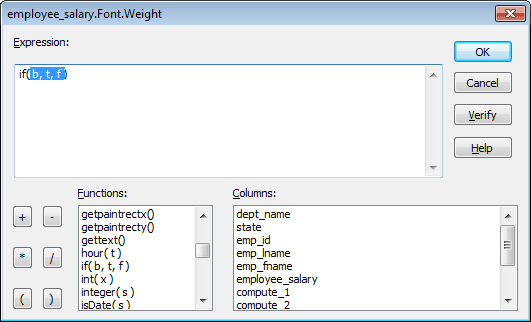
Scroll the list of functions in the Functions box until you see the IF function, and then select it:
-
Replace the b (boolean) with your condition (for example, salary>40000).
You can select columns and functions and use the buttons to add the symbols shown on them.
-
Replace the t (true) with the value to use for the property if the condition is true.
Values to use for properties are usually numbers. They are different for each property. For more information about property values that can be set on the Expressions page, see Supplying property values.
Set Font.Weight property to 700 for bold
Font properties such as Italic, Strikethrough, and Underline take a boolean value, but to specify a value for bold, you use the Font.Weight property, which takes a range of values. For values and an example, see Font.Weight.
For complete information about what the valid values are for all properties of controls in the DataWindow object, see the discussion of DataWindow object properties in DataWindow Object Properties in DataWindow Reference.
-
Replace the f (false) with the value to use for the property if the condition is false.
-
Click OK.
For examples, see Example 1: creating a gray bar effect, Example 2: rotating controls, Example 3: highlighting rows of data, and Example 4: changing the size and location of controls.
The following DataWindow object shows alternate rows with a light gray bar. The gray bars make it easier to track data values across the row:
To create the gray bar effect:
-
Add a rectangle control to the detail band and size it so that it surrounds the controls you want highlighted.
-
To make sure that you have selected the detail band, select the Position tab in the Properties view and select Band from the Layer drop-down list.
-
To make it easier to see what you are doing in the Design view, select the General tab and set the Brush Color to White and the Pen Color to Black. A narrow black line forms a boundary around the rectangle.
-
Select Send to Back from the rectangle's pop-up menu.
-
To hide the border of the rectangle, set the Pen Style to No Visible Line.
-
Click the button next to the Brush Color property on the General page.
-
In the Modify Expression dialog box, enter the following expression for the Brush.Color property:
If(mod(getrow(),2 )=1, rgb(255, 255, 255 ), rgb(240, 240, 240 ))
The mod function takes the row number (getrow()), divides it by 2, then returns the remainder. The remainder can be either 0 or 1. If the row number is odd, mod returns 1; if the row number is even, mod returns 0.
The expression mod(getrow(),2)=1 distinguishes odd rows from even rows.
The rgb function specifies maximum amounts of red, green, and blue: rgb (255, 255, 255). Specifying 255 for red, green, and blue results in the color white.
If the row number is odd (the condition evaluates as true), the rectangle displays as white. If the row number is even (the condition evaluates as false), the rectangle displays as light gray (rgb (240, 240, 240)).
The following DataWindow object shows the column headers for Health Insurance, Life Insurance, and Day Care rotated 45 degrees.
To rotate each of these three text controls:
-
Select one of the controls, then use Ctrl + click to select the other two controls.
The Properties view changes to show the properties that are common to all selected controls.
-
On the Font page in the Properties view, click the button next to the Escapement property.
-
Enter the number 450 in the Modify Expression dialog box and click OK.
The value entered for font escapement is in tenths of degrees, so the number 450 means 45 degrees. You do not have to specify a condition. Typically, you do not specify a condition for control rotation.
The rotation of the controls does not change in the Design view.
-
To see the change, close and reopen the Preview view.
The following DataWindow object is an employee phone list for a company in Massachusetts. Out-of-state (not in Massachusetts) employees are shown in bold and preceded by two asterisks (**):
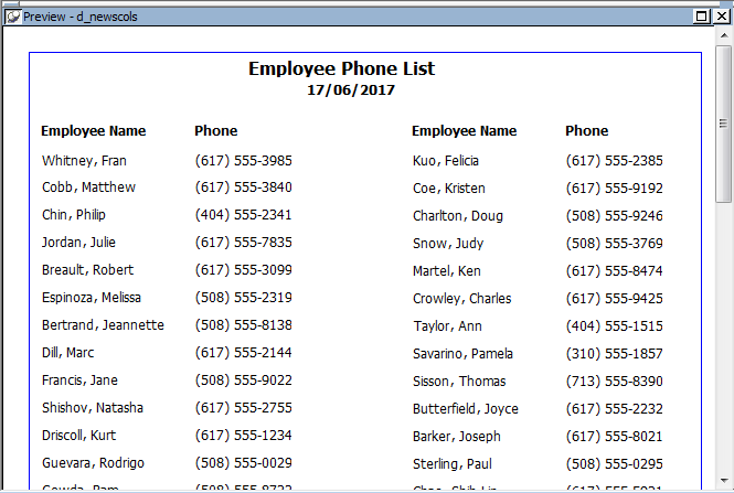
This DataWindow object uses newspaper columns. To understand how to create this DataWindow object without highlighting data, see Printing with newspaper-style columns.
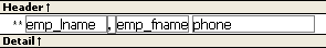
In the Design view, the detail band includes four controls: the employee last name, a comma, the employee first name, and the phone number:
To make these controls display in bold with two asterisks if the employee is not from Massachusetts:
-
Select one of the controls, then use Ctrl + click to select the other three controls.
The Properties view changes to show the properties that are common to all selected controls.
-
On the Font page in the Properties view, click the button next to the Bold property.
-
Enter the following expression in the Modify Expression dialog box and click OK:
If(state = 'MA', 400, 700)
The expression states that if the value of the state column is MA, use 400 as the font weight. This means employees from Massachusetts display in the normal font. For any state except MA, use 700 as the font weight. This means all other employees display in bold font.
Logic that relies on the state column
To use logic that relies on the state column, you need to include the column in the data source. You can add the column after creating the DataWindow object by modifying the data source. Notice that the state column does not actually appear anywhere in the DataWindow object. Values must be available but do not need to be included in the DataWindow object.
-
To insert two asterisks (**) in front of the employee name if the employee is not from Massachusetts, add a text control to the left of the employee name with the two asterisks in bold.
-
With the text control selected, click the button next to its Visible property on the General page in the Properties view.
-
In the Modify Expression dialog box that displays, enter the following expression and click OK:
If(state = 'MA', 0, 1)
This expression says that if the state of the employee is MA (the true condition), the Visible property of the ** control is off (indicated by 0). If the state of the employee is not MA (the false condition), the Visible property of the ** control is on (indicated by 1). The asterisks are visible next to that employee's name.
Tip
You can use underlines, italics, strikethrough, borders, and colors to highlight information.
The following DataWindow object shows city and state columns enclosed in a rectangle and underlined. The columns change location if the current row contains data for a customer from the state of New York. The rectangle and the line change both location and size.

This example shows how to move the rectangle and line. The process for columns is similar.
In the Design view, the rectangle and line display in one location, with a single set of dimensions. The expressions you specify are used only in Preview view and at runtime and all have the following syntax:
If ( state='NY', true value, false value )
The false value is the same as the value in Design view. All of the values used in this example are in PowerBuilder Units (PBUs), the default unit of measure used for the DataWindow object.
To change properties of the rectangle and the line for rows with the state column equal to New York:
-
Select the rectangle, display the Position page in the Properties view, and specify expressions for the following properties:
Property
Expression
X
if (state = 'NY', 2890, 1865)
Width
if (state = 'NY', 500, 1000)
Height
if (state = 'NY', 160, 120)
-
Select the line, display the Position page in the Properties view, and specify expressions for the following properties:
Property
Expression
X1
if (state = 'NY', 2890, 1865)
Y1
if (state = 'NY', 168, 132)
X2
if (state = 'NY', 3400, 2865)
Y2
if (state = 'NY', 168, 132)
-
On the General page for the line, specify this expression for Pen Width:
if (state = 'NY', 10, 4)
At runtime, the rectangle is taller and narrower, and the line is shorter and has a wider pen width.
Each property has its own set of property values that you can use to specify the true and false conditions in the If expression. Usually you specify a number to indicate what you want. For example, if you are working with the Border property, you use the number 0, 1, 2, 3, 4, 5, or 6 to specify a border.
The following table summarizes the properties available. A detailed description of each property follows the table. For a complete list of properties for each control, see Objects and Controls.
Valid values of properties are shown in parentheses in the Properties view wherever possible.
For example, the drop-down list showing border selections includes the correct number for specifying each border in parentheses after the name of the border (ShadowBox, Underline).
|
Property |
Painter option in Properties view |
Description |
|---|---|---|
|
Background Color on Background page or Font page |
Background color of a control |
|
|
Border on General page |
Border of a control |
|
|
Brush Color on General page |
Color of a graphic control |
|
|
Brush Hatch on General page |
Pattern used to fill a graphic control |
|
|
Text Color on Font page; Color on General page; Line Color on General page |
Color of text for text controls, columns, and computed fields; background color for the DataWindow object; line color for graphs |
|
|
Escapement on Font page |
Rotation of a control |
|
|
Size on Font page |
Height of text |
|
|
Italic on Font page |
Use of italic font for text |
|
|
Strikeout on Font page |
Use of strikethrough for text |
|
|
Underline on Font page |
Use of underlining for text |
|
|
Bold on Font page |
Weight (for example, bold) of text font |
|
|
Format on Format page |
Display format for columns and computed fields |
|
|
Height on Position page |
Height of a control |
|
|
Pen Color on General page |
Color of a line or the line surrounding a graphic control |
|
|
Pen Style on General page |
Style of a line or the line surrounding a graphic control |
|
|
Pen Width on General page |
Width of a line or the line surrounding a graphic control |
|
|
Pointer on Pointer page |
Image to be used for the pointer |
|
|
Protect on General page |
Whether a column can be edited |
|
|
Timer Interval on General page |
How often time fields are to be updated |
|
|
Visible on General page |
Whether a control is visible |
|
|
Width on Position page |
Width of a control |
|
|
X on Position page |
X position of a control |
|
|
X1, X2 on Position page |
X coordinates of either end of a line |
|
|
Y on Position page |
Y position of a control relative to the band in which it is located |
|
|
Y1, Y2 on Position page |
Y coordinates of either end of a line |
Description
Setting for the background color of a control.
In the painter
Background Color on the Background page or Font page in the Properties view.
Value
A number that specifies the control's background color.
For information on specifying colors, see Specifying colors.
The background color of a line is the color that displays between the segments of the line when the pen style is not solid.
If Background.Mode is transparent, Background.Color is ignored.
Example
The following statement specifies that if the person represented by the current row uses the day care benefit, the background color of the control is set to light gray. If not, the background color is set to white:
If(bene_day_care = 'Y', 15790320, 16777215)
In this example, the condition is applied to the Background.Color property for three controls: the emp_id column, the emp_fname column, and the emp_lname column.
The following is a portion of the resulting DataWindow object. Notice that the employee ID, first name, and last name have a gray background if the employee uses the day care benefit:

Description
The type of border for the control.
In the painter
Border on the General page in the Properties view.
Value
A number that specifies the type of border. Values are:
-
0—None
-
1—Shadow box
-
2—Box
-
3—Resize
-
4—Underline
-
5—3D Lowered
-
6—3D Raised
Example
The following statement specifies that if the person represented by the current row has a status of L (on leave), the status column displays with a Shadow box border:
If(status = 'L', 1, 0)
In this example, the condition is applied to the Border property of the status column.
The following is a portion of the resulting DataWindow object. Notice that the status On Leave displays with a Shadow box border:
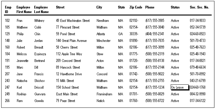
About the value L and the value On Leave
The status column uses an edit style. The internal value for on leave is L and the display value is On Leave. The conditional expression references the internal value L, which is the actual value stored in the database. The DataWindow object shows the value On Leave, which is the display value assigned to the value L in the code table for the Status edit style.
Description
Setting for the fill color of a graphic control.
In the painter
Brush Color on the General page in the Properties view.
Value
A number that specifies the color that fills the control.
For information on specifying colors, see Specifying colors.
Example
See the example for Brush.Hatch.
Description
Setting for the fill pattern of a graphic control.
In the painter
Brush Hatch on the General page in the Properties view.
Value
A number that specifies the pattern that fills the control. Values are:
-
0—Horizontal
-
1—Bdiagonal (lines from lower left to upper right)
-
2—Vertical
-
3—Cross
-
4—Fdiagonal (lines from upper left to lower right)
-
5—DiagCross
-
6—Solid
-
7—Transparent
-
8—Background (use the values on the Background tab)
Example
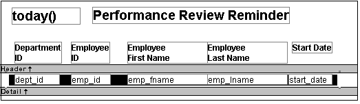
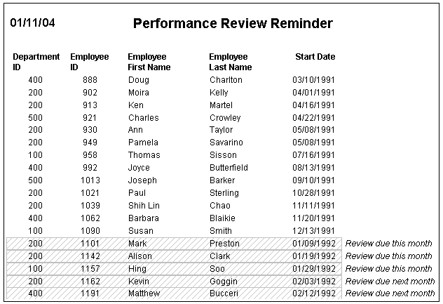
In this example, statements check the employee's start date to see if the month is the current month or the month following the current month. Properties of a rectangle control placed behind the row of data are changed to highlight employees with months of hire that match the current month or the month following the current month.
The Design view includes columns of data and a rectangle behind the data. The rectangle has been changed to black in the following picture to make it stand out:
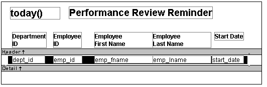
The following statement is for the Brush.Color property of the rectangle. If the month of the start date matches the current month or the next one, Brush.Color is set to light gray. If not, it is set to white, which means it will not show:
If(month( start_date ) = month(today())
or month( start_date ) = month(today())+1
or (month(today()) = 12 and month(start_date)=1),
12632256, 16777215)
The following statement is for the Brush.Hatch property of the rectangle. If the month of the start date matches the current month or the next one, Brush.Hatch is set to Bdiagonal. If not, it is set to Transparent, which means it will not show:
If(month( start_date ) = month(today())
or month( start_date ) = month(today())+1
or (month(today()) = 12 and month(start_date)=1),
1, 7)
Expressions are also provided for Pen.Color and Pen.Style.
For more about these properties and a picture, see Pen.Style.
Description
The color of text for text controls, columns, and computed fields; background color for the DataWindow object; line color for graphs.
In the painter
In the Properties view, Text Color on the Font property page; Color on the Background property page; Line Color on the General property page.
Value
A number that specifies the color used for text.
For information on specifying colors, see Specifying colors.
Example
The following statement is for the Color property of the emp_id, emp_fname, emp_lname, and emp_birth_date columns:
If(month(birth_date) = month (today()), 255, 0)
If the employee has a birthday in the current month, the information for the employee displays in red. Otherwise, the information displays in black.
The Font.Underline property has the same conditional expression defined for it so that the example shows clearly on paper when printed in black and white.
Description
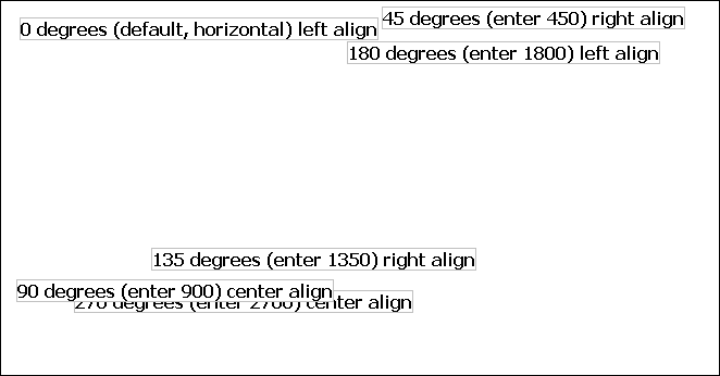
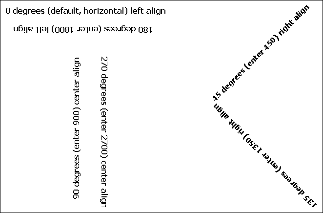
The angle of rotation from the baseline of the text.
In the painter
Escapement on the Font page in the Properties view.
Value
An integer in tenths of degrees. For example, 450 means 45 degrees. 0 is horizontal.
The alignment of the text affects the point of rotation.
Left—Rotates on the bottom left of the control
Right—Rotates on the top right of the control
Center—Rotates on the center of the control
Example
To enter rotation for a control, select the control in the Design view and click the button next to the Escapement property in the Properties view. In the dialog box that displays, enter the number of tenths of degrees.
The following picture shows the Design view with a number of text controls. Each text control shows the Font.Escapement value entered and the number of degrees of rotation. In the Design view, you do not see rotation; it looks as if the controls are all mixed up. Some controls seem to overlie each other:
The next picture shows the same controls at runtime. Each control is rotated appropriately, based on the Font.Escapement and Alignment values:
How to position controls that are rotated
Make the controls movable. To do so, display each control and select the Moveable check box in the Position page. Then in the Preview view, click the rotated text control until a gray box displays (try the center of the text). Drag the rotated control where you want it. In the Design view, the controls will be wherever you dragged them. They may look incorrectly positioned in the Design view, but they will be correctly positioned when you run the DataWindow object. When you are satisfied with the positioning, you can clear the Moveable check box for the controls to ensure that they stay where you want them.
Description
The height of the text.
In the painter
Size on the Font page in the Properties view.
Value
An integer in the unit of measure specified for the DataWindow object. Units of measure include PowerBuilder units, thousandths of an inch (1000 = 1 inch), thousandths of a centimeter (1000 = 1 centimeter), or pixels. To specify size in points, specify a negative number.
Example
The following statement is specified for the Font.Height property of a text control. Note that the DataWindow object is defined as using thousandths of an inch as its unit of measure. The statement says that if the control is in the first row, show the text 1/2-inch high (500 1/1000ths of an inch) and if it is not the first, show the text 1/5-inch high (200 1/1000ths of an inch):
If(GetRow() = 1, 500, 200)
The boundaries of the control might need to be extended to allow for the increased size of the text. At runtime, the first occurrence of the text control is big (1/2 inch); subsequent ones are small (1/5 inch).
Description
A number that specifies whether the text should be italic.
In the painter
Italic on the Font page in the Properties view.
Value
Values are:
-
0—Not italic
-
1—Italic
Example
The following statements are specified for the Font.Italic, Font.Underline, and Font.Weight properties, respectively. If the employee has health insurance, the employee's information displays in italics. If not, the employee's information displays in bold and underlined:
If(bene_health_ins = 'Y', 1, 0)
If(bene_health_ins = 'N', 1, 0)
If(bene_health_ins = 'N', 700, 400)
Statements are specified in this way for four controls: the emp_id column, the emp_fname column, the emp_lname column, and the emp_salary column. In the resulting DataWindow object, those with health insurance display in italics. Those without health insurance are emphasized with bold and underlining:

Description
A number that specifies whether the text should be crossed out.
In the painter
Strikeout on the Font page in the Properties view.
Value
Values are:
-
0—Not crossed out
-
1—Crossed out
Example
The following statement is for the Font.Strikethrough property of the emp_id, emp_fname, emp_lname, and emp_salary columns. The status column must be included in the data source even though it does not appear in the DataWindow object itself. The statement says that if the employee's status is L, which means On Leave, cross out the text in the control:
If(status = 'L', 1, 0)
An extra text control is included to the right of the detail line. It becomes visible only if the status of the row is L (see Visible).
The following is a portion of the resulting DataWindow object. It shows two employees who are On Leave. The four columns of information show as crossed out:

Description
A number that specifies whether the text should be underlined.
In the painter
Underline on the Font page in the Properties view.
Value
Values are:
-
0—Not underlined
-
1—Underlined
Example
The following statement, when applied to the Font.Underline property of columns of employee information, causes the information to be underlined if the employee does not have health insurance:
If(bene_health_ins = 'N', 1, 0)
For pictures of this example, see Font.Italic.
Description
The weight of the text.
In the painter
Bold on the Font page in the Properties view.
Value
Values are:
-
100—Thin
-
200—Extra light
-
300—Light
-
400—Normal
-
500—Medium
-
600—Semibold
-
700—Bold
-
800—Extrabold
-
900—Heavy
Most commonly used values
The most commonly used values are 400 (Normal) and 700 (Bold). Your printer driver might not support all of the settings.
Example
The following statement, when applied to the Font.Weight property of columns of employee information, causes the information to be displayed in bold if the employee does not have health insurance:
If(bene_health_ins = 'N', 700, 400)
For pictures of this example, see Font.Italic.
Description
The display format for a column.
In the painter
Format on the Format page in the Properties view.
Values
A string specifying the display format.
Example
The following statement, when applied to the Format property of the Salary column, causes the column to display the word Overpaid for any salary greater than $60,000 and Underpaid for any salary under $60,000:
If(salary>60000, 'Overpaid', 'Underpaid')
Edit Mask edit style change
The Edit Mask edit style assigned to the salary column had to be changed. Because edit styles take precedence over display formats, it was necessary to change the edit style assigned to the salary column (an Edit Mask edit style) to the Edit edit style.
Description
The height of the column or other control.
In the painter
Height on the Position page in the Properties view.
Value
An integer in the unit of measure specified for the DataWindow object. Units of measure include PowerBuilder units, thousandths of an inch (1000 = 1 inch), thousandths of a centimeter (1000 = 1 centimeter), or pixels.
Example
The following statement causes the height of a rectangle to be 160 PowerBuilder units if the state column for the row has the value NY. Otherwise, the rectangle is 120 PowerBuilder units high:
if (state = 'NY', 160, 120)
For more details and pictures, see Example 4: changing the size and location of controls.
Description
The color of the line or the outline of a graphic control.
In the painter
Pen Color on the General page in the Properties view.
Value
A number that specifies the color of the line or outline.
For information on specifying colors, see Specifying colors.
Example
See the example for the Pen.Style property.
Description
The style of the line or the outline of a graphic control.
In the painter
Pen Style on the General page in the Properties view.
Value
Values are:
-
0—Solid
-
1—Dash
-
2—Dotted
-
3—Dash-dot pattern
-
4—Dash-dot-dot pattern
-
5—Null (no visible line)
Example
In this example, statements check the employee's start date to see if the month is the current month or the month following the current month. Properties of a rectangle control placed behind the row of data are changed to highlight employees with months of hire that match the current month or the month following the current month.
The Design view includes columns of data and a rectangle behind the data. The rectangle has been changed to black in the following picture to make it stand out:
The following statement is for the Pen.Color property of the line around the edge of the rectangle. If the month of the start date matches the current month or the next one, Pen.Color is set to light gray. If not, it is set to white, which means it will not show:
If(month( start_date ) = month(today())
or month( start_date ) = month(today())+1
or (month(today()) = 12 and month(start_date)=1), 12632256, 16777215)
The following statement is for the Pen.Style property of the rectangle. If the month of the start date matches the current month or the next one, Pen.Style is set to Solid. If not, it is set to NULL, which means it will not show:
If(month( start_date ) = month(today())
or month( start_date ) = month(today())+1
or (month(today()) = 12 and month(start_date)=1), 0, 5)
Expressions are also defined for Brush.Color and Brush.Hatch.
For more about these properties, see Brush.Color and Brush.Hatch.
The following is a portion of the resulting DataWindow object. A rectangle with light gray cross-hatching highlights employees whose reviews are due soon. The line enclosing the rectangle is Light Gray and uses the pen style Solid:
Description
The width of the line or the outline of a graphic control.
In the painter
Pen Width on the General page in the Properties view.
Value
An integer in the unit of measure specified for the DataWindow object. Units of measure include PowerBuilder units, thousandths of an inch (1000 = 1 inch), thousandths of a centimeter (1000 = 1 centimeter), or pixels.
Example
The following statement causes the width of a line to be 10 PowerBuilder units if the state column for the row has the value NY. Otherwise, the line is 4 PowerBuilder units wide:
If(state = 'NY', 10, 4)
For more details and pictures, see Example 4: changing the size and location of controls.
Description
The image used for the mouse pointer when the pointer is over the specified control.
In the painter
Pointer on the Pointer page in the Properties view.
Value
A string that specifies a value of the Pointer enumerated data type or the name of a cursor file (CUR) used for the pointer.
Values of the Pointer enumerated data type are:
-
Arrow!
-
Cross!
-
HourGlass!
-
IBeam!
-
Icon!
-
Size!
-
SizeNESW!
-
SizeNS!
-
SizeNWSE!
-
SizeWE!
-
UpArrow!
Example
The following condition, entered for the Pointer property of every control in a row of expense data, changes the pointer to a column every time the value in the expense column exceeds $100,000. Note that the pointer has no meaning in a printed report. The pointer is for use on the screen display of a DataWindow object:
If(expense 100000, 'pbcolumn.cur', 'arrow!')
Description
The protection setting of a column.
In the painter
Protect on the General page in the Properties view.
Value
Values are:
-
0—False, the column is not protected
-
1—True, the column is protected
In the painter
Timer Interval on the General page in the Properties view.
Description
The number of milliseconds between the internal timer events.
Value
The default is 0 (which is defined to mean 60,000 milliseconds or one minute).
Description
Whether the control is visible in the DataWindow object.
In the painter
Visible on the General page in the Properties view.
Value
Values are:
-
0—Not visible
-
1—Visible
Example
The following statement is for the Visible property of a text control with the words On Leave located to the right of columns of employee information. The statement says that if the current employee's status is L, which means On Leave, the text control is visible. Otherwise, it is invisible:
If(status = 'L', 1, 0)
The status column must be retrieved
The status column must be included in the data source even though it does not appear in the DataWindow object itself.
The Design view includes the text control at the right-hand end of the detail line. The text control is visible at runtime only if the value of the status column for the row is L.
In the resulting DataWindow object, the text control is visible only for the two employees on leave. For a picture, see Font.Strikethrough.
Description
The width of the control.
In the painter
Width on the Position page in the Properties view.
Value
An integer in the unit of measure specified for the DataWindow object. Units of measure include PowerBuilder units, thousandths of an inch (1000 = 1 inch), thousandths of a centimeter (1000 = 1 centimeter), or pixels.
Example
The following statement causes the width of a rectangle to be 500 PowerBuilder units if the state column for the row has the value NY. Otherwise, the rectangle is 1000 PowerBuilder units wide:
if (state = 'NY', 500, 1000)
For more details and pictures, see Example 4: changing the size and location of controls.
Description
The distance of the control from the left edge of the DataWindow object. At runtime, the distance from the left edge of the DataWindow object is calculated by adding the margin to the x value.
In the painter
X on the Position page in the Properties view.
Value
An integer in the unit of measure specified for the DataWindow object. Units of measure include PowerBuilder units, thousandths of an inch (1000 = 1 inch), thousandths of a centimeter (1000 = 1 centimeter), or pixels.
Example
The following statement causes a rectangle to be located 6.250 inches from the left if the state column for the row has the value NY. Otherwise, the rectangle is 4.000 inches from the left:
If(state = 'NY', 6250, 4000)
For more details and pictures, see Example 4: changing the size and location of controls.
Description
The distance of each end of the line from the left edge of the DataWindow object as measured in the Design view. At runtime, the distance from the left edge of the DataWindow object is calculated by adding the margin to the x1 and x2 values.
In the painter
X1, X2 on the Position page in the Properties view.
Value
Integers in the unit of measure specified for the DataWindow object. Units of measure include PowerBuilder units, thousandths of an inch (1000 = 1 inch), thousandths of a centimeter (1000 = 1 centimeter), or pixels.
Example
The following statements for the X1 and X2 properties of a line cause the line to extend from 6.250 to 7.150 inches from the left if the state column for the row has the value NY. Otherwise, the line extends from 4.000 to 6.000 inches from the left:
If(state = 'NY', 6250, 4000)
If(state = 'NY', 7150, 6000)
For more details and pictures, see Example 4: changing the size and location of controls.
Description
The distance of the control from the top of the band in which the control is located.
In the painter
Y on the Position page in the Properties view.
Value
An integer in the unit of measure specified for the DataWindow object. Units of measure include PowerBuilder units, thousandths of an inch (1000 = 1 inch), thousandths of a centimeter (1000 = 1 centimeter), or pixels.
Example
For information, see Example 4: changing the size and location of controls.
Description
The distance of each end of the specified line from the top of the band in which the line is located.
In the painter
Y1, Y2 on the Position page in the Properties view.
Value
Integers in the unit of measure specified for the DataWindow object. Units of measure include PowerBuilder units, thousandths of an inch (1000 = 1 inch), thousandths of a centimeter (1000 = 1 centimeter), or pixels.
Example
The following statements for the Y1 and Y2 properties of a line cause the line to be located .400 inches (Y1 and Y2 equal .400 inches) from the top of the detail band, if the state column for the row has the value NY. Otherwise, the line is located .250 inches (Y1 and Y2 equal .250 inches) from the top of the detail band:
If(state = 'NY', 400, 250)
If(state = 'NY', 400, 250)
For more details and pictures, see Example 4: changing the size and location of controls.
You specify a color by specifying a number that represents the color. You can specify the number explicitly or by using an expression that includes the RGB (r, g, b) function.
For the numbers and expressions that specify common colors, see the following table.
How the number is calculated
The formula for combining color values into a number is:
red + 256*green + 256*256*blue
where the amount of each primary color (red, green, and blue) is specified as a value from 0 to 255.
The RGB function calculates the number from the amounts of red, green, and blue specified.
Sample numeric calculation
To create cyan, you use blue and green, but no red. If you wanted to create the most saturated (bright) cyan, you would use maximum amounts of blue and green in the formula, which is indicated by the number 255 for each. The following statements show the calculation:
red + 256*green + 256*256*blue
0 + 256*255 + 256*256*255
0 + 65280 + 16711680
16776960
Sample expression using the RGB function
The following expression specifies the brightest cyan:
RGB (0,255,255)
Notice that the expression specifies the maximum for green and blue and 0 for red. The expression returns the value 16776960. To specify cyan, entering the expression RGB(0, 255, 255) is the same as entering the number 16776960.
Numbers and expressions to enter for the common colors
The following table shows the numbers and expressions to enter for some common colors. The number and expression for a color are equivalent. You can use either.
|
Color |
Expression to enter |
Number to enter |
How the number is calculated |
|---|---|---|---|
|
Black |
RGB (0, 0, 0) |
0 |
0 (no color) |
|
Blue |
RGB (0, 0, 255) |
16711680 |
256*256*255 (blue only) |
|
Cyan |
RGB (0, 255, 255) |
16776960 |
256*255 + 256*256*255 (green and blue) |
|
Dark Green |
RGB (0, 128, 0) |
32768 |
256*128 (green only) |
|
Green |
RGB (0, 255, 0) |
65280 |
256*255 (green only) |
|
Light Gray |
RGB (192, 192, 192) |
12632256 |
192 + 256*192 + 256*256*192 (some red, green, and blue in equal amounts) |
|
Lighter Gray |
RGB (224, 224, 224) |
14737632 |
224 + 256*224 + 256*256*224 (some red, green, and blue in equal amounts) |
|
Lightest Gray |
RGB (240, 240, 240) |
15790320 |
240 + 256*240 + 256*256*240 (some red, green, and blue in equal amounts) |
|
Magenta |
RGB (255, 0, 255) |
16711935 |
255 + 256*256*255 (red and blue) |
|
Red |
RGB (255, 0, 0) |
255 |
255 (red only) |
|
White |
RGB (255, 255, 255) |
16777215 |
255 + 256*255 + 256*256*255 (red, green, and blue in equal amounts at the maximum of 255) |
|
Yellow |
RGB (255, 255, 0) |
65535 |
255 + 256*255 (red and green) |
