When you are developing an application for mobile device, you probably want to make it universal and run on various mobile devices, such as iPad, Android tablets etc. There are basically two ways to achieve this:
-
Method 1: Resize the windows and controls at runtime to fit with the various screen sizes. You will be required to remember all these screen sizes, and write code to resize the windows and controls.
-
Method 2: Use this Window Resizing tool to automatically scale the windows and its UI controls (except for controls in DataWindow objects) to fit with a wide range of mobile devices. This tool works especially well if the mobile devices have similar screen sizes, such as iPad and the Android tablets, or iPhone and the Android smart phones. See this section for details.

Click on the application name you want to configure, and the Screen Size table appears.
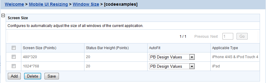
In the Screen Size table, you can:
-
Add a device: Click the Add button and select a device from the dropdown list box that appears.
The devices that Appeon claims to support and that you specified in Screen Size are listed for choices.
Automatically adding a device for an application
When a mobile device accesses the deployed application, the device will be automatically registered and the device screen size will be saved into the Screen Size table for the application if it is not registered. If the application UI is not properly displayed on a particular device, you can configure the window size for this particular device.
-
Delete devices: Check the checkboxes associated to the device(s) you want to delete and click Delete.
-
Configure size for all windows: You can specify one of the autofit modes which will automatically adjust all windows of the application from the AutoFit dropdown list box associated with the device, as shown in the following figure.
The modes and the corresponding descriptions are listed in the following table.
Table 47. Autofit mode
Mode
Descriptions
PB Design Values
Windows will be displayed in the original size on the target device.
This means windows will not be scaled, if the window is wider and/or longer than the screen, you would need to scroll to view the remaining part.
AutoFit to Full Width (X axis)
Windows will be displayed in full screen in the X direction only.
This means, windows will be scaled up or down in both the X and Y direction, until they reach the same width as the device screen, but probably not the same height, therefore, if the window is higher than the screen, you will need to scroll vertically to view the remaining part of the window.
AutoFit to Full Height (Y axis)
Windows will be displayed in full screen in the Y direction only.
This means windows will be scaled up or down in both the X and Y direction, until they reach the same height as the device screen, but probably not the same width, therefore, if the window is wider than the screen, you will need to scroll horizontally to view the remaining part of the window.
AutoFit to Full Screen (X & Y axis)
Windows will be displayed in full screen in both the X and Y directions.
This means windows will be scaled up or down to have the same height and the same width as the device screen, therefore, you can view the entire window and all of its controls in the device screen without needing to scroll.
Select one mode from the AutoFit options, and then click Save.
Once you have clicked Save, all windows of the application will be adjusted automatically by the selected mode.
Note: if new windows are added to the application, you will need to click Save again to manually apply the selected autofit mode to the new windows, otherwise, the new windows will be displayed in the original size (the PB design values), not in the selected autofit mode.

After you set the autofit mode for the application, all windows of the application will be adjusted by the selected mode, if any window needs to be adjusted differently, you can proceed to configure the size of each individual window in the Windows List table.
In the Windows List table (AEM > Mobile UI Resizing > Window Size > Application Name), all windows of the application is listed by default, including its original size in PB and the size in the selected device(s).
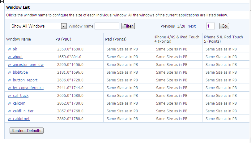
The size in the selected device(s) is determined by the selected autofit mode by default. When the autofit mode is changed, the size in the selected device(s) changes accordingly. For example, if you set the autofit mode to "Design value in PB" for iPad in the Device List table, then "Same size as in PB" will be displayed in the iPad column in the Window List table. If you configure the size of the individual window, then the new size for that window will be displayed.
View windows: You can select a search criteria from search field dropdown list box to narrow down your search area or/and input a keyword in the Window Name text box, and then click Filter to view windows that meet your request. You can also use page navigator on the top right of the Window List table to view the windows.
Restore defaults: You can revert all the windows to default by clicking the Restore Defaults button at the bottom.
To configure an individual window of the application, do the following:
Step 1: In the Window List table, click on the window you intend to configure.
In the Window Size Configuration table that displays, you will see a device screen simulator in which you can preview how the window will be displayed and adjust its size. Now you are ready to resize the window in the screen emulator:
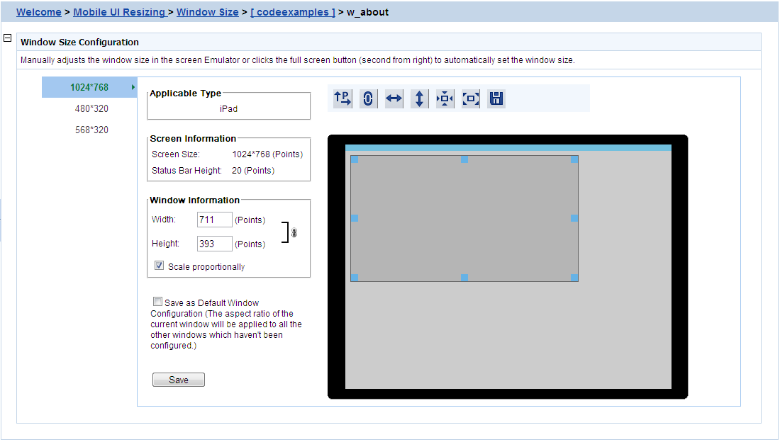
Step 2: Select a device name from the left column. The device(s) added to the Screen Size table are displayed. You need to configure the window size for each device separately.
Step 3: Select a displaying orientation (in landscape or in
portrait) by clicking the orientation icon ( ). You need to configure the window size for each
orientation separately.
). You need to configure the window size for each
orientation separately.
Step 4: (Optional) enable the proportional scale by either clicking
the proportional icon ( ) or check the Scale
proportionally checkbox. We kindly recommend that you keep this
enabled to avoid window deformations.
) or check the Scale
proportionally checkbox. We kindly recommend that you keep this
enabled to avoid window deformations.
Step 5: Use one of the following to resize the window:
-
Drag the corner of the window in the screen emulator; or
-
Click the full width icon (
 ), the full height icon (
 ), the original screen icon (
 ), or the full screen icon (
 ) above the screen simulator; or
-
Input the desired numbers in the Width and the Height text box under Window Information respectively.
The new size and the window coordinates (X & Y axis) will be displayed simultaneously.
Step 6: (Optional) if you want to apply the new size to the remaining windows, check the Save as default window configuration check box.
Step 7: Either click the save icon ( ) above the screen simulator or the Save button at the bottom to save all the
settings.
) above the screen simulator or the Save button at the bottom to save all the
settings.
You will not be able to save the window size, if AEM prompted "Current aspect ratio will lead to window deformation!". AEM performed detection immediately after the window is resized, to help prevent the window and control being stretched or shrunk unreasonably.
Notes:
1. Dragging the screen emulator to change a window coordinates does not work on windows that are opened using OpenSheet().
2. Windows that are configured using the Window Size tool may look differently on a device (such as an iPad) and in Appeon Workspace Emulator in UI.
-
On devices: The window, controls in the window, and texts will be scaled accordingly; other elements, such as pictures, will not be scaled.
-
In Appeon Workspace Emulator: The window and controls in it will be scaled accordingly; all elements, such as text, in the controls will not be scaled.
