Windows are the main interface between users and PowerBuilder applications. Windows can display information, request information from a user, and respond to mouse or keyboard actions.
Windows are separate objects that you create using the Window painter. In PowerBuilder, you can create windows anytime during the application development process.
In this lesson you:
How long does it take?
About 25 minutes.
Where you are
Change the tab order on the window
Code some Help events and preview the window
Write the script to open the window
Now you create a new window for the application. The window you create is a login window that allows the user to enter a user ID and password and connect to the database. The login window is a response window.
About response windows
Response windows are dialog boxes that require information from the user. Response windows are application modal. When a response window displays, it is the active window (it has focus) and no other window in the application is accessible until the user responds. The user can go to other applications, but when the user returns to the application, the response window is still active.
-
Click the New button (
 ) in the PowerBar.
The New dialog box displays.
-
Click the PB Object tab.
-
Select the Window icon and click OK.

The Window painter opens. Notice that you have two new toolbars, the StyleBar (with character style and text alignment buttons) and PainterBar3 (with color and border buttons, as well as grayed out control alignment buttons).
-
Make sure that the Layout view and the Properties view display in the Window painter.
You can display these views by selecting them from the View menu. If they are grayed out in the menu, the views are already displayed in the painter.
The default view layout scheme contains both views.
To retrieve the default painter layout
Select View>Layouts>Default from the workspace menu bar.
The rectangle in the Layout view represents the window you are building. The default properties in the Properties view indicate that the window is visible and enabled, and has the Main window type. You might need to scroll down in the Properties view to see the window type.
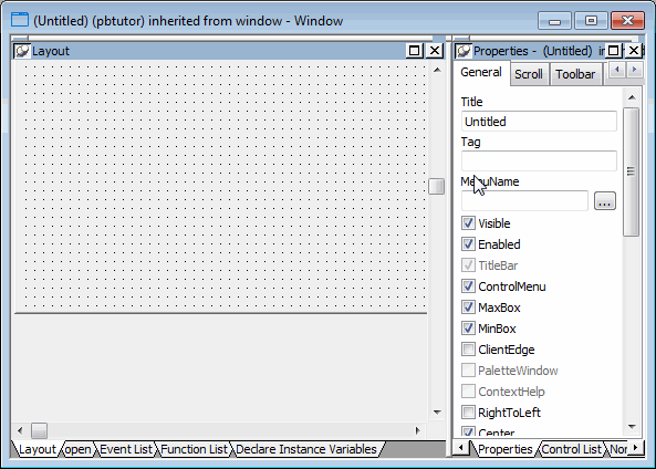
If your window does not have a pegboard look
If the window in your Layout view displays as a solid color, the Show Grid option has been disabled. To enable it, select Design>Options from the menu bar. Then select the Show Grid check box on the General page of the Options dialog box. Click Apply, then OK to save the change and close the dialog box.
-
Type Welcome in the Title text box on the General page of the Properties view.
-
Select response! in the Window Type drop-down list box.
Make sure the TitleBar and ControlMenu check boxes are selected.
Select the ContextHelp check box.
The ContextHelp property adds a question-mark button next to the (ControlMenu) close button in the login window's title bar. Users of your application can click the question-mark button to trigger Help events for the window controls. You can add a question-mark button to a response window, but not to a main window.
-
Click the Other tab in the Properties view.
Type 2300 in the Width text box and 1000 in the Height text box.
Press the Tab key.
The size of the window rectangle in the Layout view changes. The values you type are in PowerBuilder Units (PBUs). You might need to modify these values later, while you are adding controls to the window.
Other methods for entering position properties
You can use the spin controls (
 ) to enter values instead of typing
them.
Alternatively, you can change the size of the login window in the Layout view by moving the pointer to the bottom or right edge of the window. When it turns into a double-headed arrow, you can drag the arrow to change the window size.
-
Select File>Save from the menu bar.
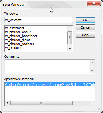
The Save Window dialog box displays. The only library in the Application Libraries text box is pbtutor.pbl, and it is selected.
-
Type w_welcome for the window name.
The prefix w_ is standard for windows.
-
(Optional) Type the following lines in the Comments text box:
This is the login window. It requires the application user to enter an ID and a password before continuing.
These comments are visible in the List view of the Library painter.
-
Click OK.
PowerBuilder saves the new login window. If you expand MyWorkspace, pbtutor, and pbtutor.pbl in the system tree, you can see w_welcome listed under it.
Where you are
Change the tab order on the window
Code some Help events and preview the window
Write the script to open the window
Controls allow users to interact with PowerBuilder objects, such as windows and DataWindows. You set properties of these controls and later add script for control events and functions.
Selecting a control button from the PainterBar
You can add controls from the Insert menu or by selecting a control button in PainterBar1. Unless you customize your toolbars, there is only one control button that appears in the PainterBar. When you first open a painter, PainterBar1 includes the CommandButton control button, which has a down arrow to its right. Clicking the down arrow displays a drop-down list of control buttons.
Some of the controls you can select from the drop-down list are described in the table below:
|
Button appearance |
Control type |
Use in tutorial |
|---|---|---|
|
|
CommandButton |
Default icon for the control button in PainterBar1. You add command buttons later in this lesson. |
|
|
Picture |
To add a picture to the login window. |
|
|
PictureHyperlink |
Not used in tutorial. Its purpose is to provide a link to a website. |
|
|
PictureButton |
Not used in tutorial. It is like a command button, but it displays a picture as well as text. |
|
|
StaticText |
To add text labels to the login window. |
|
|
StaticHyperLink |
To provide a link to a website. |
|
|
SingleLineEdit |
To add user entry text boxes to the login window. |
|
|
MultiLineEdit |
Not used in tutorial. Its purpose is to add a multiline edit text box. |
After you select a control, it appears in place of the CommandButton button on PainterBar1.
Adding controls with a 3D appearance
To make your controls look three dimensional, select Design>Options from the menu bar and make sure that the Default To 3D check box is selected on the General page of the Options dialog box. You can change the window background color from the default color of ButtonFace gray using the Properties view in the Window painter.
Now you modify the login window you just created by adding controls and changing some of their properties. You:
Now you add a Picture control to the login window.
-
Select the Picture button (
 ) from the drop-down list of controls
or
Select Insert>Control>Picture from the menu bar.
-
Click inside the rectangular window in the Layout view.
A Picture control displays at the selected location. At the same time you add the control, the Properties view switches from displaying the window properties to displaying the control properties.
If you do not see the Properties view, select View>Properties from the menu bar. If the Properties view does not display the control properties, click the picture control in the Layout view.
How to delete controls
If you add a control to the window and later decide you do not want it, select the control and press the Delete key. This deletes the control and its scripts.
-
Select the text p_1 in the Name text box on the General tab of the Properties view.
Type p_sports in the Name text box.
This names the Picture control. The prefix p_ is standard for Picture controls.
-
Click the ellipsis button next to the PictureName text box.
The Select Image dialog box displays.
-
Select the "Use a custom image" option, click the ellipsis button and navigate to the Tutorial directory if it is not already selected.
Select the tutsport.bmp file.
The bitmap you selected appears in the control you added to the Layout view. The Visible, Enabled, and OriginalSize check boxes are selected by default in the Properties view.
-
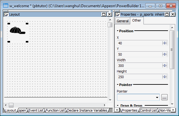
Make sure the picture control is selected in the Layout view.
Click the Other tab in the Properties view.
Type 40 in the X text box and 50 in the Y text box.
You can use the spin controls in the X and Y text boxes to enter these values. You might want to adjust the position of the picture control again after you preview the window at the end of this lesson.
-
Type 300 in the Width text box and 250 in the Height text box.
You change the size of the picture control. You might want to adjust the picture size again after you preview the window.
Now you add StaticText controls to the login window. You will use these controls to add descriptive labels to the login window.
-
Select the Text button (
 ) from the drop-down list of controls
or
Select Insert>Control>StaticText from the menu bar.
-
Click to the right of the Picture control you added in the Layout view.
A StaticText control displays at the selected location.
-
Right-click the StaticText control and select Duplicate from the pop-up menu.
PowerBuilder creates a duplicate of the selected control.
-
Select Duplicate from the StaticText control's pop-up menu again.
PowerBuilder creates another duplicate.
You now have three StaticText controls arranged vertically at the top of the window.
-
Adjust the location of the Static Text controls so that there are at least two grid lines between them.
Now you specify the properties of the StaticText controls (label text boxes) to define how they should appear on the login window.
-
Select the first StaticText control you added by clicking on it.
The Properties view displays properties of the StaticText control. If you do not see the Properties view, select View>Properties from the menu bar.
-
Select the text st_1 in the Name text box on the General page of the Properties view.
Type st_welcome in the Name text box.
Now the control has a more descriptive name. The prefix st_ is standard for StaticText controls.
-
Select the text none in the Text text box.
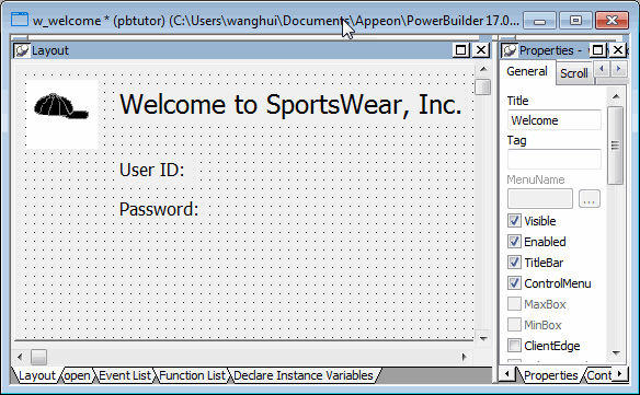
Type Welcome to SportsWear, Inc.
If you press Enter, click to another field or tab to another page in the Properties view, or click in a different view, the text you typed replaces none in the Layout view.
-
Click the Font tab in the Properties view.
Change the TextSize property for this control to 18 points.
The size of the text in the control changes.
The default typeface is Arial TrueType. You can select a different typeface and font size if this one is not available on your system.
Using the StyleBar
You can also use the StyleBar to change fonts. If you do not see the StyleBar, select Tools>Toolbars from the menu bar, click StyleBar in the Select Toolbar list box, and then select one of the Move positions such as bottom or floating.
-
Adjust the size of the StaticText control to fit the text you entered.
Keep adjusting the size until you see all of the text you entered.
To adjust the size, drag the upper-right corner of the control toward the upper-right corner of the window in the Layout view. You can also adjust the size by entering appropriate values on the Other page of the Properties view for this control.
-
Select the second StaticText control you added in the Layout view.
Type st_userid in the Name text box on the Properties view General page.
Type User ID: in the Text text box and press the Tab key.
The text displayed in the control changes.
-
Select the third StaticText control you added in the Layout view.
Type st_password in the Name text box on the Properties view General page.
Type Password: in the Text text box and press the Tab key.
Your changes display in the Layout view.
Now you add two SingleLineEdit controls to the window to allow the user to enter a user ID and password for connecting to the database. A SingleLineEdit control is a text box in which the user can enter a single line of text. SingleLineEdit controls are typically used for the input and output of data.
-
Select the SingleLineEdit button (
 ) from the drop-down list of controls
or
Select Insert>Control>SingleLineEdit from the menu bar.
-
Click to the right of the st_userid StaticText control in the Layout view.
A SingleLineEdit control displays where you clicked.
-
Increase the width of the SingleLineEdit control.
-
Right-click the SingleLineEdit control and select Duplicate from the pop-up menu.
Adjust the position of this SingleLineEdit control so that it is just to the right of the st_password StaticText control.
You should now have two SingleLineEdit controls arranged vertically to the right of the StaticText controls.
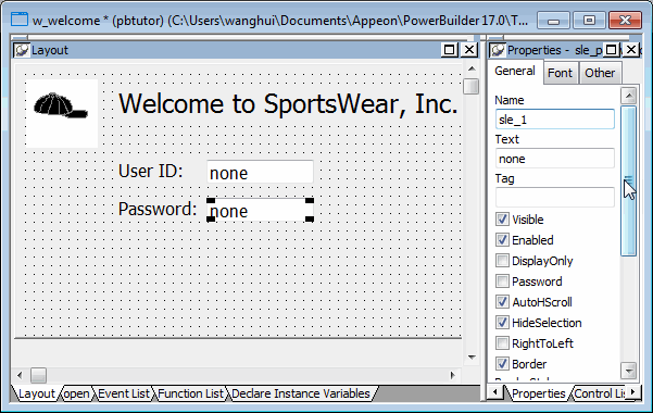
Now you define the properties of the SingleLineEdit controls you just added to the login window.
-
Select the first SingleLineEdit control you added.
The General page of the Properties view displays properties of the SingleLineEdit control. If you do not see the Properties view, select View>Properties from the menu bar.
-
Select the text sle_1 in the Name text box.
Type sle_userid in the Name text box.
Clear the default text none in the Text text box.
The prefix sle_ is standard for SingleLineEdit controls.
-
Select the second SingleLineEdit control you added.
Type sle_password in the Name text box.
Clear the default text none in the Text text box.
Select the Password check box.
Because you checked the Password check box, the password the user types at runtime will display as a string of asterisks.
Now you add CommandButton controls. Later you define scripts that execute when users click these buttons.
-
Select the CommandButton button (
 ) from the drop-down list of controls
or
Select Insert>Control>CommandButton from the menu bar.
-
Click to the right of the sle_userid SingleLineEdit control.
A CommandButton control displays where you clicked.
-
Right-click the CommandButton control and select Duplicate from the pop-up menu.
PowerBuilder creates a duplicate of the selected control.
-
Adjust the location of the controls as needed so that there is some space between them.
Now you define the properties of the CommandButton controls.
-
Select the top CommandButton control.
The General page of the Properties view displays properties of the CommandButton control.
-
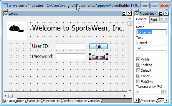
Type cb_ok in the Name text box on the Properties view General page.
Type OK in the Text text box.
Select the Default check box.
This step changes the default name of the control to something more descriptive and adds a text label (OK) to the button. Because you selected the Default check box, when an application user presses the Enter key, the Clicked event for this button will be triggered. (The user does not have to click the button itself for the event to be triggered.)
-
Select the bottom CommandButton control.
Type cb_cancel in the Name text box.
Type Cancel in the Text text box.
Select the Cancel check box.
Because you selected the Cancel check box, when an application user presses the Esc key, the Clicked event for this button will be triggered.
Where you are
> Change the tab order on the window
Code some Help events and preview the window
Write the script to open the window
When you place controls in a window, PowerBuilder assigns them a default tab order. The tab order determines the sequence in which focus moves from control to control when the user presses the Tab key.
Now you change the tab order for the window you created.
-
Select Format>Tab Order from the menu bar.
PowerBuilder displays the default tab order. The number in red at the right of each control shows the control's relative position in the tab order. Controls with the number zero are skipped when the user tabs in the window.
-
Click the tab order number for the sle_userid control.
Type 10 if the tab order value for this control is not already 10.
You can type a new tab order number only when the old number turns blue against a red background.
-
Make changes as needed so that the other controls have these values:
Click this control
Control name
Has this value
SingleLineEdit control for entering a password
sle_password
20
CommandButton control for the OK button
cb_ok
30
CommandButton control for the Cancel button
cb_cancel
40
-
Select Format>Tab Order from the menu bar.
This is a toggle switch. Selecting this menu item a second time saves your changes and clears the tab order numbers from the login window. You can also use the Tab Order button on the PainterBar.
Where you are
Change the tab order on the window
> Code some Help events and preview the window
Write the script to open the window
Now you use the Script view to add context-sensitive Help messages to the SingleLineEdit controls that you placed on the login window, and you preview the window.
Using the Script view
The Script view has three drop-down list boxes.
The first drop-down list box displays the list of available controls for the current object plus two special entries, Functions and Declare. The contents of the second drop-down list box depend on the selection in the first drop-down list box. The third drop-down list box contains all ancestor objects of the current object, if any.
|
Selection in first drop-down list box |
Contents of second drop-down list box |
Contents of third drop-down list box |
|---|---|---|
|
An object or control name |
List of events for the selected object or control. |
All of the ancestor objects of the current object, if any |
|
Functions |
List of editable functions. Displays (New Function) if no editable functions exist. |
All ancestor objects with functions having the same signature as selected function |
|
Declare |
List of declaration types: global, shared, and instance variables, and global and local external functions. |
Empty |
If the Script view is not currently displayed in your Window painter, you can open it by double-clicking an object in the Layout view.
-
Double-click the top SingleLineEdit control in the Layout view.
The object name, sle_userid, appears in the first drop-down list box in the Script view.
-
Select the Help event in the second drop-down list box in the Script view.
The Help event has the prototype: help (integer xpos, integer ypos) returns long [pbm_help]
-
Type the following line of PowerScript code in the script area:
ShowPopupHelp("pbtutor.chm", this, 100)You can find the pbtutor.chm file in the Tutorial directory. The second argument refers to the current SingleLineEdit control, and the last argument refers to a context ID in the pbtutor.chm file.
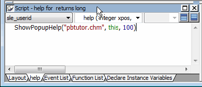
As you type text in the Script view, notice that PowerBuilder changes the text colors to show what kind of syntax element you have entered (such as keywords, variables, and comments).
-
Select sle_password from the first drop-down list box in the Script view.
Select the Help event in the second drop-down list box.
PowerBuilder compiles the code you typed for the Help event of the sle_userid SingleLineEdit text box. You now add a Help event for the sle_password SingleLineEdit text box.
-
Type the following lines in the script area:
ShowPopupHelp("pbtutor.chm", this, 200) -
Select File>Run/Preview from the menu bar
or
Click the Run/Preview Object in the PowerBar.
The Run dialog box displays. Be sure the Objects of Type list box displays Windows and the w_welcome object is selected.
Previewing the window
You can preview the window without running scripts by selecting Design>Preview on the menu bar or the Preview button in PainterBar1 (which uses the same icon as the Run/Preview Object button in the PowerBar). However, you must run scripts to view the results of the Help event scripts you just entered.
-
Click OK.
A message box prompts you to save your changes.
-
Click Yes.
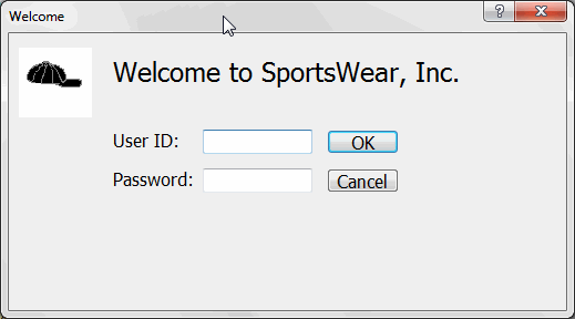
The login window appears as it would at runtime. If you do not like the window layout, you can change the size, location, and fonts of the window controls when you go back to the Window painter workspace.
-
Click the question-mark button in the login window title bar.
Click inside the sle_userid SingleLineEdit text box.
A message displays: Type your user ID here. This text is associated with context ID 100 in the pbtutor.chm file. You entered the context ID as an argument of the ShowPopupHelp call for the sle_userid Help event.
-
Click anywhere in the window to close the message.
Click inside the sle_password SingleLineEdit text box.
Press F1.
A message displays: Type your password here. This text is associated with context ID 200 in the pbtutor.chm file.
-
Click anywhere in the window to close the message.
Click the close button in the login window title bar.
You return to the Window painter workspace.
Later you add code to the Clicked event for the Cancel button that closes the application.
-
Close the Window painter by clicking the close button in PainterBar 1.
The close button is labeled with an x.
Where you are
Change the tab order on the window
Code some Help events and preview the window
> Write the script to open the window
Now you add a one-line script to open the login window as soon as the application starts executing. Although you could change the script in the Application object Open event to open the login window, in this tutorial you make the call to open the login window from the Open event of the MDI frame window. This window (w_pbtutor_frame) was created by the Template Application wizard.
In wizard-generated script, the frame window is called by the Application object Open event. When you add a call to open the login window from the MDI frame window Open event, the login window still displays before the frame window. Because the login window is a response window, it temporarily blocks execution of the remainder of the frame window Open event script.
In this exercise you:
Now you modify the frame window Open event script to open the login window.
Wizard-generated script
The frame window Open event already has a script associated with it that was generated by the Template Application wizard. The script creates an instance of a wizard-generated user object that serves as a sheet (window) manager. The Open script then calls the ue_postopen event.
The ue_postopen event registers sheet windows with the sheet manager. The event is posted to the end of the messaging queue for the window and is not processed until the remainder of the Open script (that you add in this lesson) is executed.
-
Select File>Open from the menu bar.
Make or verify the following selections in the Open dialog box:
Open dialog box item
Selection to make (or verify)
Target
pbtutor -- currently your only target
Libraries
pbtutor.pbl -- currently your only library; if you cannot see the full library name, you can drag the edge of the dialog box to increase its size
Object Name
w_pbtutor_frame
Objects of Type
Windows -- you must make sure this is selected before you can select a named object of this type
Using
Painter
The w_pbtutor_frame object is the main application window created by the Template Application wizard.
-
Click OK.
The Window painter opens and displays views of the main application window in the painter workspace.
If the Script view is not open, you can open it by selecting View>Script in the workspace menu bar or by double-clicking inside the Layout view.
-
Move the cursor to the top of the Script view.
The view title bar rolls down. It contains a pushpin button on the left and a maximize/minimize button and a close button on the right.
-
Click the pushpin in the title bar of the Script view.
The title bar of the Script view reads:
Script - open for w_pbtutor_frame returns long
-
Make sure the Open event displays in the Script view.
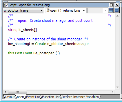
The PowerScript code in the Script view is preceded by comments.
Using comments
A comment in PowerScript is indicated by either two forward slashes (//) at the start of a single-line comment, or a slash and an asterisk (/*) at the start and an asterisk and a slash (*/) at the end of a single-line or multiline comment. Comments are not parsed by the script compiler.
You now modify the Open event script to cause the login window to display.
-
Click after the parentheses in the line that reads:
this.Post Event ue_postopen ( )
The ue_postopen event does not take any arguments.
-
Press Enter twice.
This adds a blank line in the Script view for legibility. The cursor moves to a new line following the blank line.
-
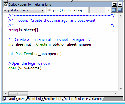
Type Open the login window on the new line in the Script view.
-
Click the Comment button (
 ) in PainterBar2.
Two slashes appear in front of the line you typed -- it is changed into a comment.
-
Move the cursor to the end of the comment.
Press Enter to add a new line.
Type open (w_welcome) on the new line.
This calls the Open function to display the login window you created.
Accessing context-sensitive Help
To access context-sensitive Help for a function or reserved word (such as Open), select the function or reserved word in the Script view and press Shift+F1. You can always open the main Help screen by pressing F1.
Now you compile the script you just typed. In this exercise, you use a pop-up menu item to compile the script. PowerBuilder also compiles a script when you close the Script view or when you select a different object, event, or function for display in the Script view.
Handling errors in scripts
When there is an error in a script, an error window displays at the bottom of the Script view with the line number of the error and the error message.
To find an error
Click on an error message to move the cursor to the line that contains that error. After you correct the error, you can try to compile the script again.
Commenting out errors
PowerBuilder does not save scripts that have errors. If you want to save a script that has errors, select the entire script and click the Comment button to comment out the code. You can come back later, uncomment the code, and fix the problem.
-
Right-click anywhere in the Script view script area.
Select Compile from the pop-up menu.
The script compiles. You do not leave the Script view or the Window painter workspace.
-
Select File>Save from the menu bar.
Select File>Close from the menu bar.
The Window painter closes.


