- Changing the DataWindow object style
- Setting colors in a DataWindow object
- Setting gradients and background pictures in a DataWindow object
- Setting transparency properties for a DataWindow object
- Specifying properties of a grid DataWindow object
- Specifying pointers for a DataWindow object
- Defining print specifications for a DataWindow object
- Modifying text in a DataWindow object
- Defining the tab order in a DataWindow object
- Naming controls in a DataWindow object
- Using borders in a DataWindow object
- Specifying variable-height bands in a DataWindow object
- Modifying the data source of a DataWindow object
This section describes the general DataWindow object properties that you can modify.
The general style properties for a DataWindow object include:
-
The unit of measure used in the DataWindow object
-
A timer interval for events in the DataWindow object
-
A background color for the DataWindow object
PowerBuilder assigns defaults when it generates the basic DataWindow object. You can change the defaults.
To change the default style properties
-
Position the pointer in the background of the DataWindow object, display the pop-up menu, and select Properties.
The Properties view displays with the General page on top.
-
Click the unit of measure you want to use to specify distances when working with the DataWindow object:
-
PowerBuilder units (PBUs) Normalized units
-
Pixels (smallest element on the display monitor)
-
Thousandths of an inch
-
Thousandths of a centimeter
Choosing the unit of measure
If you plan to print the contents of the DataWindow object at runtime, change the unit of measure to inches or centimeters to make it easier to specify the margin measurements.
-
-
Specify the number of milliseconds you want between internal timer events in the DataWindow object.
This value determines how often PowerBuilder updates the time fields in the DataWindow object. (Enter 60,000 milliseconds to specify one minute.)
If the DataWindow contains buttons, set the ShowBackColorOnXP property to make sure that the background color you select for the buttons displays on systems using the XP style.
-
On the Background page, select a background color from the Color drop-down list. The default color is the window background color.
You can set different colors for each element of a DataWindow object to enhance the display of information.
To set a solid background color in a DataWindow object
-
Position the mouse on an empty spot in the DataWindow object, display the pop-up menu, and select Properties.
-
On the Background page in the Properties view for the DataWindow object, select Solid from the Brush Mode drop-down list and a color from the Color drop-down list.
To set a solid color for a band in a DataWindow object
-
Position the mouse pointer on the bar that represents the band, display the pop-up menu, then select Properties.
-
On the Background page in the Properties view, select Solid from the Brush Mode drop-down list and a color from the Color drop-down list.
The choice you make here overrides the background color for the DataWindow object.
To set solid colors in controls in a DataWindow object
-
Position the mouse pointer on the control, display the pop-up menu, then select Properties.
You can set colors in the Background page in the Properties view.
For controls that use text, you can set colors for text on the Font page in the Properties view. For drawing controls, you can set colors on the General or Background page in the Properties view.
You can use the background effects to give the DataWindow object more visual interest. For example, you can set a vertical gradient on a header band to differentiate it from the other bands in the DataWindow object:
To set a gradient background in a DataWindow object
-
Position the mouse on an empty spot in the DataWindow object, display the pop-up menu, and select Properties.
-
On the Background page in the Properties view for the DataWindow object, select a type of gradient from the Brush Mode drop-down list.
-
Select the primary (background) color from the Color drop-down list.
-
Select the secondary (gradient) color from the Gradient group Color drop-down list.
To set a picture as the background in a DataWindow object
-
Position the mouse on an empty spot in the DataWindow object, display the pop-up menu, and select Properties.
-
On the Background page in the Properties view for the DataWindow object, select Picture from the Brush Mode drop-down list.
-
Specify the image file in the File field in the Picture group.
-
From the Tile Mode drop-down list, select the style you want to use.
Selections from the drop-down list allow you to display the picture in its original size, stretch the picture in different directions, or tile multiple copies of the picture in a variety of possible patterns.
You can change the transparency settings for colors and pictures.
To set the transparency of a gradient in a DataWindow object
-
Position the mouse on an empty spot in the DataWindow object, display the pop-up menu, and select Properties.
-
On the Background page in the Properties view for the DataWindow object, locate the Gradient group.
-
Move the Gradient group Transparency slider until the gradient (secondary) color is set to the desired transparency.
You can see the appearance in the Design view. The more transparent the gradient color is, the more you will see the primary (background) color.
To set the transparency of a background picture in a DataWindow object
-
Position the mouse on an empty spot in the DataWindow object, display the pop-up menu, and select Properties.
-
On the Background page in the Properties view for the DataWindow object, locate the Picture group.
-
Move the Picture group Transparency slider until the image is set to the desired transparency.
You can see the appearance in the Design view.
In grid DataWindow objects, you can specify:
-
When grid lines are displayed
-
How users can interact with the DataWindow object at runtime
To specify basic grid DataWindow object properties
-
Position the mouse pointer on the background in a grid DataWindow object, display the pop-up menu, and select Properties.
-
Select the options you want in the Grid section on the General page in the Properties view as described in the following table.
Option
Result
On
Grid lines always display
Off
Grid lines never display (users cannot resize columns at runtime)
Display Only
Grid lines display only when the DataWindow object displays online
Print Only
Grid lines display only when the contents of the DataWindow object are printed
Column Moving
Columns can be moved at runtime
Mouse Selection
Data can be selected at runtime (and, for example, copied to the clipboard)
Row Resize
Rows can be resized at runtime
Width.AutoSize
The AutoWidth property takes one of these numeric values:
-
0 - No AutoWidth: This is the default value.
-
1 - AutoWidth is computed for visible rows (monotonic) and does not decrease when the widest column is reduced when scrolling.
-
2 - AutoWidth is computed for visible rows (non-monotonic).
-
3 - AutoWidth is computed for all retrieved rows.
You can set the AutoWidth property:
-
In the painter - in the Properties view, select one of the values in the drop-down list for the AutoWidth property.
-
In scripts - set the AutoWidth property to one of the numeric values.
-
Just as with colors, you can specify different pointers to use when the mouse is over a particular area of the DataWindow object. For example, you might want to change the pointer when the mouse is over a column whose data cannot be changed.
To change the mouse pointer used at runtime
-
Position the mouse over the element of the DataWindow object whose pointer you want to define, display the pop-up menu, and select Properties to display the appropriate Properties view.
You can set a pointer for the entire DataWindow object, specific bands, and specific controls.
-
Select the Pointer tab.
Either choose the pointer from the Stock Pointers list or, if you have a file containing pointer definitions (CUR files), enter a pointer file name.
You can use the Browse button to search for the file.
-
Click OK.
When you are satisfied with the look of the DataWindow object, you can define its print specifications.
To define print specifications for a DataWindow object
-
In the DataWindow painter, select Properties from the DataWindow object's pop-up menu.
-
In the Units box on the General page, select a unit of measure.
It is easier to specify the margins when the unit of measure is inches or centimeters.
-
Select the Print Specifications tab.
The Print Specifications properties use the units of measure you specified on the General page.
-
Specify print specifications for the current DataWindow object.
See the following table for more information.
Setting
Description
Document Name
Specify a name to be used in the print queue to identify the report.
Printer Name
Specify the name of a printer to which this report should be sent. If this box is empty, the report is sent to the default system printer. If the specified printer cannot be found, the report is sent to the default system printer if the Can Use Default Printer check box is selected. If the specified printer cannot be found and the Can Use Default Printer check box is not selected, an error is returned.
Margins
Specify top, bottom, left, and right margins. You can also change margins in the Preview view while you are actually looking at data. If you change margins in the Preview view, the changes are reflected here on the Print Specifications page.
Paper Orientation
Choose one of the following:
-
Default: Uses the default printer setup.
-
Portrait: Prints the contents of the DataWindow object across the width of the paper.
-
Landscape: Prints the contents of the DataWindow object across the length of the paper.
Paper Size
Choose a paper size or leave blank to use the default.
Paper Source
Choose a paper source or leave blank to use the default.
Prompt Before Printing
Select to display the standard Print Setup dialog box each time users make a print request.
Can Use Default Printer
Clear this check box if a printer has been specified in the Printer Name box and you do not want the report to be sent to the default system printer if the specified printer cannot be found. This box is checked by default if a printer name is specified.
Display Buttons - Print Preview
Select to display Button controls in Print Preview. The default is to hide them.
Display Buttons - Print
Select to display Button controls when you print the report. The default is to hide them.
Clip Text
Select to clip static text to the dimensions of a text field when the text field has no visible border setting. The text is always clipped if the text field has visible borders.
Override Print Job
When you print a series of reports using the PrintOpen, PrintDataWindow, and PrintClose methods, all the reports in the print job use the layout, fonts, margins, and other print specifications defined for the computer. Select this check box to override the default print job settings and use the print settings defined for this report.
Collate Copies
Select to collate copies when printing. Collating increases print time because the print operation is repeated to produce collated sets.
Print Preview Shows Outline
Select to display a blue outline to show the location of the margins.
Print Shows Background
Whether the background settings of the DataWindow and controls are included when the DataWindow is printed.
Preview Shows Background
Whether the background settings of the DataWindow and controls display in the print preview.
Newspaper Columns Across and Width
If you want a multiple-column report where the data fills one column on a page, then the second, and so on, as in a newspaper, select the number and width of the columns in the Newspaper Columns boxes. See Printing with newspaper-style columns.
-
When you define a DataWindow object, you can specify that it print in multiple columns across the page, like a newspaper. A typical use of newspaper-style columns is a phone list, where you want to have more than one column of names on a printed page.
Use Print Preview to see the printed output
Newspaper-style columns are used only when the DataWindow object is printed. They do not appear when a DataWindow object runs (or in Preview). Therefore, to see them in PowerBuilder, use Print Preview in the DataWindow painter.
To define newspaper-style columns for a DataWindow object
-
Build a tabular DataWindow object with the data you want.
-
Select Properties from the DataWindow object's pop-up menu.
-
Select the Print Specifications tab.
-
Specify the number of columns across the page and the width of columns in the Newspaper Columns Across and Newspaper Columns Width properties.
For each control in the DataWindow object that you do not want to have appear multiple times on the page (such as headers), select Properties from the control's pop-up menu and select the HideSnaked check box on the General page in the Properties view.
Example
This example describes how to create a newspaper-style DataWindow object using the Employee table in the PB Demo DB.
Create a tabular DataWindow object, selecting the last name, first name, and phone number columns, and add a title, page number, and date.
The Emp_Fname column and the text control holding a comma are defined as Slide Left, so they display just to the right of the Emp_Lname column.
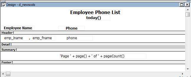
On the Print Specifications page of the DataWindow object's Properties view, specify two columns across and a column width of 3.5 inches in the Newspaper Columns boxes. (Make sure that Units is set to inches on the General property page.)
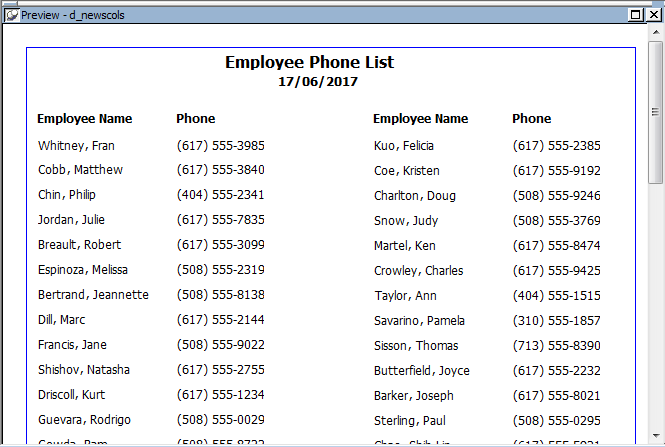
To view the DataWindow object as it will be printed, place the pointer in the Preview view and select File>Print Preview.
The DataWindow object displays the result set in two columns. Everything above the column headers (which includes page number, title, and date) also shows twice because of the 2-column specification. This information should appear only once per page.
To specify that page number, title, and date appear only once on the page, you need to suppress printing after the first column. For each of these controls, select Properties from the control's pop-up menu. Then set the HideSnaked property.
The finished DataWindow object has one set of page heading information and two columns of column header and detail information.
When PowerBuilder initially generates the basic DataWindow object, it uses the following attributes and fonts:
-
For the text and alignment of column headings and labels, PowerBuilder uses the extended column attributes made in the Database painter.
-
For fonts, PowerBuilder uses the definitions made in the Database painter for the table. If you did not specify fonts for the table, PowerBuilder uses the defaults set in the Application painter.
You can override any of these defaults in a particular DataWindow object.
When PowerBuilder generates the basic DataWindow object, it assigns columns a default tab order, the default sequence in which focus moves from column to column when a user presses the Tab key at runtime. PowerBuilder assigns tab values in increments of 10 in left-to-right and top-to-bottom order.
Tab order is not used in the Design view
Tab order is used when a DataWindow object runs, but it is not used in the DataWindow painter Design view. In the Design view, the Tab key moves to the controls in the DataWindow object in the order in which the controls were placed in the Design view.
If the DataWindow object contains columns from more than one table
If you are defining a DataWindow object with more than one table, PowerBuilder assigns each column a tab value of 0, meaning the user cannot tab to the column. This is because, by default, multitable DataWindow objects are not updatable—users cannot modify data in them. You can change the tab values to nonzero values to allow tabbing in these DataWindow objects.
For more about controlling updates in a DataWindow object, see Controlling Updates in DataWindow objects.
Tab order changes have no effect in grid DataWindow objects
In a grid DataWindow object, the tab sequence is always left to right (except on right-to-left operating systems). Changing the tab value to any number other than 0 has no effect.
To change the tab order
-
Select Format>Tab Order from the menu bar or click the Tab Order button on PainterBar2.
The current tab order displays.
-
Use the mouse or the Tab key to move the pointer to the tab value you want to change.
-
Enter a new tab value in the range 0 to 9999.
0 removes the column from the tab order (the user cannot tab to the column). It does not matter exactly what value you use (other than 0); all that matters is relative value. For example, if you want the user to tab to column B after column A but before column C, set the tab value for column B so it is between the value for column A and the value for column C.
-
Repeat the procedure until you have the tab order you want.
-
Select Format>Tab Order from the menu bar or click the Tab Order button again.
PowerBuilder saves the tab order.
Each time you select Tab Order, PowerBuilder reassigns tab values to include any columns that have been added to the DataWindow object and to allow space to insert new columns in the tab order.
Changing tab order at runtime
To change tab order programmatically at runtime, use the SetTabOrder method.
You use names to identify columns and other controls in validation rules, filters, PowerScript functions, and DataWindow expression functions.
The DataWindow painter automatically generates names for all controls in a DataWindow object. To name columns, labels, and headings, the DataWindow painter uses database and extended attribute information. To name all other controls, it uses a system of prefixes. You can control the prefixes used for automatic name generation and you can specify the name of any control explicitly.
You can place borders around text, columns, graphs, and crosstabs to enhance their appearance. PowerBuilder provides six types of borders: Underline, Box, ResizeBorder, ShadowBox, Raised, and Lowered:

Border appearance varies
Changing the border style may not have the same effect on all Windows operating systems and display settings.
To add a border to a control in a DataWindow object
-
Select one or more controls.
-
Select the border you want from the Border drop-down toolbar in the PainterBar.
PowerBuilder places the border around the selected controls.
You can also specify a border for one or more controls in the Properties view on the General page.
Sometimes DataWindow objects contain columns whose data is of variable length. For example, a Memo column in a table might be a character column that can take up to several thousand characters. Reserving space for that much information for the column in the detail band would make the detail band's height very large, meaning users could see few rows at a time.
The detail band can resize based on the data in the Memo column. If the Memo column has only one line of text, the detail band should be one line. If the Memo column has 20 lines of text, the detail band should be 20 lines high.
To provide a band that resizes as needed, specify that the variable-length columns and the band have Autosize Height.All bands in the DataWindow can be resized, but nested report overflow is supported only in the Detail band. If autosizing would preclude the display of at least one Detail band row per page, other bands cannot be autosized. Autosizing is not supported with the Graph, RichText, OLE, or Label presentation styles.
To create a resizable band in a DataWindow object
-
Select Properties from the pop-up menu of a column that should resize based on the amount of data.
-
Select the Autosize Height check box on the Position page.
-
Clear the Auto Horizontal Scroll check box on the Edit page.
PowerBuilder wraps text in the Preview view instead of displaying text on one scrollable line.
-
Repeat steps 1 to 3 for any other columns that should resize.
-
Select Properties from the band's pop-up menu.
-
Select the Autosize Height check box on the General page.
In the Preview view, the band resizes based on the contents of the columns you defined as having their height sized automatically.
Using the RowHeight function with Autosize Height
When a detail band has Autosize Height set to "true", you should avoid using the RowHeight DataWindow expression function to set the height of any element in the row. Doing so can result in a logical inconsistency between the height of the row and the height of the element. If you need to use RowHeight, you must set the Y coordinate of the element to 0 on the Position page in the Properties view, otherwise the bottom of the element might be clipped. You must do this for every element that uses such an expression. If you move any elements in the band, make sure that their Y coordinates are still set to 0.
You should not use an expression whose runtime value is greater than the value returned by RowHeight. For example, you should not set the height of a column to rowheight() + 30. Such an expression produces unpredictable results at runtime.
Clipping columns
You can have Autosize Height columns without an Autosize Height detail band. If such a column expands beyond the size of the detail band in the Preview view, it is clipped.
When modifying a DataWindow object, you might realize that you have not included all the columns you need, or you might need to define retrieval arguments. You can modify the data source from the DataWindow painter. How you do it depends on the data source.
If the data source is SQL (such as Quick Select, SQL Select, or Query), you can graphically modify the SQL SELECT statement.
To modify a SQL data source
-
Select Design>Data Source from the menu bar.
PowerBuilder returns you to the SQL Select painter. (If you used Quick Select to define the data source, this might be the first time you have seen the SQL Select painter.)
-
Modify the SELECT statement graphically using the same techniques as when creating it.
For more information, see Using SQL Select.
Modifying the statement syntactically
Select Design>Convert to Syntax from the menu bar to modify the SELECT statement syntactically.
-
Click the Return button to return to the painter.
Some changes you make (such as adding or removing columns) require PowerBuilder to modify the update capabilities of the DataWindow object.
For more information about controlling updates in a DataWindow object, see Controlling Updates in DataWindow objects.
Changing the table
If you change the table referenced in the SELECT statement, PowerBuilder maintains the columns in the Design view (now from a different table) only if they match the datatypes and order of the columns in the original table.
Modifying the retrieval arguments
You can add, modify, or delete retrieval arguments when modifying your data source.
To modify the retrieval arguments
-
In the SQL Select painter, select Design>Retrieval Arguments from the menu bar.
The Specify Retrieval Arguments dialog box displays, listing the existing arguments.
-
Add, modify, or delete the arguments.
-
Click OK.
You return to the SQL Select painter, or to the text window displaying the SELECT statement if you are modifying the SQL syntactically.
Reference any new arguments in the WHERE or HAVING clause of the SELECT statement.
For more information about retrieval arguments, see Defining DataWindow Objects.
If the data source is External or Stored Procedure, you can modify the result set description.
To modify a result set
-
If the Column Specification view is not open, select View>Column Specifications from the menu bar.
-
Review the specifications and make any necessary changes.
If the data source is a stored procedure
If you are modifying the result set for a DataWindow object whose data source is a stored procedure, the pop-up menu for the Column Specification view contains the menu item Stored Procedure.
-
Select Stored Procedure from the Column Specification view's pop-up menu to edit the Execute statement, select another stored procedure, or add retrieval arguments. For more information about editing the Execute statement, see Using Stored Procedure.
