By setting menu properties, you can customize the display of menus in applications that you create with PowerBuilder. You use the Menu painter to change the appearance and behavior of your menu and menu items by choosing different settings in the tab pages in the Properties view. For a list of all menu item properties, see Objects and Controls.
This section describes the properties you can set when you select a menu item and then select the General tab page in the Properties view.
Creating MicroHelp and tags
MicroHelp is a brief text description of the menu item that displays on the status bar at the bottom of a Multiple Document Interface (MDI) application window. Type the text you want to display in the MicroHelp box. For examples of MicroHelp text, select an item from a menu in PowerBuilder and look at the text that displays in the status bar.
A tag is a text string that you can associate with an object and use in any way you want.
For information about defining MicroHelp text and tag properties, see Building an MDI Application in Application Techniques.
Setting the appearance of a menu item
On the General tab page in the Properties view, you can also specify how a menu item appears at runtime.
|
Property |
Meaning |
|---|---|
|
Visible |
Whether the menu item is visible. An invisible menu item still displays in the WYSIWYG and Tree Menu views, but at runtime, it will not display. In WYSIWYG Menu view, an invisible item has faded and dotted text. |
|
Enabled |
Whether the menu item can be selected. |
|
Checked |
Whether the menu item displays with a check mark next to it. |
|
Default |
Whether the menu item text is bold. In a pop-up menu, Default indicates what action occurs if the user double-clicks instead of right-clicks on an item. In dragging, Default indicates what happens when an item is dragged with the left mouse button instead of the right mouse button. |
|
ShiftToRight |
Whether the menu item shifts to the right (or down for a drop-down or cascading menu) when you add menu items in a menu that is inherited from this menu. Selecting this property allows you to insert menu items in descendant menus, instead of being able to add them only to the end. For more information, see Inserting menu items in a descendant menu. |
|
MergeOption |
The way menus are modified when an OLE object is activated. Options are: File, Edit, Window, Help, Merge, Exclude. For more information, see Using OLE in an Application in Application Techniques. |
|
MenuItemType |
Whether the menu item you are creating is Normal, About, Exit, or Help type. |
The settings you specify here determine how the menu items display by default. You can change the values of the properties in scripts at runtime.
Assigning accelerator and shortcut keys
Every menu item should have an accelerator key, also called a mnemonic access key, which allows users to select the item from the keyboard by pressing Alt+key when the menu is displayed. Accelerator keys display with an underline in the menu item text.
You can also define shortcut keys, which are combinations of keys that a user can press to select a menu item whether or not the menu is displayed.
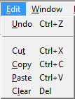
For example, in the following menu all menu items have accelerator keys: the accelerator key is U for Undo, T for Cut, and so on. New, Undo, Cut, Copy, Paste, and Clear each have shortcut keys: the Ctrl key in combination with another key or keys.
You should adopt conventions for using accelerator and shortcut keys in your applications. All menu items should have accelerator keys, and commonly used menu items should have shortcut keys.
If you specify the same shortcut for more than one MenuItem, the command that occurs later in the menu hierarchy is executed.
Some shortcut key combinations, such as Ctrl+C, Ctrl+V, and Ctrl+X, are commonly used by many applications. Avoid using these combinations when you assign shortcut keys for your application.
To assign an accelerator key
-
Type an ampersand (&) before the letter in the menu item text that you want to designate as the accelerator key.
For example, &File designates the F in File as an accelerator key and Ma&ximize designates the x in Maximize as an accelerator key.
Displaying an ampersand in the text
If you want an ampersand to display in the menu text, type two ampersands. For example, Fish&&Chips displays as Fish&Chips with no accelerator key. To display Fish&Chips as the menu text with the C underlined as the accelerator, type Fish&&&Chips.
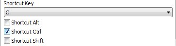
To assign a shortcut key
-
Select the menu item to which you want to assign a shortcut key.
-
Select the General tab in the Properties view.
-
Select a key from the Shortcut Key drop-down list.
-
Select Shortcut Alt, Shortcut Ctrl, and/or Shortcut Shift to create a key combination.
PowerBuilder displays the shortcut key next to the menu item name.
Menus with a contemporary style have a three-dimensional menu appearance and can include bitmap and menu title bands. The following figure shows a contemporary style menu:
After you select the contemporary style, you can modify other menu style properties on the top-level menu object and on all lower-level menu items. Since it is important to maintain a consistent look across each menu and toolbar, very few style properties are modifiable at the menu item level.
If you select the traditional menu style
If you select traditionalmenu! for the top-level menu object, you cannot modify any of the menu style properties.
You can modify menu style properties only at design time. After you select the contemporary menu style for a top-level menu object, you can select values for other style properties to manipulate a menu's visual appearance. The following properties are modifiable for the top-level menu object only; you cannot modify them for individual menu items:
|
Property |
Datatype |
Use to assign |
|---|---|---|
|
MenuStyle |
Enumerated |
Overall menu style. Values are: contemporarymenu! and traditionalmenu! |
|
MenuTextColor |
Long |
Menu text color. (Default is the Windows menu text color.) |
|
MenuBackColor |
Long |
Background color of the menu. |
|
MenuHighlightColor |
Long |
Menu highlight color. (Default is the default Windows highlight color.) |
|
FaceName |
String |
Font face name. |
|
TextSize |
Integer |
Font character size in points for menu items. (Does not apply to the main menu bar which has a fixed height.) |
|
Bold |
Boolean |
Bold font. |
|
Italic |
Boolean |
Italic font. |
|
Underline |
Boolean |
Underline font. |
|
TitleBackColor |
Long |
Background color of the title panel. |
|
BitmapBackColor |
Long |
Background color of the bitmap band of the menu. (Default is silver.) |
|
MenuBitmaps |
Boolean |
Bitmap band for the menu. |
|
BitmapGradient |
Boolean |
Background of the bitmap band to a gradient style. |
|
MenuTitles |
Boolean |
Menu title band. |
|
TitleGradient |
Boolean |
Background gradient style for the title panel. |
Menu items have style properties that you set at design time. You cannot use these style properties with a traditional style menu. Unlike the style properties on the Menu object that display on the Appearance tab of the Properties view, the fields where you set these properties are located on the General tab of the Properties view for each menu item.
|
Property |
Datatype |
Use to assign |
|---|---|---|
|
MenuAnimation |
Boolean |
Visual sizing cue to the menu item bitmap when the associated menu item is selected. This property is ignored if the MenuImage property is not assigned. |
|
MenuImage |
String |
Bitmap image to be used with the menu item. This property is ignored if the MenuBitmaps property for the menu object is not selected or is set to "false". |
|
MenuTitleText |
String |
Label for menu item that has a cascading submenu. The label text is set vertically in a column to the left of the submenu items and the bitmaps for submenu items, if any. If the vertical label text is longer than the height of all the submenu items, the label text is cut from the end. This property is ignored if the MenuTitles property for the menu object is not selected. |
You select or enter values for the menu item style properties on the General tab of the Properties view for each menu item. You can make selections for the MenuAnimation and MenuImage properties only if the MenuBitmaps check box for the current menu object is selected. The MenuBitmaps check box is selected by default for the contemporary menu style.
You can enter text for the MenuTitleText property only if the MenuTitles check box for the current menu object is selected.
