About this chapter
This chapter describes how to use TreeView controls to present hierarchical information in an expandable list.
TreeView controls provide a way to represent hierarchical relationships within a list. The TreeView provides a standard interface for expanding and collapsing branches of a hierarchy:
When to use a TreeView
You use TreeViews in windows and custom visual user objects. Choose a TreeView instead of a ListBox or ListView when your information is more complex than a list of similar items and when levels of information have a one-to-many relationship. Choose a TreeView instead of a DataWindow control when your user will want to expand and collapse the list using the standard TreeView interface.
Hierarchy of items
Although items in a TreeView can be a single, flat list like the report view of a ListView, you tap the power of a TreeView when items have a one-to-many relationship two or more levels deep. For example, your list might have one or several parent categories with child items within each category. Or the list might have several levels of subcategories before getting to the end of a branch in the hierarchy:
Root
   Category 1
      Subcategory 1a
         Detail
         Detail
      Subcategory 1b
         Detail
         Detail
   Category 2
      Subcategory 2a
         Detail
Number of levels in each branch
You do not have to have the same number of levels in every branch of the hierarchy if your data requires more levels of categorization in some branches. However, programming for the TreeView is simpler if the items at a particular level are the same type of item, rather than subcategories in some branches and detail items in others.
For example, in scripts you might test the level of an item to determine appropriate actions. You can call the SetLevelPictures function to set pictures for all the items at a particular level.
Content sources for a TreeView
For most of the list types in PowerBuilder, you can add items in the painter or in a script, but for a TreeView, you have to write a script. Generally, you will populate the first level (the root level) of the TreeView when its window opens. When the user wants to view a branch, a script for the TreeView's ItemPopulate event can add items at the next levels.
The data for items can be hard-coded in the script, but it is more likely that you will use the user's own input or a database for the TreeView's content. Because of the one-to-many relationship of an item to its child items, you might use several tables in a database to populate the TreeView.
For an example using DataStores, see Using DataWindow information to populate a TreeView.
Pictures for items
Pictures are associated with individual items in a TreeView. You identify pictures you want to use in the control's picture lists and then associate the index of the picture with an item. Generally, pictures are not unique for each item. Pictures provide a way to categorize or mark items within a level. To help the user understand the data, you might:
-
Use a different picture for each level
-
Use several pictures within a level to identify different types of items
-
Use pictures on some levels only
-
Change the picture after the user clicks on an item
Pictures are not required
You do not have to use pictures if they do not convey useful information to the user. Item labels and the levels of the hierarchy may provide all the information the user needs.
Appearance of the TreeView
You can control the appearance of the TreeView by setting property values. Properties that affect the overall appearance are shown in the following table.
|
Properties |
Effect when set |
|---|---|
|
HasButtons |
Puts + and - buttons before items that have children, showing the user whether the item is expanded or collapsed |
|
HasLines and LinesAtRoot |
Display lines connecting items within a branch and connecting items at the root level |
|
Checkboxes |
Replaces the state image with checked and unchecked check boxes |
|
TrackSelect |
Changes the appearance of an item as the mouse moves over it |
|
FullRowSelect |
Highlights the entire row of a selected item |
|
SingleExpand |
Expands the selected item and collapses the previously selected item automatically |
|
Indent |
Sets the amount an item is indented |
|
Font properties |
Specifies the font for all the labels |
|
Various picture properties |
Controls the pictures and their size |
|
LayoutRTL and RightToLeft |
Display elements and characters in the control from right to left |
For more information about these properties, see the section called “TreeView control” in Objects and Controls.
User interaction
Basic TreeView functionality allows users to edit labels, delete items, expand and collapse branches, and sort alphabetically, without any scripting on your part. For example, the user can click a second time on a selected item to edit it, or press the Delete key to delete an item. If you do not want to allow these actions, properties let you disable them.
You can customize any of these basic actions by writing scripts. Events associated with the basic actions let you provide validation or prevent an action from completing. You can also implement other features such as adding items, dragging items, and performing customized sorting.
Using custom events
In PowerBuilder 7 and later releases, PowerBuilder uses Microsoft controls for ListView and Treeview controls. The events that fire when the right mouse button is clicked are different from earlier releases.
When you release the right mouse button, the pbm_rbuttonup event does not fire. The stock RightClicked! event for a TreeView control, pbm_tvnrclickedevent, fires when the button is released.
When you click the right mouse button on an unselected TreeView item, focus returns to the previously selected TreeView item when you release the button. To select the new item, insert this code in the pbm_tvnrclickedevent script before any code that acts on the selected item:
this.SelectItem(handle)
When you right double-click, only the pbm_rbuttondblclk event fires. In previous releases, both the pbm_rbuttondblclk and pbm_tvnrdoubleclick events fired.
You must write a script to add items to a TreeView. You cannot add items in the painter as with other list controls. Although you can populate all the levels of the TreeView at once, TreeView events allow you to populate only branches the user looks at, which saves unnecessary processing.
Typically, you populate the first level of the TreeView when the control is displayed. This code might be in a window's Open event, a user event triggered from the Open event, or the TreeView's Constructor event. Then a script for the control's ItemPopulate event would insert an item's children when the user chooses to expand it.
The ItemPopulate event is triggered when the user clicks on an item's plus button or double-clicks the item, but only if the item's Children property is TRUE. Therefore, when you insert an item that will have children, you must set its Children property to TRUE so that it can be populated with child items when the user expands it.
You are not restricted to adding items in the ItemPopulate event. For example, you might let the user insert items by dragging from a ListBox or filling in a text box.
There are several functions for adding items to a TreeView control, as shown in the following table.
|
This function |
Adds an item here |
|---|---|
|
InsertItem |
After a sibling item for the specified parent. If no siblings exist, you must use one of the other insertion functions. |
|
InsertItemFirst |
First child of the parent item. |
|
InsertItemLast |
Last child of the parent item. |
|
InsertItemSort |
As a child of the parent item in alphabetic order, if possible. |
For all the InsertItem functions, the SortType property can also affect the position of the added item.
There are two ways to supply information about the item you add, depending on the item properties that need to be set.
Method 1: specifying the label and picture index only
You can add an item by supplying the picture index and label. All the other properties of the item will have default values. You can set additional properties later as needed, using the item's handle.
Example
This example inserts a new item after the currently selected item on the same level as that item. First it gets the handles of the currently selected item and its parent, and then it inserts an item labeled Hindemith after the currently selected item. The item's picture index is 2:
long ll_tvi, ll_tvparent

ll_tvi = tv_list.FindItem(CurrentTreeItem!, 0)
ll_tvparent = tv_list.FindItem(ParentTreeItem!, &
   ll_tvi)
tv_list.InsertItem(ll_tvparent, ll_tvi, &
   "Hindemith", 2)
Method 2: setting item properties in a TreeViewItem structure
You can add items by supplying a TreeViewItem structure with properties set to specific values. The only required property is a label. Properties you might set are shown in the following table.
|
Property |
Value |
|---|---|
|
Label |
The text that is displayed for the item. |
|
PictureIndex |
A value from the regular picture list. |
|
SelectedPictureIndex |
A value from the regular picture list, specifying a picture that is displayed only when the item is selected. If 0, no picture is displayed for the item when selected. |
|
StatePictureIndex |
A value from the State picture list. The picture is displayed to the left of the regular picture. |
|
Children |
Must be TRUE if you want double-clicking to trigger the ItemPopulate event. That event script can insert child items. |
|
Data |
An optional value of any datatype that you want to associate with the item. You might use the value to control sorting or to make a database query. |
Example
This example sets all these properties in a TreeViewItem structure before adding the item to the TreeView control. The item is inserted as a child of the current item:
treeviewitem tvi
long h_item = 0, h_parent = 0

h_parent = tv_1.FindItem(CurrentTreeItem!, 0)
tvi.Label = "Choral"
tvi.PictureIndex = 1
tvi.SelectedPictureIndex = 2
tvi.Children = true
tvi.StatePictureIndex = 0
h_item = tv_1.InsertItemSort(h_parent, tvi)
For more information about inserting items into a TreeView control, see the section called “InsertItem” in PowerScript Reference.
The very first item you insert does not have any sibling for specifying a relative position, so you cannot use the InsertItem function -- you must use InsertItemFirst or InsertItemLast. For an item inserted at the root level, you specify 0 as its parent.
This sample code is in a user event triggered from the Open event of the window containing the TreeView. It assumes two instance variable arrays:
-
A string array called item_label that contains labels for all the items that will be inserted at the root level (here composer names)
-
An integer array that has values for the Data property (the century for each composer); the century value is for user-defined sorting:
int ct
long h_item = 0
treeviewitem tvi

FOR ct = 1 TO UpperBound(item_label)
      tvi.Label = item_label[ct]
      tvi.Data = item_data[ct]
      tvi.PictureIndex = 1
      tvi.SelectedPictureIndex = 2
      tvi.Children = TRUE
      tvi.StatePictureIndex = 0
      tvi.DropHighlighted = TRUE
      h_item = tv_1.InsertItemSort(0, tvi)
NEXT
After inserting all the items, this code scrolls the TreeView back to the top and makes the first item current:
// Scroll back to top
h_item = tv_1.FindItem(RootTreeItem!, 0)
tv_1.SetFirstVisible(h_item)
tv_1.SelectItem(h_item)
The first time a user tries to expand an item to see its children, PowerBuilder triggers the ItemPopulate event if and only if the value of the item's Children property is TRUE. In the ItemPopulate event, you can add child items for the item being expanded.
Parent item's Children property
If the ItemPopulate event does not occur when you expect, make sure the Children property for the expanding item is TRUE. It should be set to TRUE for any item that will have children.
Inserting items not restricted to the ItemPopulate event
The ItemPopulate event helps you design an efficient program. It will not populate an item that the user never looks at. However, you do not have to wait until the user wants to view an item's children. You can add children in any script, just as you added items at the root level.
For example, you might fully populate a small TreeView when its window opens and use the ExpandAll function to display its items fully expanded.
Has an item been populated?
You can check an item's ExpandedOnce property to find out if the user has looked at the item's children. If the user is currently looking at an item's children, the Expanded property is also TRUE.
Example
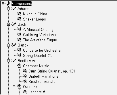
This TreeView lists composers and their music organized into categories. The script for its ItemPopulate event checks whether the item being expanded is at level 1 (a composer) or level 2 (a category). Level 3 items are not expandable.
For a level 1 item, the script adds three standard categories. For a level 2 item, it adds pieces of music to the category being expanded, in this pattern:
Mozart
   Orchestral
      Symphony No. 33
      Overture to the Magic Flute
   Chamber
      Quintet in Eb for Horn and Strings
      Eine Kleine Nachtmusik
   Vocal
      Don Giovanni
      Idomeneo
This is the script for ItemPopulate:
TreeViewItem tvi_current, tvi_child, tvi_root
long hdl_root
Integer ct
string categ[]

// The current item is the parent for the new itemsThis.GetItem(handle, tvi_current)

IF tvi_current.Level = 1 THEN
   // Populate level 2 with some standard categories
   categ[1] = "Orchestral"
   categ[2] = "Chamber"
   categ[3] = "Vocal"

      tvi_child.StatePictureIndex = 0
   tvi_child.PictureIndex = 3
   tvi_child.SelectedPictureIndex = 4
   tvi_child.OverlayPictureIndex = 0
   tvi_child.Children = TRUE

   FOR ct = 1 to UpperBound(categ)
      tvi_child.Label = categ[ct]
      This.InsertItemLast(handle, tvi_child)
   NEXT
END IF

// Populate level 3 with music titles
IF tvi_current.Level = 2 THEN

   // Get parent of current item - it's the root of
   // this branch and is part of the key for choosing
   // the children

   hdl_root = This.FindItem(ParentTreeItem!, handle)
   This.GetItem(hdl_root, tvi_root)

   FOR ct = 1 to 4
      // This statement constructs a label -
      // it is more realistic to look up data in a
      // table or database or accept user input
      This.InsertItemLast(handle, &
      tvi_root.Label + " Music " &
      + tvi_current.Label + String(ct), 3)
   NEXT
END IFAn item in a TreeView is a TreeViewItem structure. The preceding section described how to set the item's properties in the structure and then insert it into the TreeView.
This code declares a TreeViewItem structure and sets several properties:
TreeViewItem tvi_defined

tvi_defined.Label = "Symphony No. 3 Eroica"
tvi_defined.StatePictureIndex = 0
tvi_defined.PictureIndex = 3
tvi_defined.SelectedPictureIndex = 4
tvi_defined.OverlayPictureIndex = 0
tvi_defined.Children = TRUE
For information about Picture properties, see Managing TreeView pictures.
When you insert an item, the inserting function returns a handle to that item. The TreeViewItem structure is copied to the TreeView control, and you no longer have access to the item's properties:
itemhandle = This.InsertItemLast(parenthandle, &
   tvi_defined)
Procedure for items: get, change, and set
If you want to change the properties of an item in the TreeView, you:
-
Get the item, which assigns it to a TreeViewItem structure.
-
Make the changes, by setting TreeViewItem properties.
-
Set the item, which copies it back into the TreeView.
When you work with items that have been inserted in the TreeView, you work with item handles. Most TreeView events pass one or two handles as arguments. The handles identify the items the user is interacting with.
This code for the Clicked event uses the handle of the clicked item to copy it into a TreeViewItem structure whose property values you can change:
treeviewitem tvi
This.GetItem(handle, tvi)
tvi.OverlayPictureIndex = 1
This.SetItem(handle, tvi)
Important
Remember to call the SetItem function after you change an item's property value. Otherwise, nothing happens in the TreeView.
Items and the hierarchy
You can use item handles with the FindItem function to navigate the TreeView and uncover its structure. The item's properties tell you what its level is, but not which item is its parent. The FindItem function does:
long h_parent
h_parent = This.FindItem(ParentTreeItem!, handle)
You can use FindItem to find the children of an item or to navigate through visible items regardless of level.
For more information, see the section called “FindItem” in PowerScript Reference.
Enabling TreeView functionality in scripts
By setting TreeView properties, you can enable or disable user actions like deleting or renaming items without writing any scripts. You can also enable these actions by calling functions. You can:
-
Delete items
-
Rename items
-
Move items using drag and drop
-
Sort items
To allow the user to delete items, enable the TreeView's DeleteItems property. When the user presses the Delete key, the selected item is deleted and the DeleteItem event is triggered. Any children are deleted too.
If you want more control over deleting, such as allowing deleting of detail items only, you can call the DeleteItem function instead of setting the property. The function also triggers the DeleteItem event.
Example
This script is for a TreeView user event. Its event ID is pbm_keydown and it is triggered by key presses when the TreeView has focus. The script checks whether the Delete key is pressed and whether the selected item is at the detail level. If both are TRUE, it deletes the item.
The value of the TreeView's DeleteItems property is FALSE. Otherwise, the user could delete any item, despite this code:
TreeViewItem tvi
long h_item

IF KeyDown(KeyDelete!) = TRUE THEN
   h_item = This.FindItem(CurrentTreeItem!, 0)
   This.GetItem(h_item, tvi)
   IF tvi.Level = 3 THEN
      This.DeleteItem(h_item
)   END IF
END IF
RETURN 0
If you enable the TreeView's EditLabels property, the user can edit an item label by clicking twice on the text.
Events
There are two events associated with editing labels.
The BeginLabelEdit event occurs after the second click when the EditLabels property is set or when the EditLabel function is called. You can disallow editing with a return value of 1.
This script for BeginLabelEdit prevents changes to labels of level 2 items:
TreeViewItem tvi
This.GetItem(handle, tvi)
IF tvi.Level = 2 THEN
   RETURN 1
ELSE
   RETURN 0
END IF
The EndLabelEdit event occurs when the user finishes editing by pressing enter, clicking on another item, or clicking in the text entry area of another control. A script you write for the EndLabelEdit event might validate the user's changes for example, it could invoke a spelling checker.
EditLabel function
For control over label editing, the BeginLabelEdit event can prohibit editing of a label, as shown above. Or you can set the EditLabels property to FALSE and call the EditLabel function when you want to allow a label to be edited.
When you call the EditLabel function, the BeginLabelEdit event occurs when editing begins and the EndLabelEdit event occurs when the user presses enter or the user clicks another item.
This code for a CommandButton puts the current item into editing mode:
long h_tvi
h_tvi = tv_1.findItem(CurrentTreeItem!, 0)
tv_1.EditLabel(h_tvi)
At the window level, PowerBuilder provides functions and properties for dragging controls onto other controls. Within the TreeView, you can also let the user drag items onto other items. Users might drag items to sort them, move them to another branch, or put child items under a parent.
When you implement drag and drop as a way to move items, you decide whether the dragged item becomes a sibling or child of the target, whether the dragged item is moved or copied, and whether its children get moved with it.
There are several properties and events that you need to coordinate to implement drag and drop for items, as shown in the following table.
|
Property or event |
Setting or purpose |
|---|---|
|
DragAuto property |
TRUE or FALSE If FALSE, you must call the Drag function in the BeginDrag event. |
|
DisableDragDrop property |
FALSE |
|
DragIcon property |
An appropriate icon or None!, which means the user drags an image of the item |
|
BeginDrag event |
Script for saving the handle of the dragged item and optionally preventing particular items from being dragged |
|
DragWithin event |
Script for highlighting drop targets |
|
DragDrop event |
Script for implementing the result of the drag operation |
Example
The key to a successful drag-and-drop implementation is in the details. This section illustrates one way of moving items. In the example, the dragged item becomes a sibling of the drop target, inserted after it. All children of the item are moved with it and the original item is deleted.
A function called recursively moves the children, regardless of the number of levels. To prevent an endless loop, an item cannot become a child of itself. This means a drop target that is a child of the dragged item is not allowed.
BeginDrag event
The script saves the handle of the dragged item in an instance variable:
ll_dragged_tvi_handle = handle
If you want to prevent some items from being dragged -- such as items at a particular level -- that code goes here too:
TreeViewItem tvi
This.GetItem(handle, tvi)
IF tvi.Level = 3 THEN This.Drag(Cancel!)
DragWithin event
The script highlights the item under the cursor so the user can see each potential drop target. If only some items are drop targets, your script should check an item's characteristics before highlighting it. In this example, you could check whether an item is a parent of the dragged item and highlight it only if it is not:
TreeViewItem tvi
This.GetItem(handle, tvi)
tvi.DropHighlighted = TRUE
This.SetItem(handle, tvi)
DragDrop event
This script does all the work. It checks whether the item can be inserted at the selected location and inserts the dragged item in its new position a sibling after the drop target. Then it calls a function that moves the children of the dragged item too:
TreeViewItem tvi_src, tvi_child
long h_parent, h_gparent, h_moved, h_child
integer rtn

// Get TreeViewItem for dragged item
This.GetItem(ll_dragged_tvi_handle, tvi_src)
// Don't allow moving an item into its own branch,
// that is, a child of itself
h_gparent = This.FindItem(ParentTreeItem!, handle)

DO WHILE h_gparent <> -1
   IF h_gparent = ll_dragged_tvi_handle THEN
      MessageBox("No Drag", &
      "Can't make an item a child of itself.")
      RETURN 0
   END IF

h_gparent=This.FindItem(ParentTreeItem!, h_gparent)
LOOP

// Get item parent for inserting
h_parent = This.FindItem(ParentTreeItem!, handle)

// Use 0 if no parent because target is at level 1
IF h_parent = -1 THEN h_parent = 0

// Insert item after drop target
h_moved = This.InsertItem(h_parent, handle, tvi_src)
IF h_moved = -1 THEN
   MessageBox("No Dragging", "Could not move item.")
   RETURN 0
ELSE
   // Args: old parent, new parent
   rtn = uf_movechildren(ll_dragged_tvi_handle, &
      h_moved)

   / If all children are successfully moved,
   // delete original item
   IF rtn = 0 THEN
      This.DeleteItem(ll_dragged_tvi_handle)
   END IF

END IF
The DragDrop event script shown above calls the function uf_movechildren. The function calls itself recursively so that all the levels of children below the dragged item are moved:
// Function: uf_movechildren
// Arguments:
// oldparent - Handle of item whose children are
// being moved. Initially, the dragged item in its
// original position
//
// newparent - Handle of item to whom children are
// being moved. Initially, the dragged item in its
// new position.

long h_child, h_movedchild
TreeViewItem tvi

// Return -1 if any Insert action fails

// Are there any children?
h_child = tv_2.FindItem(ChildTreeItem!, oldparent)
IF h_child <> -1 THEN
   tv_2.GetItem(h_child, tvi)
   h_movedchild = tv_2.InsertItemLast(newparent, tvi)
   IF h_movedchild = -1 THEN RETURN -1

   // Move the children of the child that was found
   uf_movechildren(h_child, h_movedchild)

   // Check for more children at the original level
   h_child = tv_2.FindItem(NextTreeItem!, h_child)
   DO WHILE h_child <> -1
      tv_2.GetItem(h_child, tvi)
      h_movedchild= tv_2.InsertItemLast(newparent,tvi)
      IF h_movedchild = -1 THEN RETURN -1
      uf_movechildren(h_child, h_movedchild)

      // Any more children at original level?
      h_child = tv_2.FindItem(NextTreeItem!, h_child)
   LOOP
END IF
RETURN 0 // Success, all children moved
A TreeView can sort items automatically, or you can control sorting manually. Manual sorting can be alphabetic by label text, or you can implement a user-defined sort to define your own criteria. The SortType property controls the way items are sorted. Its values are of the enumerated datatype grSortType.
Automatic alphabetic sorting
To enable sorting by the text label, set the SortType property to Ascending! or Descending!. Inserted items are sorted automatically.
Manual alphabetic sorting
For more control over sorting, you can set SortType to Unsorted! and sort by calling the functions in the following table.
|
Use this function |
To do this |
|---|---|
|
InsertItemSort |
Insert an item at the correct alphabetic position, if possible |
|
Sort |
Sort the immediate children of an item |
|
SortAll |
Sort the whole branch below an item |
If users will drag items to organize the list, you should disable sorting.
Sorting by other criteria
To sort items by criteria other than their labels, implement a user-defined sort by setting the SortType property to UserDefinedSort! and writing a script for the Sort event. The script specifies how to sort items.
PowerBuilder triggers the Sort event for each pair of items it tries to reorder. The Sort script returns a value reporting which item is greater than the other. The script can have different rules for sorting based on the type of item. For example, level 2 items can be sorted differently from level 3. The TreeView is sorted whenever you insert an item.
Example of Sort event
This sample script for the Sort event sorts the first level by the value of the Data property and other levels alphabetically by their labels. The first level displays composers chronologically, and the Data property contains an integer identifying a composer's century:
//Return values
//-1   Handle1 is less than handle2
// 0   Handle1 is equal to handle2
// 1   Handle1 is greater than handle2

TreeViewItem tvi1, tvi2

This.GetItem(handle1, tvi1)
This.GetItem(handle2, tvi2)

IF tvi1.Level = 1 THEN
   // Compare century values stored in Data property
   IF tvi1.data > tvi2.Data THEN
      RETURN 1
   ELSEIF tvi1.data = tvi2.Data THEN
      RETURN 0
   ELSE
      RETURN -1
   END IF
   ELSE
   // Sort other levels in alpha order
   IF tvi1.Label > tvi2.Label THEN
      RETURN 1
   ELSEIF tvi1.Label = tvi2.Label THEN
      RETURN 0
   ELSE
      RETURN -1
   END IF
END IFPowerBuilder stores TreeView images in three image lists:
-
Picture list (called the regular picture list here)
-
State picture list
-
Overlay picture list
You add pictures to these lists and associate them with items in the TreeView.
There are several ways to use pictures in a TreeView. You associate a picture in one of the picture lists with an item by setting one of the item's picture properties, described in the following table.
|
Property |
Purpose |
|---|---|
|
PictureIndex |
The primary picture associated with the item is displayed just to the left of the item's label. |
|
StatePictureIndex |
A state picture is displayed to the left of the regular picture. The item moves to the right to make room for the state picture. If the Checkboxes property is TRUE, the state picture is replaced by a pair of check boxes. Because a state picture takes up room, items without state pictures will not align with items that have pictures. So that all items have a state picture and stay aligned, you could use a blank state picture for items that do not have a state to be displayed. A use for state pictures might be to display a check mark beside items the user has chosen. |
|
OverlayPictureIndex |
An overlay picture is displayed on top of an item's regular picture. You set up the overlay picture list in a script by designating a picture in the regular picture list for the overlay picture list. An overlay picture is the same size as a regular picture, but it often uses a small portion of the image space so that it only partially covers the regular picture. A typical use of overlay pictures is the arrow marking shortcut items in the Windows Explorer. |
|
SelectedPictureIndex |
A picture from the regular picture list that is displayed instead of the regular picture when the item is the current item. When the user selects another item, the first item gets its regular picture and the new item displays its selected picture. If you do not want a different picture when an item is current, set SelectedPictureIndex to the same value as PictureIndex. |
How to set pictures
You can change the pictures for all items at a particular level with the SetLevelPictures function, or you can set the picture properties for an individual item.
If you do not want pictures
Your TreeView does not have to use pictures for items. If an item's picture indexes are 0, no pictures are displayed. However, the TreeView always leaves room for the regular picture. You can set the PictureWidth property to 0 to eliminate that space:
tv_2.DeletePictures()
tv_2.PictureWidth = 0
You can add pictures to the regular and state picture lists in the painter or during execution. During execution, you can assign pictures in the regular picture list to the overlay list.
Mask color
The mask color is a color used in the picture that becomes transparent when the picture is displayed. Usually you should pick the picture's background color so that the picture blends with the color of the TreeView.
Before you add a picture, in the painter or in a script, you can set the mask color to a color appropriate for that picture. This statement sets the mask color to white, which is right for a picture with a white background:
tv_1.PictureMaskColor = RGB(255, 255, 255)
Each picture can have its own mask color. A picture uses the color that is in effect when the picture is inserted. To change a picture's mask color, you have to delete the picture and add it again.
Image size
In the painter you can change the image size at any time by setting the Height and Width properties on each picture tab. All the pictures in the list are scaled to the specified size.
During execution, you can change the image size for a picture list only when that list is empty. The DeletePictures and DeleteStatePictures functions let you clear the lists.
Example
This sample code illustrates how to change properties and add pictures to the regular picture list during execution. Use similar code for state pictures:
tv_list.DeletePictures()
tv_list.PictureHeight = 32
tv_list.PictureWidth = 32

tv_list.PictureMaskColor = RGB(255,255,255)
tv_list.AddPicture("c:\apps_pb\kelly.bmp")
tv_list.PictureMaskColor = RGB(255,0,0)
tv_list.AddPicture("Custom078!")
tv_list.PictureMaskColor = RGB(128,128,128)
tv_list.AddPicture("Custom044!")
Deleting pictures and how it affects existing items
Deleting pictures from the picture lists can have an unintended effect on item pictures being displayed. When you delete pictures, the remaining pictures in the list are shifted to remove gaps in the list. The remaining pictures get a different index value. This means items that use these indexes get new images.
Deleting pictures from the regular picture list also affects the overlay list, since the overlay list is not a separate list but points to the regular pictures.
To avoid unintentional changes to item pictures, it is best to avoid deleting pictures after you have begun using picture indexes for items.
The pictures in the overlay list come from the regular picture list. First you must add pictures to the regular list, either in the painter or during execution. Then during execution you specify pictures for the overlay picture list. After that you can assign an overlay picture to items, individually or with the SetLevelPictures function.
This code adds a picture to the regular picture list and then assigns it to the overlay list:
integer idx
idx = tv_1.AddPicture("Custom085!")
IF tv_1.SetOverlayPicture(1, idx) <> 1 THEN
   sle_get.Text = "Setting overlay picture failed"
END IF
This code for the Clicked event turns the overlay picture on or off each time the user clicks an item:
treeviewitem tvi
This.GetItem(handle, tvi)
IF tvi.OverlayPictureIndex = 0 THEN
   tvi.OverlayPictureIndex = 1
ELSE
   tvi.OverlayPictureIndex = 0
END IF
This.SetItem(handle, tvi)
A useful implementation of the TreeView control is to populate it with information that you retrieve from a DataWindow. To do this your application must:
-
Declare and instantiate a DataStore and assign a DataWindow object
-
Retrieve information as needed
-
Use the retrieved information to populate the TreeView
-
Destroy the DataStore instance when you have finished
Because a TreeView can display different types of information at different levels, you will probably define additional DataWindows, one for each level. Those DataWindows usually refer to different but related tables. When an item is expanded, the item becomes a retrieval argument for getting child items.
Populating the first level
This example populates a TreeView with a list of composers. The second level of the TreeView displays music by each composer. In the database there are two tables: composer names and music titles (with composer name as a foreign key).
This example declares two DataStore instance variables for the window containing the TreeView control:
datastore ids_data, ids_info
This example uses the TreeView control's Constructor event to:
-
Instantiate the DataStore
-
Associate it with a DataWindow and retrieve information
-
Use the retrieved data to populate the root level of the TreeView:
//Constructor event for tv_1
treeviewitem tvi1, tvi2
long ll_lev1, ll_lev2, ll_rowcount, ll_row

//Create instance variable datastore
ids_data = CREATE datastore
ids_data.DataObject = "d_composers"
ids_data.SetTransObject(SQLCA)
ll_rowcount = ids_data.Retrieve()

//Create the first level of the TreeView
tvi1.PictureIndex = 1
tvi1.Children = TRUE
//Populate the TreeView with
//data retrieved from the datastore
FOR ll_row = 1 to ll_rowcount
      tvi1.Label = ids_data.GetItemString(ll_row, &
      'name')
      This.InsertItemLast(0, tvi1)
NEXT
Populating the second level
When the user expands a root level item, the ItemPopulate event occurs. This script for the event:
-
Instantiates a second DataStore
Its DataWindow uses the composer name as a retrieval argument for the music titles table.
-
Inserts music titles as child items for the selected composer
The handle argument of ItemPopulate will be the parent of the new items:
//ItemPopulate event for tv_1
TreeViewItem tvi1, tvi2
long ll_row, ll_rowcount

//Create instance variable datastore
ids_info = CREATE datastore
ids_info.DataObject = "d_music"
ids_info.SetTransObject(SQLCA)

//Use the label of the item being populated
// as the retrieval argument
This.GetItem(handle, tvi1)
ll_rowcount = ids_info.Retrieve(tvi1.Label)

//Use information retrieved from the database
//to populate the expanded item
FOR ll_row = 1 to ll_rowcount
      This.InsertItemLast(handle, &
      ids_info.GetItemString(ll_row, &
      music_title'), 2)
NEXT
Destroying DataStore instances
When the window containing the TreeView control closes, this example destroys the DataStore instances:
//Close event for w_treeview
DESTROY ids_data
DESTROY ids_info
