It is recommended that you use RibbonBar Builder to create the source of a RibbonBar control and then use the source to create the RibbonBar control in the application.
RibbonBar Builder provides a graphical UI of the RibbonBar control template and the corresponding XML scripts in an editor, to help you quickly create your own source of a ribbon bar.
To launch the RibbonBar Builder, select Tools > RibbonBar Builder from the menu bar in the PowerBuilder IDE.
To open the RibbonBar control template in the RibbonBar Builder, click the Open Template button on the toolbar of the RibbonBar Builder.
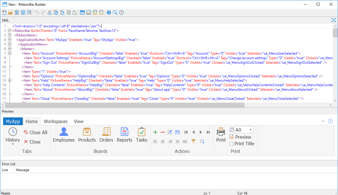
You can directly adjust the scripts in the XML editor to design your own RibbonBar control and preview the UI on the fly. Every change you make to the XML script is immediately reflected in the Preview pane. The RibbonBar Builder allows you to:
-
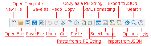
Create or open the XML or JSON scripts of a RibbonBar control
To create a new XML file, click New File.
To open an existing XML file, click Open File.
To open the default XML template of RibbonBar, click Open Template.
To import XML scripts from a JSON file and display the XML scripts in the XML editor, click Import from JSON.
-
Save the current RibbonBar as an XML or JSON file, or as a PowerBuilder string.
To save the XML scripts to an XML file, click the Save File or Save As button.
To save the XML scripts to a JSON file, click the Export to JSON button.
To save the XML scripts to a PowerBuilder string, click the Copy as a PB String button.
-
Search or replace text for the ribbon bar controls in the XML editor
Click the Search button from the toolbar or directly press Ctrl+F to display the search box. You can search for or replace text in the search box.
-
Set property values in the XML editor
Select to modify the property value, or input "=" after a property, the editor aromatically displays a list of values for the property.
-
Insert images
Method 1: Place the cursor in the value of the PictureName property, or double click to select the value of the PictureName property, and then click the Select Image button from the toolbar.
Method 2: In the Select Image dialog, select to use a custom image or a built-in image. The selected image name will be inserted into the value of the PictureName property.
-
Edit the ribbon bar controls
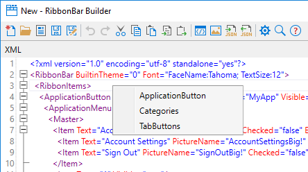
To insert a control, right click where you want to insert the control in the XML editor; the editor will display a list of controls that can be inserted in the current position. As shown in the following figure, if you right click after <RibbonItems>, you will be prompted to select from the following options: ApplicationButton, Categories, and TabButtons.
You can also copy/paste the corresponding XML node to reuse the XML scripts for a control.
To remove a control, simply remove the corresponding XML node.
-
Customize the RibbonBar Builder
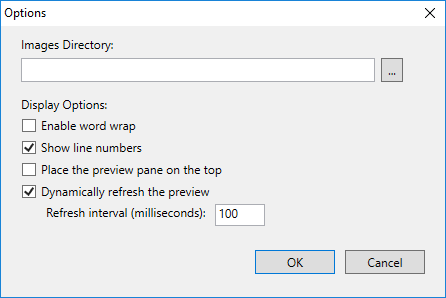
The Option button on the toolbar provides a number of settings for you to customize the RibbonBar Builder.
-
Images Directory -- This directory will be ignored if a built-in image is selected. For a custom image, you can specify a relative path of the custom image in the XML scripts according to the directory specified here; or specify an absolute path if the custom image is in a different directory.
-
Enable word wrap -- Whether to break a long line into multiple lines based on the XML editor view area.
-
Show line numbers -- Whether to show line numbers on the left hand side of the XML editor.
-
Place the preview pane on the top -- Whether to place the preview pane on the top of the XML editor.
-
Dynamically refresh the preview -- Whether to dynamically refresh the preview pane to reflect the changes made to the RibbonBar control. If this option is not selected, a refresh icon will appear on the top right corner of the preview pane and you can click this icon (or press Ctrl + R) to refresh the preview pane manually.
-
Refresh interval -- When "Dynamically refresh the preview" option is selected, you can determine how frequently should the preview pane be refreshed after a change is made.
-
The XML editor also provides auto-completion to help you write XML elements, properties, and property values easily.
-
When you input "<", the editor automatically displays a list of possible elements
-
When you enter a space in an element, the editor automatically displays a list of properties for the current element.
-
When you input "=" after a property, the editor aromatically displays a list of values for the property.
The scripts will be validated against XML 1.0 Specification immediately after input. The syntax error, if any, will be displayed in Error List pane at the bottom of the RibbonBar Builder.
You can right-click in the XML editor to add the nodes, and use the Error List pane to analyze and fix any syntax error.
Here is a brief description to the main XML nodes of a RibbonBar control which can help you understand what a valid structure looks like:
-
<RibbonBar> -- This is the root node. It provides property values for the RibbonBar controls.
-
<RibbonItems> -- This is the only-one second-level node. Only one <RibbonItems> is allowed here.
-
<ApplicationButton> -- Only one <ApplicationButton> is allowed here. It provides property values for the application button.
-
<ApplicationMenu> -- Only one <ApplicationMenu> is allowed here. <ApplicationMenu> can contain only one <Master> and only one <Recent>; and <Master> and <Recent> can contain multiple <Item>.
-
-
<Categories> -- This is the only-one node for all of the categories.
-
<Category> -- Multiple <Category> are allowed.
-
<Panel> -- Multiple <Panel> are allowed. <Panel> can contain multiple <LargeButton>, <SmallButton>, <CheckBox>, <ComboBox>, and <Group>.
-
<Group> -- Multiple <Group> are allowed. <Group> can contain multiple <SmallButton>, <CheckBox>, and <ComboBox>, but cannot contain any <LargeButton>.
-
<SmallButton> -- Multiple <SmallButton> are allowed. <SmallButton> can contain only one <Menu>; <Menu> can have multiple <Item>.
-
<LargeButton> -- Multiple <LargeButton> are allowed. <LargeButton> can contain only one <Menu>; <Menu> can have multiple <Item>.
-
<CheckBox> -- Multiple <CheckBox> are allowed.
-
<ComboBox> -- Multiple <ComboBox> are allowed. <ComboBox> can contain multiple <Item>.
-
-
-
-
<TabButtons> -- This is the only-one node for all of the tab buttons.
-
<TabButton> -- Multiple <TabButton> are allowed. <TabButton> can contain only one <Menu>; <Menu> can have multiple <Item>.
-
-
-
After you finalize the design, you can save the XML scripts of the RibbonBar control to an XML or JSON file or as a string, and then load the file or string to create the RibbonBar in the application.
-
To load the XML file to create the RibbonBar, call the
ImportFromXMLFilefunctionLnv_RibbonBar1.ImportFromXMLFile ("D:\RibbonBarXML\RibbonBar.xml") -
To load the JSON file to create the RibbonBar, call the
ImportFromJSONFilefunctionLnv_RibbonBar1.ImportFromJSONFile ("D:\RibbonBarXML\RibbonBar.json") -
To load the XML string to create the RibbonBar, call the
ImportXMLfunctionLnv_RibbonBar1.ImportXML (XMLData)
-
To load the JSON string to create the RibbonBar, call the
ImportJSONfunctionLnv_RibbonBar1.ImportJSON (JSONData)
