Appeon Mobile generates the native mobile app with an intuitive, user-friendly, and modern user interface. The user interface is automatically adapted to the look and feel of the target device. This section lists the controls, objects, and functions that are enhanced or added by Appeon Mobile to achieve the typical mobile-style user interface. The enhanced controls and objects include Window, Menu, Toolbar, TreeView, etc.
In addition, though not described in detail below, due to the difference between desktop computer and mobile device, most PB controls are adjusted slightly to be used easily on the mobile device, for example, the row height of TreeView, DropDownListBox, ListView, etc., the tiny triangle icon for DatePicker, DropDownListBox, EditMask, etc., and the checkbox of TreeView, ListView etc. are automatically adjusted with tappable size.
The PB desktop application usually has a title bar which displays the window title, the Max, Min and Close icons, and other adornments; while the mobile application calls this a navigation bar, as it usually contains navigation buttons such as the Back icon, the Next icon. Appeon Mobile combines the title bar and the navigation bar into one (and calls it title bar in all of user guides), by placing the window title in the middle and the icons on two ends.
Some of the icons such as the Window List icon, Close App icon, Full Screen icon can be shown or hidden by calling the Appeon Mobile API. For details, refer to the section called “Mobile Device API” in Workarounds & APIs Guide.
-
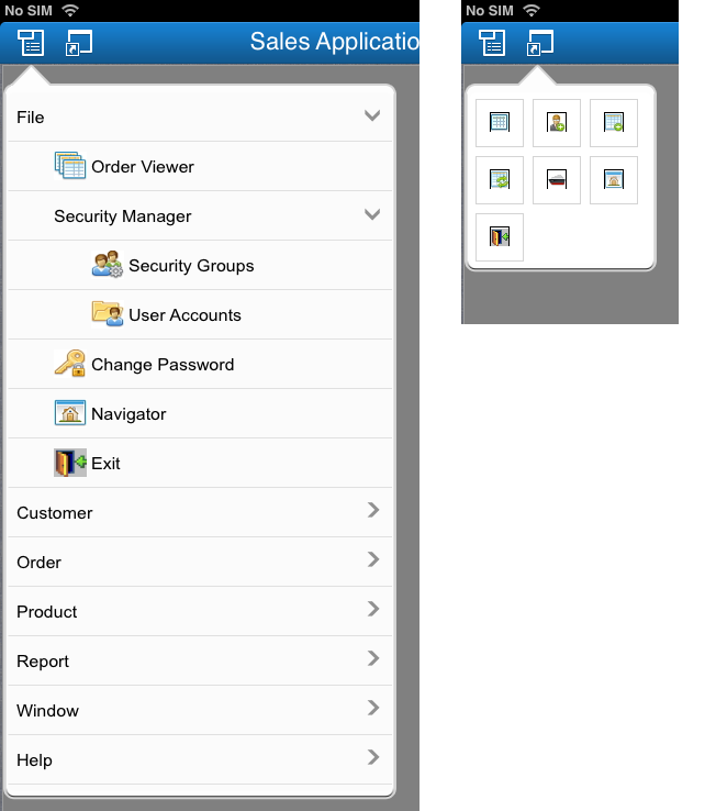
The Menu icon will display the menu items in a treeview hierarchical structure. Notice that the treeview layout is automatically handled by Appeon Mobile.
-
The Toolbar icon will display the toolbars by row(s). Considering the limited space, only icons will be shown, text will not.
-
The window title will be displayed at the center of the title bar and in the font size of 22 points by default. If the title text cannot display completely, the font size will be automatically reduced, until it goes down to the minimum font size 14 points; if the text still cannot fit into the title bar, then the text will be truncated.
-
The Window List icon will list the opened window(s) with the Max, Min and Close icons. You can navigate to any active window in any order, or close, minimize or maximize any window.
-
The Close App icon will exit the app from the background.
-
The Home icon will return you to the Appeon Workspace home page, and the app will run in the background.
-
The Full Screen icon will hide the title bar, to allow more space for the window.
Window menu and toolbar are not usual in mobile apps as is in PB apps, probably because they take up the precious screen space and are tiny and placed closed in the original layout therefore cannot be easily manipulated by a finger. However, they are very handy when navigating between windows, especially in the MDI window. Therefore, if any menu or toolbar is used in the PB application, they will be preserved on the Appeon Mobile application, and will be laid out differently in order to make them easy to use by fingers.
Window menu and toolbar on an iPad:
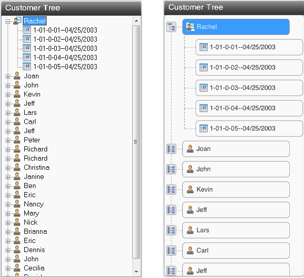
The TreeView control is automatically adjusted to be easily tapped by fingers in the mobile device. The plus and minus signs to expand and collapse the tree are automatically replaced with larger icons that are easy to touch by fingers. The height of the treeview item is also automatically increased to be 44 points.
PB-style TreeView (left) VS. mobile-style TreeView (right):
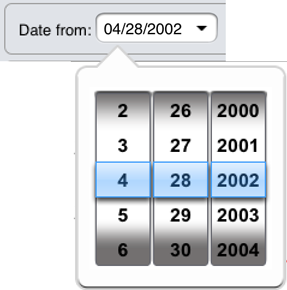
To get a date/time picker exactly like the native mobile Date and Time Picker, you can set the EditMask control to a date/datetime/time mask and then enable its Spin property.
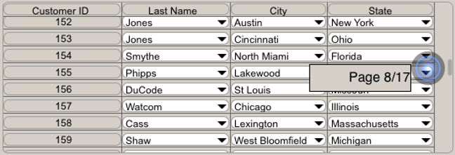
Speedy scrollbar is a tool added by Appeon Mobile to help scroll quickly through a long list of data records. In the DataWindow control, the user can use the speedy scroll bar to scroll through a large amount of data page by page, instead of row by row. The speedy scroll bar automatically appears when the user swipes up or down in a DataWindow with more than 10 pages of data. The speedy scroll bar will disappear if it is not used for 2 seconds.
The horizontal scrollbar and vertical scrollbar for controls will be automatically replaced with the mobile-style scrollbar, instead of the Windows-style scrollbar.
There is no mouse pointer in the mobile device like the desktop computers, therefore most of the pointer shapes that can be displayed in the desktop computer will not be displayed in the mobile device, except for "HourGlass". When it is set to "HourGlass", the mobile-style activity indicator will display in the mobile device to indicate the busy state. The activity indicator will also automatically appear every time when the client calls the server, you can set to empty string SetPointer("") to not automatically display the activity indicator.
In addition to controls, Appeon Mobile also added a bunch of functions to call the mobile native APIs, such as functions to call camera, device, GPS, bar code, etc. For details, refer to the section called “Mobile Device API” in Workarounds & APIs Guide.
To support the Back button that the Android device provides, a user event named "appeon_android_back" is added to the Application object. This event will be triggered when the Back button on the Android device is pressed. For details, refer to the section called “Application” in Supported PB Features for Appeon Mobile (Mobile only).


